

The Anatomy Of A Great Product Page
Published 08.05.26
8th May 2026
Last Updated 14.09.26
14th September 2026

The key things to consider when crafting great product pages.

Oops! We could not locate your form.
The key things to consider when crafting great product pages.
Whether you sell exclusively online, operate both physical and digital stores, or simply use your website as a catalogue for products sold through third parties, your product pages are among the most important assets on your entire website.
Regardless of whether you’re selling to consumers or businesses, these pages are heavy lifters. They need to fulfil multiple roles simultaneously, serving as marketing landing pages, answering pre-purchase questions, building trust, and guiding visitors toward a decision.
Here are some key things to consider when crafting great product pages.
Before we get into the visible anatomy of a product page, let’s start with something less glamorous but equally critical – performance.
So what do I mean by performance? I’d say there are 2 important considerations here:
slow page kills conversions. Research consistently shows that a site loading in one second achieves a conversion rate roughly three times higher than one loading in five seconds. Every fraction of a second counts, and with mobile traffic now accounting for over 57% of all eCommerce sales, the bar is even higher on mobile, where users are less patient and abandon more quickly when pages are slow or confusing.
Page performance can also impact how your pages perform organically. Core Web Vitals are Google’s framework for measuring real-world page experience. They cover things like loading performance, interactivity, and visual stability. Read more about Core Web Vitals here.
These metrics feed directly into how your pages perform in organic search, and they matter especially on mobile. Optimising your images, reducing render-blocking scripts, and choosing a solid hosting infrastructure are important.
There’s a tendency to focus first-impression effort on the homepage. But not every visitor enters through the front door. If your SEO strategy is working, or if you’re running paid campaigns that link to product pages directly, a significant proportion of users will land on a product page before they’ve seen anything else about your brand.
Studies show users form an unconscious judgement within seconds of arriving on a page. That means your product page needs to establish credibility and context for someone who has never heard of you before.
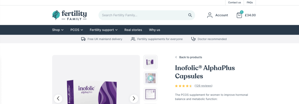
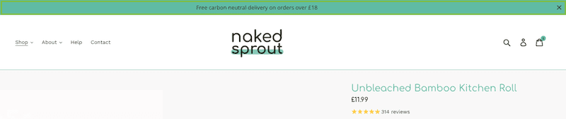
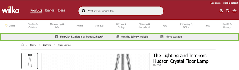
One effective tool here is to provide users with useful information that might make purchasing from you more attractive upfront. If you offer free delivery, free returns, have attractive USPs, or anything else that sweetens the deal, you can let users know within seconds, regardless of what page they land on.
This can be achieved with a simple site wide banner, or notification bar that sits above or below the main navigation. A notification bar can also be used to let people know about any temporary offers or sales. It’s one of the highest-leverage, lowest-effort elements you can add to a site.
Here are few examples for inspiration:
Without a product in hand, your imagery is doing the sensory work that a physical shop does naturally. It needs to work hard.
Research is unambiguous on this. 67% of online shoppers cite image quality as the single most important factor in their buying decision. More influential than product descriptions, reviews, or price. Shoppers who watch a product video are significantly more likely to add to cart than those who don’t.
A strong image strategy for a product page typically combines:
Images need to be zoomable, high resolution, and optimised for fast loading. There’s no point in stunning photography if it takes four seconds to render. Use modern image formats (WebP or AVIF), implement lazy loading, and serve appropriately sized images to different devices.
Image accuracy is something that matters more than ever. AI-powered visual search tools, including Google Lens, are increasingly being used to find and compare products. Your images need to accurately and clearly represent what you’re actually selling, not just look attractive.
Before you write a word of copy or select an image, it’s worth thinking about how the page is architecturally laid out. The order in which information is presented has a direct effect on whether a visitor stays, scrolls, and converts.
The general principle is to put the most persuasive and decision-critical information above the fold (visible without scrolling). On desktop this typically means the product title, primary image (or image gallery), price, key variants (size, colour), ratings summary, and the add-to-cart button. Everything else, like detailed descriptions, specifications, reviews, FAQs, delivery information, follows below.
A few structural choices worth making deliberately:
Tabbed layouts (Description/Specifications/Reviews/Delivery) keep the page feeling clean but hide content from users who don’t click. Accordion style sections or full on-page content is better for SEO and for users who scan rather than navigate. For content-heavy products, a combination works well, with key information on the page, wand expandable sections for the deeper detail.
For longer product pages, common with technical products, furniture, or anything with extensive specifications, a sticky navigation bar with anchor links (Overview/Features/Specs/Reviews) lets users jump to the section they care about without losing their place.
On a phone screen, ‘above the fold’ is a much smaller area. The primary image often takes up the full viewport on mobile. Think carefully about what follows it in the scroll order. Price and CTA should appear before lengthy description copy.
Getting the structure right isn’t just a UX exercise. Well structured pages with logical heading hierarchies are easier for search engines and AI systems to parse, which feeds directly into your SEO performance.
Quality product page content is vital for many reasons, and needs to perform a number of roles. It needs to inform, persuade, answer questions, support organic search, and satisfy paid search landing page requirements. That’s a lot to ask of a few paragraphs, but it’s achievable if you approach it with structure.
Customers don’t always know what a technical specification means in practice. “Merino wool, 200gsm” tells you something, but “warm enough for a winter commute, light enough to not overheat indoors” tells you more. Technical details absolutely belong on the page — just not as the opening argument.
Use the language your audience actually uses. A product page for professional photographers can afford more technical depth than one aimed at casual hobbyists for example. Think about who is reading and write accordingly.
A useful exercise is to go through your customer service inbox, your reviews, and your social comments and identify the questions that come up again and again. The answers to those questions belong on your product page. This can be in the description, in an FAQ section, or in a specifications panel, but if 10% of your customers are emailing to ask whether a product is compatible with a particular device, that information should be on the page.
There’s a persistent myth that product descriptions should be short. In reality, comprehensive content that genuinely helps a shopper make a decision tends to convert better than thin copy. That said, structure it well. Use clear headings, bullet points for specifications, expandable sections for technical detail, and keep the most persuasive content near the top.
Research shows that 98% of online shoppers read reviews before making a purchase, and product pages with ratings and reviews see a lift in conversions.
The way you present reviews matters:
Beyond reviews, trust signals can take many forms: security badges, money-back guarantees, authorised dealer confirmations, sustainability certifications, and clear returns and delivery policies. Research consistently shows that shoppers who can’t find shipping cost and returns information are among the most likely to abandon a purchase, so surface this information prominently, ideally near the add-to-cart button.
The area around your add-to-cart button, sometimes referred to as the buy section or buy box, is where the decision actually happens, and it deserves as much design attention as any other element on the page.
A few things consistently make a difference:
“Add to Cart” works perfectly well for most products. But for higher-ticket items, copy that incorporates reassurance (for example, free returns), can outperform a plain call to action because it addresses the risk the shopper is weighing at exactly the right moment. For impulse purchases, ownership language like “Get Yours” can work really well.
A buy button that stays visible as the user scrolls, particularly a drawer that slides up from the bottom of the screen, keeps the action available when intent is highest, rather than forcing the user to scroll back up.
Low stock indicators, limited-time offers, and delivery countdown timers (e.g. “Order in the next 3 hours for next-day delivery”) all give shoppers a nudge toward action. The key word here though is honestly. Manufactured scarcity is easily detected and damages trust.
Show pricing clearly. If you ship internationally, consider currency localisation. 92% of shoppers prefer to see pricing in their own currency, and 33% are likely to abandon a purchase when prices are only in US dollars.
Instalment options, like Klarna, Clearpay and Paypal’s Pay In 3, have become an expected feature on many product pages, particularly for higher-priced items. Displaying the monthly or weekly equivalent near the price (or 4 payments of £24.75) can meaningfully reduce sticker shock and lower the barrier to adding to cart.
If your product pages serve as a catalogue rather than a direct purchase point (common in B2B, trade, and wholesale contexts) they still need a clear next step. ‘Find a stockist’, ‘Request a quote’, ‘Download the spec sheet’, or ‘Contact our sales team’ all serve the same purpose as an add-to-cart button – they move the visitor forward. A page that provides all the information but no obvious action is a missed opportunity.
Delivery and returns information deserves more than a footnote. Research consistently shows that shoppers who can’t quickly find shipping costs, lead times, or returns policies are among the most likely to abandon. This isn’t at the checkout, but instead right here on the product page, before they’ve even committed to buying.
The most effective approach is to surface key delivery and returns information close to the buy section, not in the footer or on a separate page behind a link. Specifics convert better than vagueness. ‘Free standard delivery, arrives in 2–4 working days’ is more reassuring than ‘Delivery available’. Similarly, ‘Free returns within 30 days’ removes a specific risk the shopper may be quietly weighing.
For products where sizing, fit, or compatibility are common return drivers (clothing, footwear, electronics accessories) it’s worth going further. Size guides, compatibility checkers, and detailed measurement information on the product page itself can significantly reduce return rates, which matters as much for your margins as for the customer experience.
Mobile-first is no longer a best practice, it’s the baseline. Mobile commerce now accounts for the majority of eCommerce transactions, and Baymard Institute’s latest benchmarking found that 62% of mobile eCommerce sites have “mediocre or worse” UX on their product pages. That’s both a warning and an opportunity.
On mobile, prioritise:
Accessibility deserves a mention beyond just mobile. Properly structured HTML, meaningful image alt text, adequate colour contrast, and keyboard-navigable interfaces aren’t just good practice, they expand your potential audience, increasingly matter for SEO, and in some cases are a legal requirement.
A product page isn’t just a destination, it’s also a launching pad. Done well, recommendations increase average order value, improve product discovery, and help shoppers find what they actually need, even if they didn’t search for it directly.
The main patterns to consider:
AI-powered recommendation engines can surface genuinely relevant complementary products based on real purchase data. These sections can lift average order value, but the key word here is relevant. Irrelevant recommendations don’t just fail to convert, they can undermine the page’s clarity and feel pushy.
If you offer the same product at different quality or feature tiers, a product page is the right place to make that comparison easy. A simple ‘compare models’ feature or a brief table showing what the premium version adds can convert shoppers upward without feeling like a hard sell.
Broader discovery recommendations, typically powered by browsing or purchase behaviour, that introduce shoppers to adjacent products they may not have thought to search for.
Presenting a curated bundle of complementary products at a slight discount can increase basket size while simultaneously answering the question ‘what else do I need?’ that many shoppers have but don’t know to ask.
The placement of these elements matters. Recommendations that compete visually with the buy section can distract at the wrong moment. Most evidence favours placing cross-sell and upsell content below the fold, after the primary buy decision has been made, or as part of a sticky cart drawer, rather than above it.
Personalisation has moved from a nice to have, to an expectation for many shoppers. Luckily the technology to deliver it is now accessible to businesses well below enterprise scale.
At its most basic, personalisation on a product page means showing the right information to the right visitor. Someone arriving from a paid ad for a specific use case shouldn’t have to wade through generic copy to find what they need. Someone who’s previously browsed or purchased should see relevant context, such as their last viewed size, their loyalty points balance, or a reminder that they bought a compatible product last year.
Some practical approaches:
A visitor arriving from a Google Shopping ad for ‘waterproof walking boots’ and a visitor who found the page by browsing your ‘new in’ section have different contexts and different levels of intent. Adjusting page headlines, lead images, or notification bar messages based on traffic source or UTM parameters can make pages feel more relevant without requiring a full personalisation platform.
If a customer is signed in, you can surface their loyalty tier and any applicable rewards, remind them of previous purchases of related items, or pre-populate size and delivery preferences. These small touches reduce friction and signal that you know them.
Increasingly, shoppers are finding product pages through AI-assisted search that interprets intent rather than matching keywords. A search for ‘gifts for someone who loves cooking but already has everything’ might surface a product page based on its content, not its exact keywords. This means the content on your pages needs to be rich enough to serve intent-based queries, not just exact-match ones.
Personalisation doesn’t require a massive investment to start. Begin with what your platform already supports. Many eCommerce platforms have built-in recommendation engines and session-based personalisation, so you can build from there.
Out-of-stock products present a genuine strategic question. The instinct is often to hide them or redirect, but that can cost you. If a page has organic search visibility, removing it destroys that value instantly.
Better approaches include:
Product page SEO has always mattered, but nowadays it’s operating on more fronts simultaneously.
Descriptive, keyword-informed page titles. Compelling meta descriptions written for click-through, not just crawlers. Clean URL structures. Fast page speeds. Well-structured content with logical headings. These aren’t exciting, but they’re not optional either.
Product schema (marking up your product name, description, price, availability, ratings, and SKU in JSON-LD) enables rich results in Google Search, including star ratings, price displays, and availability information.
These rich snippets consistently generate higher click-through rates than un-enhanced results. Beyond Google, it is thought that structured data is increasingly how AI systems like ChatGPT, Perplexity, Google’s AI Overviews, understand, verify, and cite product information. Sites with complete Product schema are significantly more likely to appear in AI-generated answers and shopping recommendations.
Experience, Expertise, Authoritativeness, and Trustworthiness are Google’s quality framework, and they apply to eCommerce as much as editorial content. Comprehensive product descriptions, accurate specifications, genuine reviews, clear brand information, and consistent product data across channels all contribute to E-E-A-T signals.
Conflicting information, like a product described differently across your website, Google Shopping, and third-party marketplaces, can actively weaken these signals.
A growing share of product research now happens through AI assistants and conversational search tools, not just traditional search engines. These systems evaluate product pages differently from keyword-matching algorithms. They look for structured, factual, answer-ready content.
Pages that clearly address ‘who is this for’, ‘what does it do’, ‘how does it compare’, and ‘what do existing customers say’, are better positioned to be cited in AI-generated responses. Complete, accurate, and well-structured product data is the foundation.
Merchant Centre (now part of Google’s broader retail solutions ecosystem) remains essential for any product sold online. Keeping your product feed accurate, well-attributed, and up to date feeds into Shopping ads, free product listings, and increasingly into Google’s AI-powered shopping features.
A product page is never finished. The brands achieving the highest conversion rates, well above the industry average of 2-5%, got there through disciplined testing rather than following universal best practices. What works for one product category, price point, and audience doesn’t automatically transfer.
The most valuable elements to test include:
Heat maps and session recordings can reveal where users spend time and where they drop off before you even begin A/B testing.
The most important discipline is resisting the urge to stop testing once you find something that works. Shoppers, devices, and expectations change, and so should your pages.
A great product page is never just one thing. It’s the result of performance, design, content, trust signals, technical SEO, and structured data all working together, and crucially, working together on every device.
The reassuring truth is that the bar isn’t as high as it sounds. Baymard’s benchmarking found that the majority of leading eCommerce sites still have mediocre product page UX. That means the opportunity to differentiate, not through some radical innovation, but through simply doing the fundamentals well, is genuinely there for the taking.
Start with what you have. Audit your most important product pages. Find the gaps. Fix them one by one. Then test your way to better.

If you’d like to learn more about optimising your WordPress or WooCommerce product pages, drop us an email or give James a call.
Our Evolve plans are designed to enhance and extend the lifespan of your website, ensuring it remains well optimised, and aligned with your business.


