Making the Most of Product Imagery to Create a Better User Experience
Published 18.11.21
18th November 2021
Last Updated 27.09.23
27th September 2023

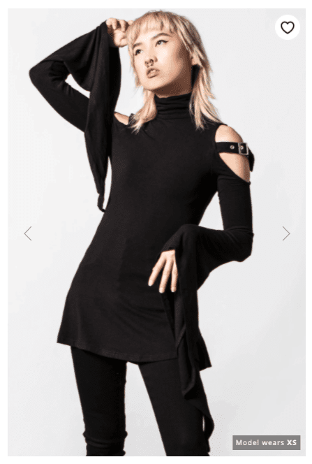
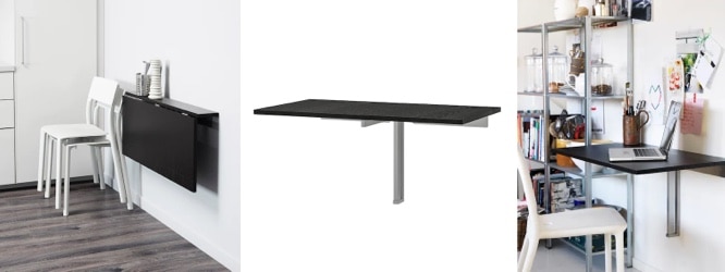
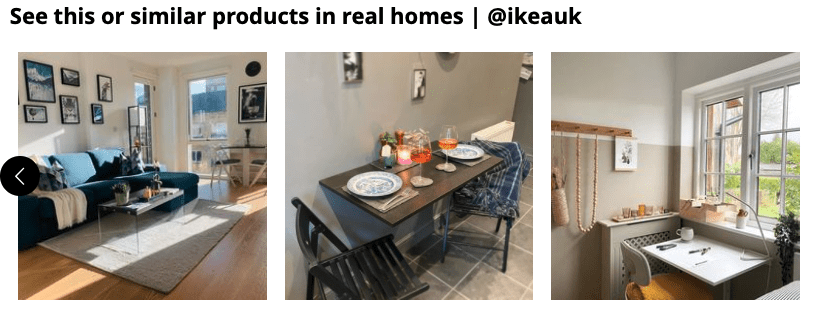
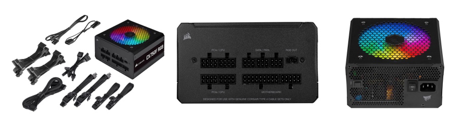
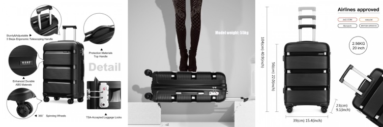
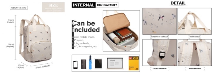
Quality, useful and thought-out product imagery can do wonders for user experience, increasing sales, reducing returns, and much more. But so many websites are still getting it wrong.