Making Delivery A Positive Experience For Your eCommerce Customers
We talk a lot about the importance of UX for e-commerce websites, from forms, product pages and imagery, to the full checkout process journey.

Oops! We could not locate your form.
We talk a lot about the importance of UX for e-commerce websites, from forms, product pages and imagery, to the full checkout process journey.

One area that can often get overlooked is delivery – options, prices, dates. Along with how they are communicated throughout the customer journey.
Yet this is something that can easily result in frustration. This, in turn, can lead to cart abandonment or a poor experience which loses you a potential repeat customer.
Depending on what you sell, the delivery expectations will differ. Items kept in stock are expected to arrive quickly. Custom or made-to-order items come with the expectation of a longer wait for production. Digital content is expected immediately, or if gifted, on a set date.
What is important in all cases, is clarity and transparency. Shipping times and prices should never come as a nasty surprise. Ensuring your customers are aware of these things from the start of their journey with you is important. It prevents them from feeling like they’ve had the wool pulled over their eyes.
Giving users choices also goes a long way to creating a positive experience. In the era of Amazon Prime this is even more important, with users expecting greater flexibility and speed. People don’t want to feel strong-armed into a single option.
Joe briefly touched on both of these points in a post on getting the checkout process right. But let’s dive into this in more detail. We’ll look at how delivery can be considered at various stages of the user journey, and ways to improve the experience for your customers.
Ever found the perfect item on a website, added it to your cart, input your details, only to reach the delivery option stage to be given a single expensive option? Or to find out that delivery times are far too long for your needs? Have you then immediately abandoned your cart? I certainly have on many occasions.
On one occasion I found a lovely A4 print perfect for a friend. I went through the whole process only to find that the delivery cost was more than the print cost itself. This was daft enough on its own. Even worse was that at no point had I been given an indication of delivery costs, so I was at least forewarned. I’d also already gone through an overly complicated and long checkout process by this point, adding to my annoyance.
So this went from a ‘blimey that’s a bit steep, I’ll only use this site when placing a larger order to get better value from the steep delivery cost’ to a ‘*bleep* bleep* bleeeeeep* what a waste of my time, I’m never shopping with this site again’ moment.
Even if the delivery cost needed to be that high and no other option was possible, being made aware of that at an earlier stage of my journey on the site would have prevented a negative experience. This negative experience lost me as a customer for good.
So how do you implement this transparency throughout the customer journey, to ensure these negative experiences are avoided? Let’s look at some examples.
Offer free delivery over a certain amount? Make sure this is obvious on whatever landing page a customer arrives on.
Like this example from Pets At Home. In a banner just below the navigation they clearly display their spend minimum for free delivery. It also displays their click and collect service.

If you have various shipping options, or pricing bands for delivery worldwide, have an easy to find page with that information clearly explained. Don’t hide it away in the footer, it shouldn’t take extra work for your users to find it.
Like this example from Don’t Buy Her Flowers. The delivery information page is clearly displayed in the secondary header navigation. This example also illustrates the next point.

If you offer next day delivery among your options, make sure it is clear to users when they need to order by to qualify for next day arrival. In the Don’t Buy Her Flower’s example above, this is shown on every page. It’s in the area below the primary header navigation.
You could also do this on product pages, giving the cut off time next to the add to basket button.
As seen in this example from Office Shoes. Note that they also have a quick link to their delivery and return information page in the same area. Their minimum spend for free delivery is also in the pink bar just below the header navigation.
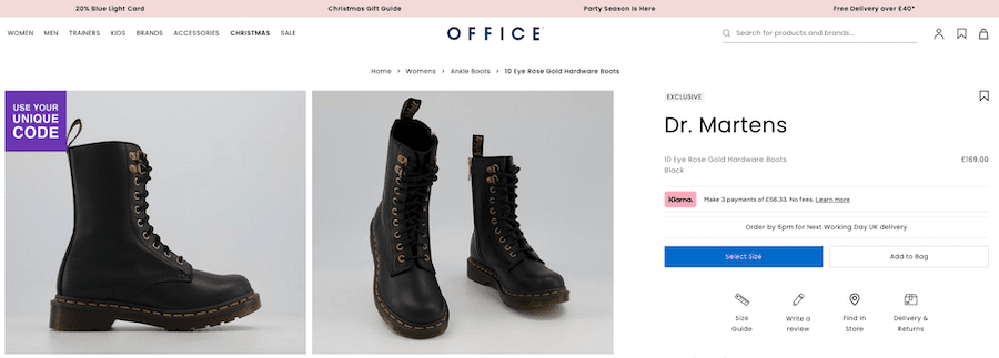
You could go one step further, and add all delivery options to the product page. Rather than just the next day cut off time.
Delivery speed can be very vague and deceptive for a user. Does it include processing time, will their order arrive by the date they need it? If you enjoy reading reviews, you’ll see many negative ones on eCommerce sites come from delivery taking longer than expected.
Rather than giving a speed like this:

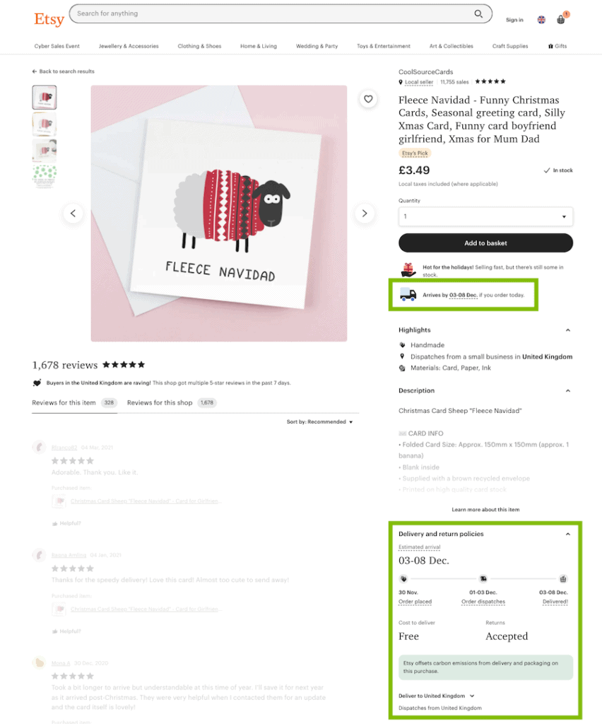
Instead offer a date, or at least a date range. This saves the buyer from having to do mental arithmetic to figure out if the timeline works. It reduces the likelihood of negative reviews due to timing confusion.
Here’s a great example from Etsy. You can see that a delivery date range is provided, not once but twice. Delivery cost (in this case free) is clearly shown at this stage too.
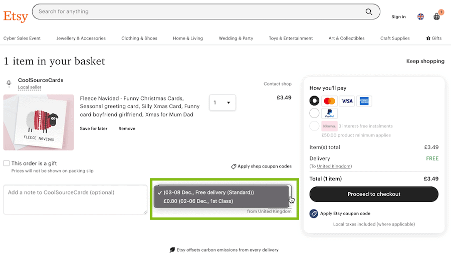
Rather than making someone go through most of your checkout process before presenting delivery options, you can provide them from the basket page.
Here is another example from Etsy (they’re very good at this UX stuff) in which you can see and select all available delivery options straight from the basket page. The carbon offset for deliveries messaging is also a nice touch.
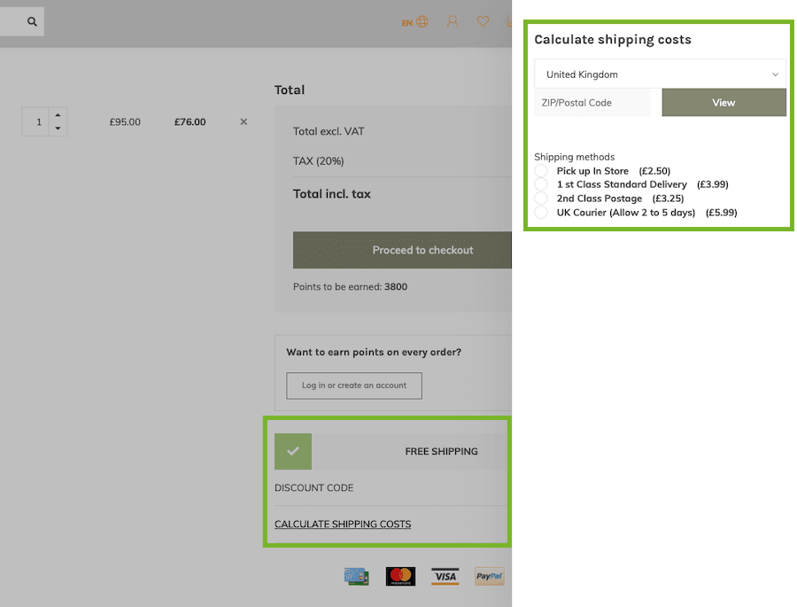
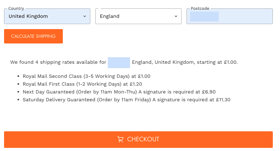
Or at least allow options to be calculated from the basket as in this example from 4Tk Gaming. Not only do they automatically highlight if you’ve qualified for free shipping, but you can also calculate and apply delivery method from the basket page.
We like our autonomy, and whilst too much choice can be overwhelming, we are still creatures that like to have options.
Depending on our purchase reason, delivery options can be a main driver and decision maker.
Forgotten to get a present sorted for a friend’s birthday in advance, then an expedited shipping option is a must. Just moved and have no mattress because the old one met its mouldy end in storage, then a ready to dispatch with next day delivery option is going to be high on your shopping list (can confirm).
Now not every eCommerce business can offer a huge list of delivery options. But even a couple can go a long way to creating the feeling of choice.
Offering a range of services priced by delivery speed/date is frequently the ideal situation for most buyers. This won’t apply to every business selling online, but for most it will.
Big retailers can and usually do, offer a range of delivery options. From standard through to next day or same day delivery. But this doesn’t mean that smaller businesses can’t also offer some choice.
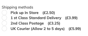
A small independent greetings card retailer for example, might not be able to offer 8 different delivery options. But they could easily offer First Class and Second Class options. This example from small indie card business The Curious Pancake offers 4:
Or as in the example from 4Tk Gaming (an independent hobby store) I used above, they have free shipping over a certain amount spent, and then the following options:
Depending on what you sell, next day and expedited options are great. If someone needs a last minute outfit for an unexpected event, or they’ve forgotten to send a birthday gift ahead of time. In the age of Amazon Prime and on demand content people expect things quickly.
As I mentioned before, don’t forget to make it clear what the cut off time for next day delivery is.
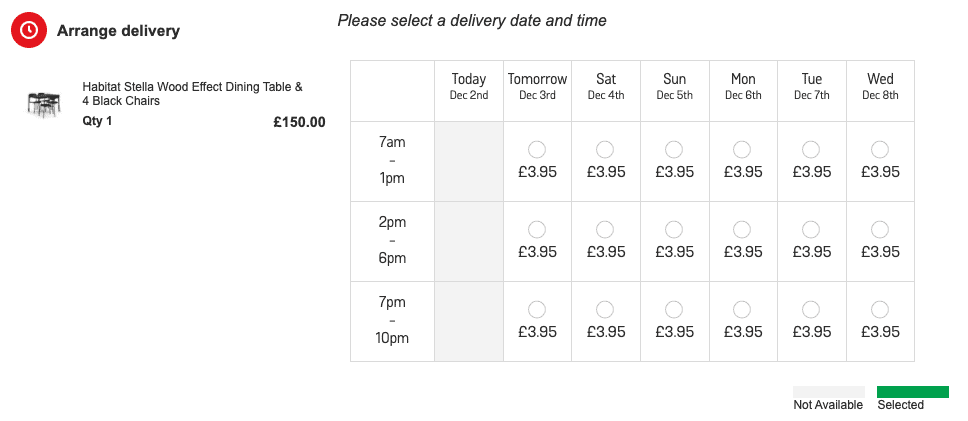
This can be a big factor for people in full-time work or education. If it’s something that can’t be posted through a letterbox, being able to pick a day when they’ll be in to receive a delivery can be the decider.
If you can provide a time or time slot, even better. This could be the difference between someone having to take an entire day of holiday off work, or just an hour and making it up by working through their lunch break.
This also applies to delivery of digital content or vouchers by email. It makes for easier gifting.
Flexibility is key. Like this example from Argos.
This is particularly important for high value goods. Offering an insured and more traceable delivery method is better for the customer and the retailer. We all know how unreliable standard mail services can be. I’ve had stuff go missing or arrive in terrible condition.
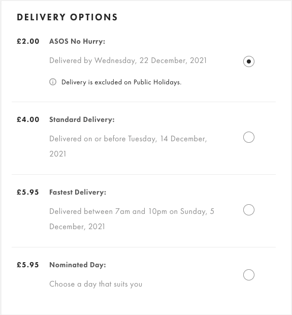
This is one I really like to see. When I’m ordering everyday items, or I’m not in a rush to receive my delivery, I don’t mind waiting a bit longer to save a bit of money. Here is an example from ASOS.
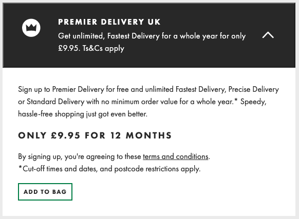
This one is great if you have regular repeat customers. I think the best known example of this is also from ASOS. A user can add a premier delivery membership to their basket, which for a set price means they receive expedited delivery on every order for a year.
So there you have it, a look at creating a good user experience in regards to the eCommerce delivery process and how it is communicated.
If you’d like to see a recent example of an eCommerce website we designed and developed, head over to Don’t Buy Her Flowers, or you can have a look at some of our other eCommerce website builds on our case study page.
