logo

WordPress Design Agency

020 3355 8747

Message Us
  • Home
  • About Impact®
    Learn More About Impact Media®
    • Meet The Team
       
    • Why WordPress
       
    • Careers
       
    • Giving Back
       
    • 100K Tree Challenge
       
    James Coates
    Schedule a discovery call with UX Specialist James
    Book A Call
  • WordPress Services
    Learn More About Our Services
    • WordPress Web Design
       
    • UX Design
       
    • WordPress Development
       
    • WordPress Support & Maintenance
       
    • WordPress Evolve Retainer
       
    • WordPress Multisite Development
       
    • WooCommerce
       
    • Replatform To WordPress
       
    • WordPress Consultancy
       
    • Integrations & Plugins
       
    • WordPress Managed Hosting
       
    • WordPress Health Check
       
    James Coates
    Schedule a discovery call with UX Specialist James
    Book A Call
  • Our Process
  • Case Studies
  • Insights
  • Contact Us
WordPress Design Agency
020 3355 8747
logo logo
Book A Call
Back
Menu
  • Home
     
  •  
    About Impact Media
    Learn More About The Impacters
    • Meet The Team
       
    • Why WordPress
       
    • Careers
       
    • Giving Back
       
    • 100K Tree Challenge
       
  •  
    Our Services
    Discover How We Can Help
    • WordPress Web Design
       
    • UX Design
       
    • WordPress Development
       
    • WordPress Support & Maintenance
       
    • WordPress Evolve Retainer
       
    • WordPress Multisite Development
       
    • WooCommerce
       
    • Replatform To WordPress
       
    • WordPress Consultancy
       
    • Integrations & Plugins
       
    • WordPress Managed Hosting
       
    • WordPress Health Check
       
  • Our Process
     
  • Case Studies
     
  • Insights
     
  • Contact Us
     
020 3355 8747
Mon - Fri • 9am - 5pm
Close

Oops! We could not locate your form.

Home / Insights / Understanding The Importance Of Responsive Web Design
Back

Understanding The Importance Of Responsive Web Design

Published 01.08.16
1st August 2016
Last Updated 27.11.25
27th November 2025
Newer
7 Min Read
Joe Dawson
Joe Dawson
Web Design
Older
7 Min Read
 
Joe Dawson
Joe Dawson
 
Web Design

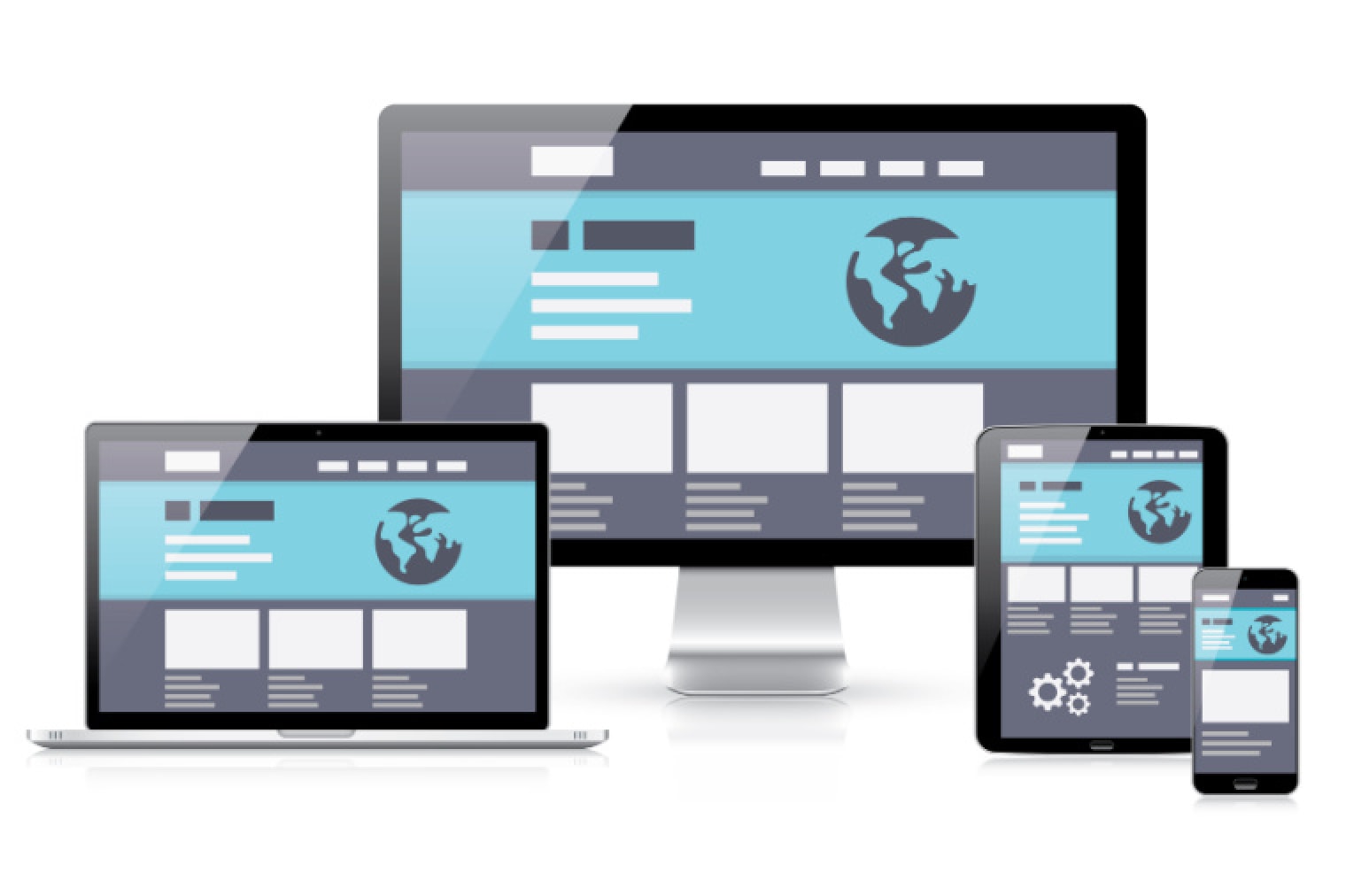
Having a responsive website will enable you to give your visitors the best experience possible, from any device they choose to access it from. Its core purpose is to optimise the viewing and interaction experience of your site.

responsive web design hero image

Edit: Although originally published in 2016, this post received an update in 2025 to ensure continued value and accuracy.

The Changing Landscape Of Web Browsing

Over the years, web browsing habits have altered with the introduction of various web connected devices.

No longer are we tied to a PC or laptop computer if we want to browse, research, or shop online. We now have powerful personal web connected devices in our pockets.

Whilst tablets have made a little notch in internet usage stats, it is mobile that has completely changed the landscape.

Way back in 2016, Mobile internet usage surpassed Desktop usage worldwide for the first time. It has continued its growth ever since and sits at around 63% worldwide today.

Following The Browsing Trends

With the growth in mobile internet usage after the introduction of smart phones and tablets, web publishers had to make changes.

Websites were traditionally designed to be viewed on desktop and laptop screens. This did not lend itself to the smaller, vertically aligned screens on mobile devices. Using a desktop website on an older smartphone was an ordeal.

Initially, to provide mobile visitors with a usable website, many businesses created separate mobile websites. These were usually m. versions of websites that sat on a sub domain, and mobile traffic was redirected to this version of the website.

These mobile sites were usually heavily stripped down versions of the desktop website. They didn’t really offer an equal user experience. Users would often still need to visit a site on a desktop device to achieve certain goals.

In 2016 Google began introducing mobile-first indexing. Alongside this, they introduced mobile usability as an important page experience signal for ranking. This focus on mobile user experience has continued with Core Web Vitals rolling out for mobile first.

With the continued rise in the number of hand-held devices purchased every year, it’s now more important than ever that your website is accessible on as many devices as possible.

What Does Responsive Mean?

Responsive web design is a design and development approach that ensures your website automatically adjusts its layout, content, and functionality to suit the screen size and orientation of the device it’s being viewed on.

Instead of building multiple versions of a site for different devices (e.g., a separate mobile site), a responsive site uses flexible grids, fluid images, and media queries to dynamically adapt content. Whether your visitor is using a smartphone on the move or a widescreen monitor at their desk, they’ll get an optimised and seamless experience.

Having a responsive website will enable you to give visitors the best possible experience, from whatever device they access it from.

Its core purpose is to optimise the viewing and interaction experience of your site. This includes improving ability to read, navigate, and decrease or even irradicate the need for panning or zooming on a device.

water filling different sized containers
Seven Deadly Mobile Myths from Josh Clark

Why Is A Responsive Website So Important?

1. Your Customers Expect It

More than half of all web traffic now comes from mobile devices. This number increases as people become more comfortable using these devices for all manner of web related activities.

Whether they are looking for information, making a purchase, or booking tickets for an event, your audience should be able to complete these actions with ease whether they are using their phone, or a home computer.

If your site isn’t responsive, visitors will struggle with tiny text, unclickable buttons, or horizontal scrolling, and they’ll likely leave. A responsive site keeps users engaged and improves their experience.

2. Google Requires It

Google uses mobile-first indexing, meaning it looks at the mobile version of your site first when determining rankings.

If you rely on organic search to bring people to your website, a responsive website can help improve your organic rankings, as Google prioritises mobile-friendly, fast-loading sites in its search results. Whilst a non-responsive website could be damaging your search visibility.

Responsive design helps meet Google’s performance and usability standards, which have been around for a long time now. This quote is from all the way back in 2014:

This quote was taken from a blog post from Google earlier this year;

“Today’s the day we begin globally rolling out our mobile-friendly update. We’re boosting the ranking of mobile-friendly pages on mobile search results. Now searchers can more easily find high-quality and relevant results. Where text is readable without tapping or zooming, tap targets are spaced appropriately, and the page avoids unplayable content or horizontal scrolling.“

3. One Website, Multiple Benefits

A responsive site means less content duplication, easier management, and reduced development overhead. Instead of maintaining separate sites or apps for different devices, your team can focus on evolving one core website, streamlining everything from SEO to content updates.

4. Improved Performance and Conversions

Responsive design goes hand in hand with performance. Fast-loading pages, optimised layouts, and intuitive user journeys help increase conversion rates, whether your audience is browsing products, booking a service, or requesting a demo.

5. Future-Proofing Your Digital Presence

New devices emerge constantly. From foldable phones to smart TVs, responsive design gives your site the flexibility to adapt, without constant redesigns. It’s a scalable, sustainable approach to website development.

Responsive Design In Action

At Impact Media, every WordPress website we build is designed responsively from the ground up.

We prototype layouts, test across real devices, and follow accessibility and UX best practices, ensuring your website performs just as well for a commuter on their phone as it does for a stakeholder on their office desktop.

We also help established businesses improve existing websites.

Today, responsive design isn’t optional. It is essential. If your website isn’t adapting to meet your audience wherever they are, you’re not just falling behind, you’re actively losing opportunities.

FAQs

What is responsive web design?

Responsive web design is an approach to building websites that automatically adapt to different screen sizes and devices, from desktops and laptops to tablets and smartphones.

Why is responsive design important?

A responsive website improves user experience, reduces bounce rates, and ensures your content is easy to navigate on any device. It’s also a key factor in Google’s mobile-first indexing, which can impact your SEO rankings.

How is responsive design different from mobile design?


Mobile design creates a separate version of your site just for mobile. Responsive design uses one website layout that flexibly adjusts to fit all screen sizes, offering a more consistent and future-proof solution.

Will my site look the same on every device?

Not exactly, and that’s the point. A responsive site adjusts layout, images, and content to best suit the device it’s being viewed on, making it more usable and visually appealing everywhere.

A picture of James Coates.

Impact Media® has been crafting award-winning websites since 2003.

Need support modernising your website, or another project that you’d like to work with us on? Let’s get the ball rolling! Just drop us a message or request a call to talk through your requirements.

button to visit contact page

Share Socially
Joe Dawson
Joe Dawson
Head of Digital
Joe is Head of Digital at Impact. His expertise are UX and design, but he's also a highly experienced web developer. He's been designing and building websites since he was at school. These days he likes to attend as many WordPress conferences as possible, to continuously expand his skills.
View Team Profile
See More Articles
Joe Dawson
Joe Dawson
Head of Digital
Joe is Head of Digital at Impact. His expertise are UX and design, but he's also a highly experienced web developer. He's been designing and building websites since he was at school. These days he likes to attend as many WordPress conferences as possible, to continuously expand his skills.
See More Articles
View Team Profile
Let's Get The Ball
Rolling On Your New Website
Give us a call or drop us a message, to see if we could be the right fit for your project.
Let's Chat
studio@impactmedia.co.uk
020 3355 8747
Impact Media's LinkedIn
Impact Media's Twitter
Impact Media's Facebook
Impact Media's Instagram
Impact Media's Youtube
wordpress.org

About Impact

  • About Impact Media®
  • Meet The Impact Team
  • Why WordPress?
  • Our Web Development Process
  • Careers
  • Awards
  • Partners
  • Giving Back
  • 100K Tree Challenge

WordPress Services

  • WordPress Web Design
  • UX Design
  • WordPress Development
  • WordPress Evolve Retainers
  • WooCommerce Development
  • Multisite WordPress
  • Migrate To WordPress
  • Custom Integrations & Plugins
  • WordPress Consultancy

WordPress Support

  • WordPress Support & Maintenance
  • WordPress Managed Hosting
  • Case Studies
  • Insights
  • Contact Us

Addresses

London Address:

50 Liverpool Street,

London, EC2M 7PY, UK

+44 (0) 20 3355 8747


Registered Address:

Woodland Place, Hurricane Way

Wickford, SS11 8YB, UK

  • Privacy Policy
  • Cookie Policy
Impact Media logo
© Impact Media® 2003 - 2025
Impact Media is a trading name of IMDMS LTD. Company Reg. 05970261
Impact® & Impact Media®
are registered trademarks of IMDMS LTD