logo

WordPress Design Agency

020 3355 8747

Message Us
  • Home
  • About Impact®
    Learn More About Impact Media®
    • Meet The Team
       
    • Why WordPress
       
    • Careers
       
    • Giving Back
       
    • 100K Tree Challenge
       
    James Coates
    Schedule a discovery call with UX Specialist James
    Book A Call
  • WordPress Services
    Learn More About Our Services
    • WordPress Web Design
       
    • UX Design
       
    • WordPress Development
       
    • WordPress Support & Maintenance
       
    • WordPress Evolve Retainer
       
    • WordPress Multisite Development
       
    • WooCommerce
       
    • Replatform To WordPress
       
    • WordPress Consultancy
       
    • Integrations & Plugins
       
    • WordPress Managed Hosting
       
    • WordPress Health Check
       
    James Coates
    Schedule a discovery call with UX Specialist James
    Book A Call
  • Our Process
  • Case Studies
  • Insights
  • Contact Us
WordPress Design Agency
020 3355 8747
logo logo
Book A Call
Back
Menu
  • Home
     
  •  
    About Impact Media
    Learn More About The Impacters
    • Meet The Team
       
    • Why WordPress
       
    • Careers
       
    • Giving Back
       
    • 100K Tree Challenge
       
  •  
    Our Services
    Discover How We Can Help
    • WordPress Web Design
       
    • UX Design
       
    • WordPress Development
       
    • WordPress Support & Maintenance
       
    • WordPress Evolve Retainer
       
    • WordPress Multisite Development
       
    • WooCommerce
       
    • Replatform To WordPress
       
    • WordPress Consultancy
       
    • Integrations & Plugins
       
    • WordPress Managed Hosting
       
    • WordPress Health Check
       
  • Our Process
     
  • Case Studies
     
  • Insights
     
  • Contact Us
     
020 3355 8747
Mon - Fri • 9am - 5pm
Close

Oops! We could not locate your form.

Home / Insights / I Want That Too! Part 2- eCommerce Features You May Want To Include In Your Next Web Design Brief
Back

I Want That Too! Part 2- eCommerce Features You May Want To Include In Your Next Web Design Brief

Published 17.06.26
17th June 2026

Newer
35 Min Read
Vikki Baker
Vikki Baker
Web Design
Older
35 Min Read
 
Vikki Baker
Vikki Baker
 
Web Design

A few popular eCommerce website features that you may want to consider adding to your website design brief.

My colleague Richard wrote a post about popular B2B website features a while ago, so I thought it would be a good idea to write a part 2, this time focussing on eCommerce.

If you’re thinking about a redesign, or making some improvements to your existing eCommerce website, it is useful to be able to put a name to a feature when writing your brief. So here is a list of some favoured eCommerce website features and how they could benefit your business, so you can add them to your next design brief if they are relevant.

Advanced Product Filtering & Faceted Search

Broad catalogues without good filtering are overwhelming and off putting. Faceted search lets visitors narrow results by multiple attributes simultaneously, like size, colour, material, price range, rating, availability. The more options you sell, the more essential this becomes.

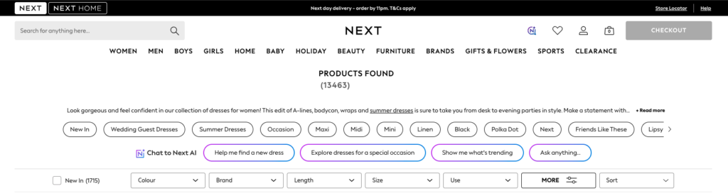
Here is a good example from UK retailer, Next. They have an enormous catalogue (13,463 items in the dress category alone), so having a solid advanced filtering tool is vital. These are the filtering options on display initially.

Advanced product filtering for dresses on Next.co.uk

When you click on more, the selection expands to provide further filtering options, making it very easy to find products that fit a very specific set of criteria.

Additional filtering options from Next.co.uk

If you are implementing something like this, work out your product taxonomy before development begins. Filters are only as useful as the data behind them.

Beyond basic filters, smart search with typo tolerance and synonym matching (so ‘grey’ finds ‘gray’, and ‘sofa’ finds ‘couch’) dramatically reduces zero-results pages, which are effectively dead ends in the customer journey.

Choosing The Right Site Search Solution For Your WordPress Website

Shoppable Content & Editorial Integration

Lookbooks, buying guides, blog posts with inline ‘add to basket’ functionality provide content that converts without the shopper having to search out, or filter their way to a product page. This type of content is particularly powerful for lifestyle, fashion, and home brands where inspiration drives purchase.

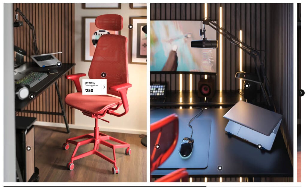
Ikea are very good at this style of content. For each room type in a home, they have a section where they provide photography of dressed and styled rooms with clickable labels for each product featured and its pricing, which take you straight to the product’s page.

This is really effective and brings their in-store experience online.

Ikea staged rooms with clickable targets on each purchasable item

Product Bundles & Cross-Sell Logic

The ‘Frequently Bought Together’ feature pioneered by Amazon has become a fairly commonplace feature. Smart cross-sell and upsell suggestions, whether on the product page, in the basket, or at checkout, increase average order value without requiring any extra effort from the customer.

This can be achieved in numerous ways and levels of complexity. Here are 2 examples from plant retailers.

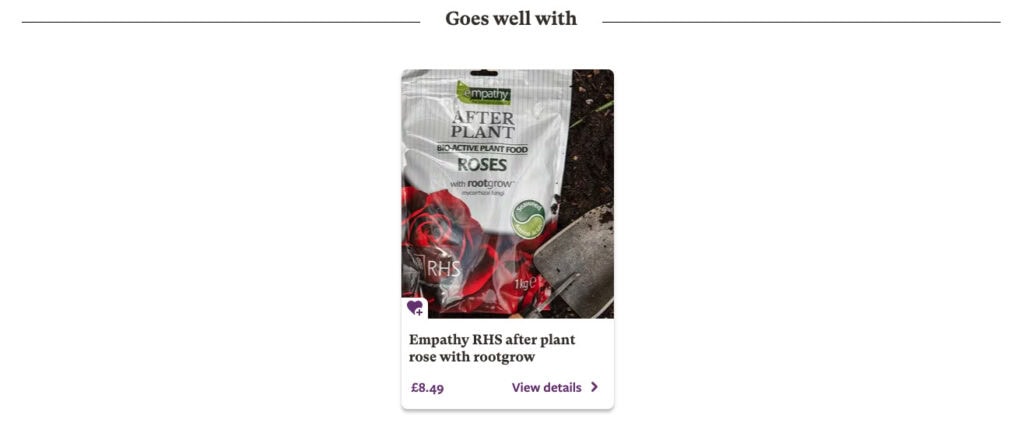
First we have a simple ‘Goes well with’ suggested complimentary product, from the bottom of a product page for a rose on the RHS website:

RHS 'goes well with' recommendation

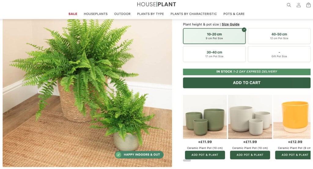
Second is an example from Houseplant.co.uk, where the complementary product (a suitably sized plant pot) can be added directly from a selection, as you are adding your chosen plant to your basket.

Bundles go a step further by packaging complementary products at a slight discount, presenting them as a ready-made solution. A camera store might bundle a body, lens, and case. A skincare brand might offer a morning and evening routine set. The shopper feels they’re getting a deal; you increase basket size.

Define your bundle logic and cross-sell rules before development. The best recommendations reflect how your customers actually shop, so involve your sales or merchandising team.

Subscription & Repeat Purchase Options

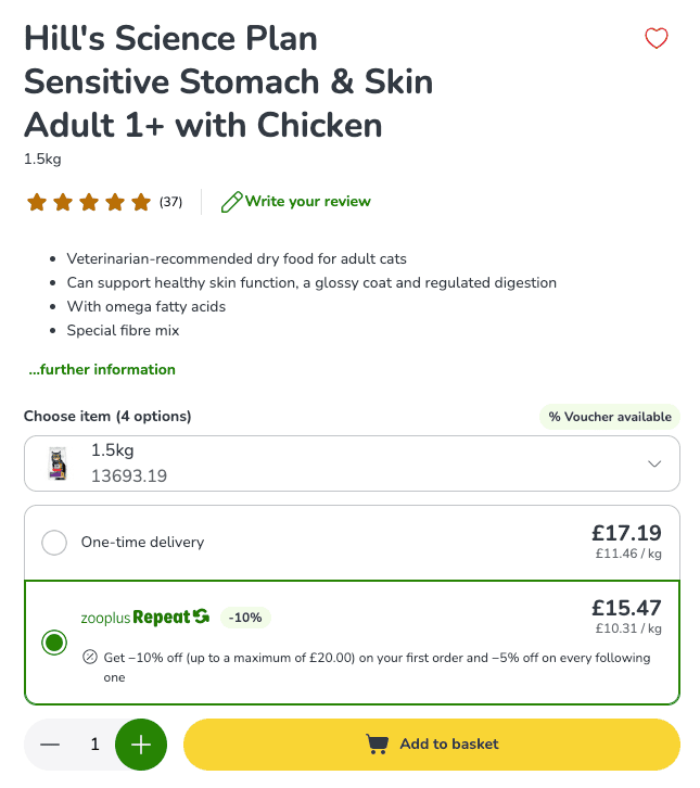
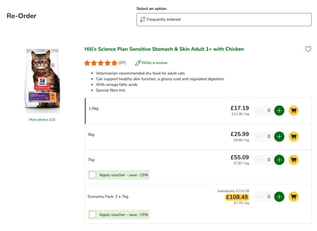
‘Subscribe & Save’ mechanics let customers set up recurring orders for consumables. For Zooplus, this is for pet food and products, but it could equally be for coffee, skincare, or supplements. This locks in revenue, improves LTV, and removes the friction of reordering.

Here is how Zooplus have implemented this feature, similar to what Amazon does.

Even a simple ‘reorder in one click’ for past purchases is a useful friction remover for repeat buyers, or a ‘add to basket from your last order’. This is a something Zooplus also provides, with a dedicated reorder page showing items from your last purchase. Each item is shown with all available size variables, so you can easily add a larger or smaller size straight to your basket.

They even have a link to the reorder page in the navigation which takes you via a login page, if you aren’t already signed in.

Wish Lists & Save for Later

Not every visitor is ready to buy right now. A wish list feature lets them save products they love and come back when the time is right. Crucially, it gives you a mechanism to re-engage them (carefully) with ‘your saved item is back in stock’ or ‘the price has dropped on something you saved’ email triggers. These can be very high-converting, as the intent to purchase has already been shown.

Allow wish lists to be shared, and you’ve also created a word-of-mouth channel. Gift wish lists are particularly powerful for clothing, home goods, and lifestyle brands. Amazon is obviously one example of wish lists and wishlist sharing, and Etsy is another, but plenty of smaller brands use them too.

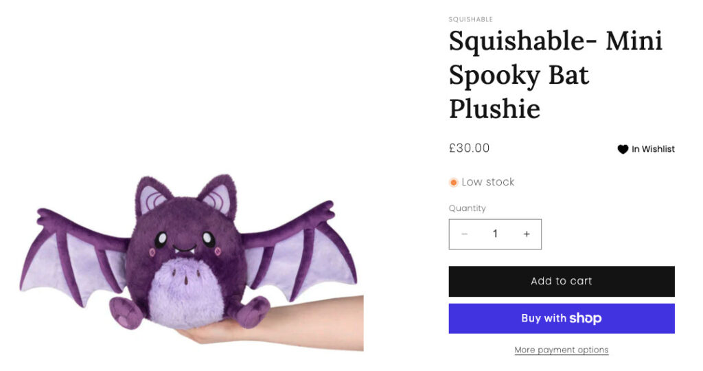
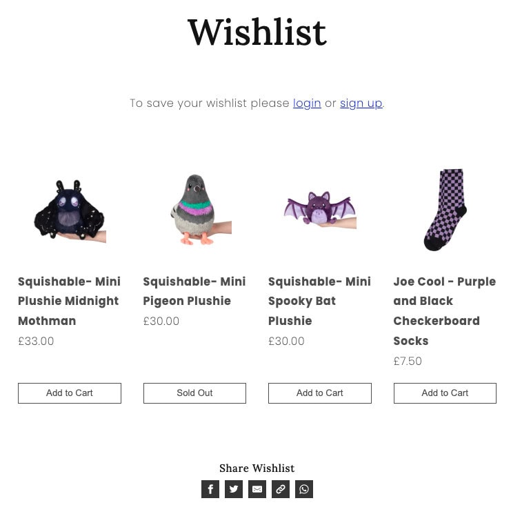
For example, Thunder Egg, use a simple heart to add to wishlist feature from product pages and product listings, which is a popular option. The wish list feature can then be accessed from the main navigation, and you can then save your list by creating an account or logging in.

add to wishlist heart from Thunder Egg

thunder egg wishlist

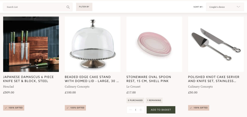
This feature also extends to more niche use cases, like online wedding gift registries, such as www.weddingpresentco.com, where couples can create a list from the company’s large homeware range, and share it with wedding guests. When an item has been purchased, the list is updated, to save on accidental duplicates.

the wedding present company list

Guest Checkout & Streamlined Account Creation

Forcing account creation before purchase is one of the most reliably conversion-killing decisions a retailer can make. Always offer guest checkout. Then, once the order is placed, offer the option to save details with a single click, at which point the customer is already committed and the friction feels negligible.

Why You Should Provide A Guest Checkout Option

Reducing the number of form fields, using postcode lookup tools, and offering express checkout via Stripe, Apple Pay, Google Pay, or PayPal further removes obstacles for shoppers who know exactly what they want and simply want to pay.

How To Help Your Users Checkout Faster Than An Aldi Cashier

Audit your checkout flow before briefing a redesign. Count the steps, count the fields, and challenge every single one.

Dynamic Pricing & Sale Mechanics

Countdown timers for flash sales, automated markdown schedules, and bundle deal displays (‘Buy 2, save 15%’) create urgency and can move stock. These are slightly different to the bundles and subscription models we already covered, as they are more about pricing display logic and urgency mechanics than product groupings, but there is certainly some crossover.

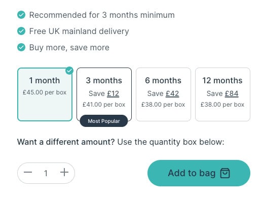
When creating the product pages for Fertility Family, we provided buy multiple and save functionality, as their products are recommended for prolonged use. We developed the feature to show the prospective buyer the savings they can achieve by buying this way.

Fertility Family subscribe and save functionality

Real-Time Stock & Delivery Transparency

Shoppers want to know: will this arrive before my event? Is it actually in stock or will I get a delay email next week? Showing live stock levels (‘only 3 left’ or ‘low stock’), clear despatch cut-off times (‘order before 2pm for next-day delivery’), and estimated delivery dates at the product level, not just at checkout, gives customers the confidence to commit.

Even a simple stock level traffic light system or similar can work well for both transparency and to create a sense of urgency when stock is genuinely low.

green in stock notification
amber low stock notification
grey out of stock notification

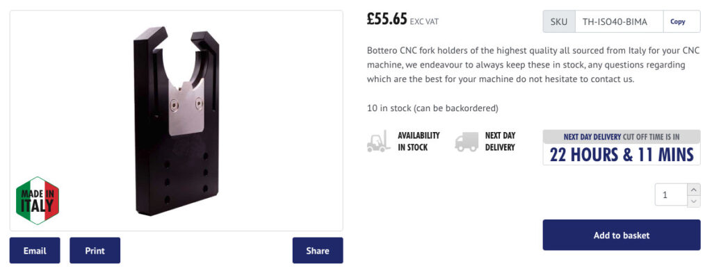
Here is an example from the site we built for Vetro Tooling. This is displayed below the header across the site, to let users know the cut off time for next day delivery:

next day delivery cut off time vetro tooling

This is also shown in the product information on the product pages, above the add to cart button, so there is absolutely no doubt:

vetro product information with next day delivery information

Equally important is showing clear, honest lead times for made-to-order or personalised products upfront. Surprises at the checkout cause abandonment.

Making Delivery A Positive Experience For Your eCommerce Customers

Back-In-Stock & Price Drop Alerts

We briefly mentioned this in the wishlist section, but it deserves its own section. A simple email/SMS opt-in on an out-of-stock product page captures intent that would otherwise walk away. These are extremely high-converting notifications because the customer has already told you exactly what they want.

Click & Collect/Local Fulfilment Options

If your business has physical locations, click and collect is a significant conversion driver, particularly for shoppers who want something quickly or want to avoid delivery costs. Store availability shown at product level, not just checkout, is the key UX detail here.

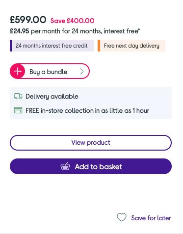
Here is an example from Currys, where you can see if a product has click and collect options in the product listings, before you even click through to a product page.:

Currys click and collect shown on product listing page

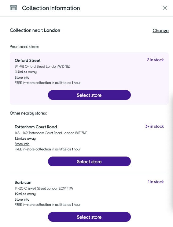
One the product page, you can then run a postcode check to view actual click and collect availability at stores local to you:

currys click and collect availability postcode search

Product Reviews & UGC Integration

User-generated content, reviews, ratings, and customer photos, is consistently one of the highest-converting elements on any eCommerce page. Shoppers trust other shoppers far more than brand copy. A product with 47 reviews and a 4.6 rating will almost always outsell the same product with no social proof, even if yours is technically superior.

How To Use Customer Reviews To Increase Conversions On Your Website

Go beyond star ratings where you can. Q&A sections, verified purchase badges, and the ability to sort reviews by relevance or recency all improve the research experience. Integrations with platforms like Trustpilot, Google Reviews, or Reviews.io make collection and display straightforward.

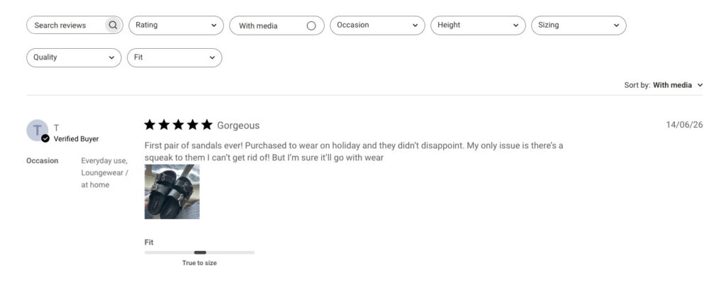
Clothing retailer, Disturbia, use verified buyer reviews, that allow the reviewer to upload photos, and provide useful feedback on whether an item fits true to size:

review with photo and fit guidance

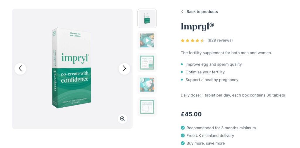
When designing and building a website for or our client Fertility Family, we included verified purchaser reviews, building trust and providing transparency, which is hugely important for the products that they sell.

Above the fold, we have the ubiquitous product star rating, with the number of reviews. This links down to the full reviews section:

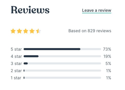
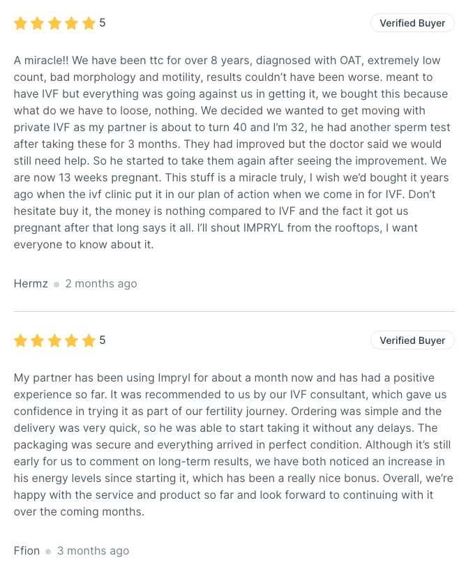
In the reviews section of the page, we have the reviews summary box, and then the individual reviews with the verified purchase badge:

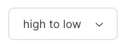
Visitors can are able to filter reviews from high to low, or low to high, and can read every review left for the products, with the load more reviews feature. Again, these options provide transparency, and help to build trust. Nothing is hidden away.

Load more reviews button
Filter to sort reviews by star rating

Advanced Checkout Trust Signals

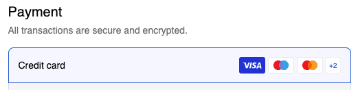
Secure payment badges, money-back guarantee callouts, free returns messaging are often an afterthought in briefs but have measurable impact on checkout abandonment. Where you sit them in the flow matters enormously.

Personalisation & Recently Viewed

A ‘Recently Viewed’ section is a simple feature with a reliable impact. Customers who browse multiple products often want to compare or return to something they liked, and surfacing this without them having to remember the product name or dig through browsing history is a small but appreciated convenience. I have a horrible memory, so this is always a feature I appreciate.

Personalisation can go further, including but not limited to, tailoring homepage banners, recommended products, and even email content based on browsing or purchase history. The more relevant the experience, the higher the engagement.

Even basic personalisation requires cookies and appropriate consent handling. Factor this into your brief and ensure your setup complies with UK GDPR requirements.

Personalisation In eCommerce: How To Tailor The Shopping Experience

Loyalty & Rewards Programme

Acquiring a new customer costs significantly more than retaining an existing one. A built-in loyalty scheme, points for purchases, bonus points for reviews or referrals, redeemable rewards at checkout, gives shoppers a reason to return and a reason to spend more when they do.

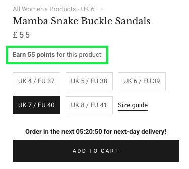
Alternative clothing retailer, Disturbia, have a rewards programme that gives points (1 for every pound spent) for purchases. Users can also collect points by completing actions like following Disturbia’s social accounts and so on. 100 points become a £10 voucher which can be spent against a minimum order value of £40.

disturbia loyalty points amount on product page

There are a number of platforms out there which integrate well with most eCommerce stacks, and make the technical implementation manageable. The real work is in designing a programme that’s genuinely valuable to your customer base, not just a marketing afterthought.

Create Loyal Customers With A Loyalty Programme

Size Guides, Fit Finders & Visual Swatches

For clothing, footwear, homewares, and anything where fit or finish matters, interactive size guides and fit finders reduce returns and build buyer confidence. A simple quiz-style tool (‘What’s your height? Your usual size in other brands?’) that outputs a personalised recommendation removes one of the biggest barriers to buying clothing online.

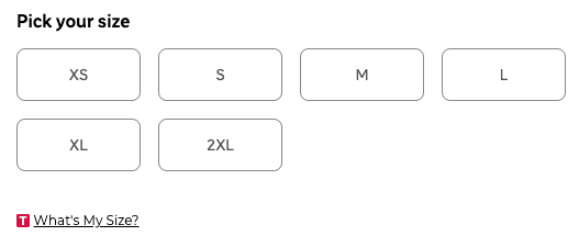
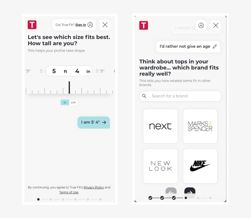
Here is an example from Very.co.uk. They use a tool called True Fit, which can be accessed just below the size selection on a product page:

The tool asks you a number of questions, like height, weight, age, and popular brands that fit you well, to provide you with a size recommendation. You can even save your answers as a profile, which you can use when shopping on Very.co.uk again, or other retailers uses the same tool:

True Fit tool as seen on Very.co.uk

Providing Accurate Clothing Size Guidance On Your eCommerce Website
Reduce Returns & FAQs With Fit Finder Tools

Visual colour and material swatches, ones that update product imagery in real time, rather than just changing a dropdown value, give shoppers a much clearer sense of what they’re actually buying.

Virtual Try-On/AR Product Visualisation

For eyewear, furniture, homeware, and cosmetics this is increasingly expected rather than novel. Letting a customer see a sofa in their living room via AR, or a shade of lipstick on their face, dramatically reduces return rates and increases confidence to buy.

Here is an example from eyewear retailer, Shade Station:

trying on sunglasses virtually

James wrote a post about his experience using this feature on Shade Station, which you can read here:

Use AR/Virtual Try-On Technology To Drive Sales & Reduce Returns

Product Comparison Tool

For categories where specs matter, this can be an enormously useful feature. Think electronics, appliances, mattresses, office furniture, and so on. Letting shoppers compare two or three products side-by-side in a structured table reduces the ‘I’ll go away and think about it’ exit.

I’m a real sucker for a comparison table or tool.

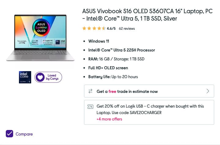
Here is another example from Currys. When scrolling through the product listings you can select up to 3 products using a checkbox, and then view a comparison table:

product result with comparison checkbox

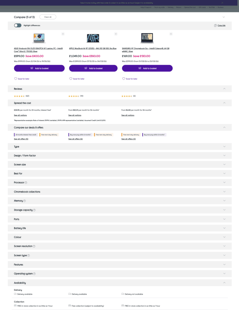
Here is an example of the product comparison table they provide, with 3 laptops side-to-side. All of the relevant information and specs can be accessed in accordions, making it easy to dig out the information you are particularly interested in:

currys comparison table

Sticky Add-To-Basket On Mobile

On long product pages with detailed descriptions, specs, and reviews, the add-to-basket button quickly scrolls out of view on mobile. A sticky bar at the bottom of the screen that keeps the product name, price, and buy button permanently visible, appearing once the user scrolls past the main button, removes the need to scroll back up to convert.

On mobile, where the majority of eCommerce browsing now happens, this is one of the highest-return improvements you can make to a product page.

Persistent/Sticky Basket

How many times has a customer added items to their basket, navigated away to read a product description, and returned to find an empty cart? A persistent basket saves items between sessions, so returning visitors pick up exactly where they left off.

Pair this with a slide-out mini basket, one that appears when an item is added without redirecting the shopper away from what they were browsing, and you remove one of the most frustrating friction points in eCommerce.

Make sure basket persistence is clear to the user. A small ‘your basket has been saved’ message builds trust without feeling intrusive.

B2B/Trade Account Functionality

If your business sells to businesses as well as consumers, trade pricing tiers, PO number fields, invoice payment options, and multi-user accounts are a whole feature set often forgotten until late in a project.

VAT Toggle/Price Switcher

For B2B eCommerce or eComm brands that sell to both businesses and consumers, a VAT toggle is simple but also very useful. Let visitors switch between excluding VAT and including VAT pricing with a single click.

We implemented a VAT toggle for school furniture provider, Morleys, for their B2B and B2C customer base:

Alternatively, you could have a trade/retail toggle if you serve different buyer types.

Either way provides greater pricing transparency for your customers, and removes the need for mental mathematics when figuring out what they’ll pay.

Currency Switcher

A currency switcher can be a useful tool for businesses serving international audiences, so their users can see clearly what price they will pay in their local currency, without having to faff around with currency conversion websites.

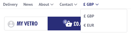
We introduced a currency switcher for Vetro Tooling, along with custom shipping routes, as they serve both the United Kingdom and Europe:


Post-Purchase Experience

Order tracking pages that are branded (not just a courier link), delivery notification preferences, and a smooth returns portal all create a better and more joined up experience for your customers. Their experience doesn’t end at ‘thank you for your order’ and a poor post-purchase experience is what kills repeat customers.

Is It Right For Your Store?

Not every feature on this list belongs in every brief. A boutique selling ten handmade products needs different tools than a retailer with ten thousand SKUs. The most effective eCommerce sites aren’t the ones with the most features, they’re the ones where every feature solves a real problem in the customer’s path to purchase.
Before adding anything to your brief, ask yourself, what does this help my customer do, and where does it remove a barrier? Use this list as a starting point for that conversation with your web agency or development team. The best briefs begin with a problem, not a feature list, and now you’ve got the vocabulary to have that conversation.

Share Socially
Vikki Baker
Vikki Baker
Digital Marketing Manager, Cat Lady & Former Female Indiana Jones
Vikki has over 15 years of experience in Digital Marketing for WordPress specialist agencies. She loves WordPress for its simplicity of use, huge flexibility, and how great it is for SEO.
View Team Profile
See More Articles
Vikki Baker
Vikki Baker
Digital Marketing Manager, Cat Lady & Former Female Indiana Jones
Vikki has over 15 years of experience in Digital Marketing for WordPress specialist agencies. She loves WordPress for its simplicity of use, huge flexibility, and how great it is for SEO.
See More Articles
View Team Profile
Let's Get The Ball
Rolling On Your New Website
Give us a call or drop us a message, to see if we could be the right fit for your project.
Let's Chat
studio@impactmedia.co.uk
020 3355 8747
Impact Media's LinkedIn
Impact Media's Twitter
Impact Media's Facebook
Impact Media's Instagram
Impact Media's Youtube
wordpress.org

About Impact

  • About Impact Media®
  • Meet The Impact Team
  • Why WordPress?
  • Our Web Development Process
  • Careers
  • Awards
  • Partners
  • Giving Back
  • 100K Tree Challenge

WordPress Services

  • WordPress Web Design
  • UX Design
  • WordPress Development
  • WordPress Evolve Retainers
  • WooCommerce Development
  • Multisite WordPress
  • Migrate To WordPress
  • Custom Integrations & Plugins
  • WordPress Consultancy

WordPress Support

  • WordPress Support & Maintenance
  • WordPress Managed Hosting
  • Case Studies
  • Insights
  • Contact Us

Addresses

London Address:

50 Liverpool Street,

London, EC2M 7PY, UK

+44 (0) 20 3355 8747


Registered Address:

Woodland Place, Hurricane Way

Wickford, SS11 8YB, UK

  • Privacy Policy
  • Cookie Policy
Impact Media logo
© Impact Media® 2003 - 2026
Impact Media is a trading name of IMDMS LTD. Company Reg. 05970261
Impact® & Impact Media®
are registered trademarks of IMDMS LTD