logo

WordPress Design Agency

020 3355 8747

Message Us
  • Home
  • About Impact®
    Learn More About Impact Media®
    • Meet The Team
       
    • Why WordPress
       
    • Careers
       
    • Giving Back
       
    • 100K Tree Challenge
       
    James Coates
    Schedule a discovery call with UX Specialist James
    Book A Call
  • WordPress Services
    Learn More About Our Services
    • WordPress Web Design
       
    • UX Design
       
    • WordPress Development
       
    • WordPress Support & Maintenance
       
    • WordPress Evolve Retainer
       
    • WordPress Multisite Development
       
    • WooCommerce
       
    • Replatform To WordPress
       
    • WordPress Consultancy
       
    • Integrations & Plugins
       
    • WordPress Managed Hosting
       
    • WordPress Health Check
       
    James Coates
    Schedule a discovery call with UX Specialist James
    Book A Call
  • Our Process
  • Case Studies
  • Insights
  • Contact Us
WordPress Design Agency
020 3355 8747
logo logo
Book A Call
Back
Menu
  • Home
     
  •  
    About Impact Media
    Learn More About The Impacters
    • Meet The Team
       
    • Why WordPress
       
    • Careers
       
    • Giving Back
       
    • 100K Tree Challenge
       
  •  
    Our Services
    Discover How We Can Help
    • WordPress Web Design
       
    • UX Design
       
    • WordPress Development
       
    • WordPress Support & Maintenance
       
    • WordPress Evolve Retainer
       
    • WordPress Multisite Development
       
    • WooCommerce
       
    • Replatform To WordPress
       
    • WordPress Consultancy
       
    • Integrations & Plugins
       
    • WordPress Managed Hosting
       
    • WordPress Health Check
       
  • Our Process
     
  • Case Studies
     
  • Insights
     
  • Contact Us
     
020 3355 8747
Mon - Fri • 9am - 5pm
Close

Oops! We could not locate your form.

Home / Insights / Create A Better Basket Experience To Reduce eCommerce Cart Abandonment
Back

Create A Better Basket Experience To Reduce eCommerce Cart Abandonment

Published 18.04.23
18th April 2023
Last Updated 10.09.25
10th September 2025

Newer
18 Min Read
Vikki Baker
Vikki Baker
WooCommerce
Older
18 Min Read
 
Vikki Baker
Vikki Baker
 
WooCommerce

The basket page is an incredibly important stage in the buying journey for many online retailers, and it is usually the gateway page to the checkout. Investing time in getting it right can have a huge impact on reducing abandonment rates and overall user experience.

Basket page blog hero image.

The basket page of an eCommerce website often gets overlooked when it comes to considering user experience and optimisation.

Time will be spent on creating a fast and friendly checkout process. If a user doesn’t reach the checkout, this effort is wasted.

Likewise, a great deal of effort is invested in creating strong and informative product pages. If the user then comes up against frustrations on the basket page, they may just go elsewhere.

The basket page is an incredibly important stage in the buying journey. It is usually the gateway page to the checkout. Investing time in getting it right can have a huge impact on reducing abandonment rates and overall user experience. It can even be a great opportunity for upsell in the right setting.
So let’s dive into some ways you can craft a better basket page for your online store.

Provide A Smooth Experience On Mobile

For many eCommerce businesses, the majority of their website traffic and conversions come from users on their mobile devices.

It is no surprise that retail sales revenue from mobile (or m-commerce) continues to grow year on year in the UK. Nor that mobile accounts for upwards of 60% of all online sales across Europe.

As the number of people both researching and purchasing on their mobile phone grows, many online retailers are putting up barriers to purchase for this audience. With websites, and particularly baskets and checkout processes that are not built with mobile user experience in mind.

This can result in:

  • frustration
  • cart abandonment
  • lost revenue
  • poor brand perception

If designing, evolving or redesigning your eCommerce website (particularly if the majority of your traffic comes from mobile devices) a mobile first approach to design will serve you well.

Make sure that you don’t just replicate the desktop basket experience to work tolerably on mobile devices. Instead it is vital to consider the differences in how your website looks and how a user interacts with your it on their phone. Consider the size of elements, spacing, tapping, swiping, mobile keyboards and so on.

It is far easier to build with a mobile first approach, and have it work well on desktop, than to design for desktop, and then try and make it work for mobile.

Here is an example from the website we built for Don’t Buy Her Flowers. The basket has all the features on mobile that it has on desktop, including editing, duplication, and viewing component items.

It was designed with a mobile first approach to ensure a smooth experience for their audience, the majority of whom visit the site on mobile.

Our research prior to the build project uncovered key usability issues for mobile users across the buying journey. So this way one of the core objectives to improve upon in the redesign.

Let Users View Product Information In The Basket

User behaviours and intentions vary and considerations and questions will arise at various points of the buying journey.

Some people will use the basket to collect numerous options, and then assess and refine the contents before checking out. I frequently use baskets almost like changing rooms. Where I collect together everything I’m interested in, then look through and delete anything that isn’t right or in my budget.

Others will be more focused and only add what they intend to buy, whilst some will add multiple versions of an item so they can use the basket as a place to compare from.

Giving your users access to the information they need to make their choice or answer their questions before checking out greatly improves the user experience.

This should be replicated across your website. Starting with informative product pages, FAQs and quality product imagery, and continuing through to your basket page and checkout process.

Providing Product Information In the Basket

There are many ways to do this, depending on the product and the information the user is trying to find.

The most simple option is to ensure users can click on the products in their basket, to be taken to the product pages. They can then return to the basket back using the back button in their browser, or by clicking the basket from the main navigation or a ‘go to basket’ button on the product page itself.

This might seem counterintuitive, when your goal is to keep them in that basket to checkout funnel. But it is much better to give people quick and easy access to product information, rather than making them leave the basket altogether to hunt out the product all over again.

Here is an example from the site we built for Vetro Tooling. A user can click on either the product image or name, to be taken to that product’s page.

Another option, which doesn’t require the user to leave the basket page at all, is to provide users with product information within the basket itself. This will obviously depend on how much information you wish to provide and how it will be displayed.

Here is another example from the website we designed and built for Don’t Buy Her Flowers. The user can open up a list of each of the items contained within their gift package, quantities, and see their gift message.

Combining both information within the basket, and allowing people to click through to product pages from the basket offers users with a more flexible experience, to meet their needs.

Let Users Edit Their Basket

If a user reaches the basket page, and realises they’ve made a mistake, they’ll want to be able to correct that quickly from within the basket. Whether it’s the size, the colour, the wording, or the contents of a multi product item like a gift basket.

If a user can’t edit their basket they will either have to:

  • empty their basket and start over
  • remove the incorrect item and leave the basket to find and add the correct item

This is not only frustrating, but also leaves more time for them to change their mind or get distracted and leave before making a purchase.

Editing a basket isn’t always as simple as removing an item or changing the number of items. So ensure that your users can make the necessary changes that keep them on the basket page, regardless of what products you sell.

Consider things like:

  • Size
  • Colour
  • Quantity
  • Personalised features like wording or fonts
  • Individual items within a ‘create your own’ multi-item product
  • Format (for example, hardback or paperback books)

For Don’t Buy Her Flowers, we introduced functionality to allow their users to edit everything about a product in the basket. From the contents of the gift package, to the personalised gift message.

Make Sure Your Basket Page Is Accessible

It may seem obvious, but considering that a report this year revealed that a whopping 96.3% of the of the top 1,000,000 home pages have WCAG 2 failures, it stands to reason that basket pages are just as guilty.

Whats more, WCAG 2 is only a part of creating a truly accessible website. A baseline to build from.

Before you gloss over this section, assuming it doesn’t impact your website, you should be aware that estimates suggest that in the UK alone, the loss to businesses not adequately meeting the needs of those with disabilities is over £2 billion!

Building Accessible Pages

So how do you ensure that not only your basket page, but your whole website is accessible for as many potential users as possible?

This topic alone could fill an entire book, so for now, I’ll provide some links to resources to consider when creating an accessible website.

W3C

As already mentioned, WCAG, W3C’s Web Content Accessibility Guidelines are a great starting point for creating an accessible website.

A good web development agency should build sites to pass WCAG and will be able to help you achieve your desired level. For example, at Impact we build to pass WCAG as standard.

The A11Y Project

The A11Y Project is another invaluable resource when it comes to understanding accessible design.

Legal Requirements

To understand legal accessibility requirements for the countries your business operates in, W3C provide some information here.

However, it is advisable to access government guidance for the country in question. Here is the UK Government Digital Accessibility page.

Bureau Of Internet Accessibility

The BIOA website provides lots of good information on accessibility, along with courses and useful tools like a colour contrast validator.

Remember:

Accessibility isn’t a separate entity, it’s an integral part of good UX

People Also Buy or Don’t Forget To Add Suggestions

A basket page can also be a great way to upsell related or sundry items. This is often something you see on product pages or as a pop-up upon clicking an add to basket button, with ‘people also buy’ or ‘don’t forget to include’ type CTAs. It can also be effective when used in moderation on basket pages.

Now, upselling may not seem like a way to provide a positive user experience. But if you’ve ever been that parent on Christmas Day who forgot to buy batteries for the battery operated toy, or the last minute gift buyer who is out of wrapping paper, then you may understand where the benefit to the buyer comes in to play.

That’s not to say that you should upsell your whole product catalogue to a user once they reach the basket page. Nobody wants to feel like they’re being bombarded with ads when reaching the final stages of the buying journey.

This kind of upselling should be used with care, and only where it provides actual benefit to users. You don’t want to stray into dark patterns. Ensure pricing is clear and don’t use it to mislead people.

Some good examples of implementing it well include:

  • a gift wrapping service
  • batteries for products that require them
  • shoe care products for leather or suede shoes
  • pots or food for plants
  • side dishes for a main meal

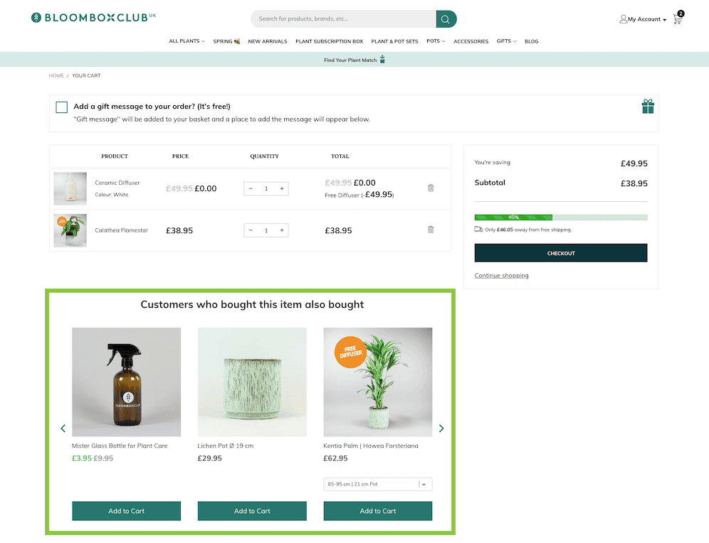
Here is an example of this being put in to practice well by plant retailer, Bloombox Club. The basket page presents personalised additional items based on what other customers who have bought the items already in the basket, have also purchased.

An indoor plant mister and decorative pot of the right size are natural additions for a houseplant that comes in a plain plastic grow pot.

bloombox club upselling on basket page example

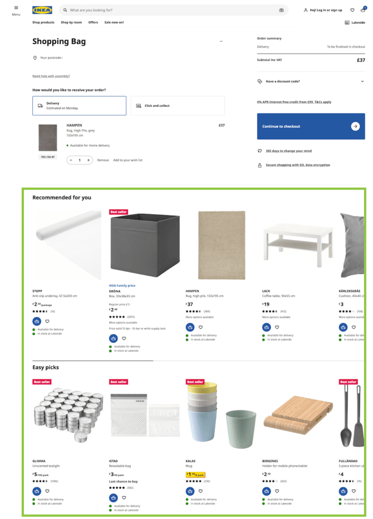
Here is another example from Ikea. A little more aggressive perhaps with both ‘recommended’ and ‘easy picks’. But the recommended items includes an anti-slip underlay, very useful when buying a rug, and the easy picks are useful low cost items, replicating the in-store checkout experience at an Ikea store.

Ikea basket page recommended for you example

One other example of upselling that can be very appealing to your customers, whilst also beneficial to your business, is providing a message of how much extra the user needs to spend in order to qualify for free shipping.

This obviously isn’t suited to all web stores, but if you do have a minimum spend that qualifies a buyer for free delivery, this can be something to highlight on the basket page. Especially if the additional amount they need to spend isn’t that much.

Provide or Repeat Important Information To Avoid Abandonment At Checkout

Personally, I have abandoned many a cart after reaching the checkout stage, on discovering that the delivery time will not work for me, that the delivery cost is exorbitant, or that they don’t accept a payment method that I feel comfortable using.

Whilst this important information should be shared across your website, and particularly on product pages, the basket page is the final opportunity to ensure your prospective customer won’t have any nasty surprises once they reach the checkout.

You can use your basket page to:

  • Remind users of the secure payment options that you have available
  • Provide any important shipping information like dispatch times or estimated delivery dates
  • Give the user shipping cost estimates or delivery options that are available, such as Next Day or Free
  • Let the user know where to find your returns policy

Here are a few examples where this has been put into practice.

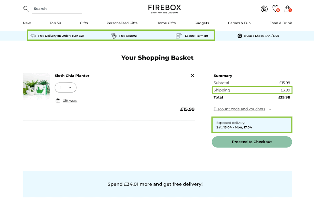
Starting with Firebox, where the sitewide banner below the navigation provides information on shipping, payment and returns. Whilst the Summary box shows shipping costs and expected delivery dates.

The Firebox basket page

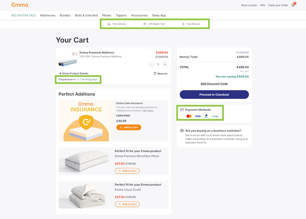
Mattress brand Emma have a sitewide banner with delivery and return information, similar to Firebox’s. They also have payment methods with logo images for quick recognition, and a dispatch time estimate.

Emma mattresses basket page

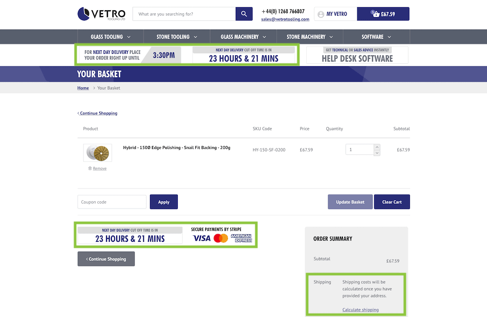
The website we built for Vetro Tooling has a sitewide banner with cut off times to order by for next day delivery. The basket page also reiterates this, alongside secure payment options with logos, and the option to calculate shipping costs.

Vetro Tooling's basket page

Provide Social Proof or Proof of Social Good

Social proof such as reviews, testimonials, awards, and case studies are a great way to build trust with your potential customers. These should be used effectively across the website, and a well placed review, rating or award located on the basket page may help persuade someone to complete their order.

If your business is involved in any charitable schemes for social good, this is another excellent thing to remind users of on the basket page. Knowing that their purchase will do some further good in the world can be another great way to build a rapport with the consumer and encourage the completion of a purchase.

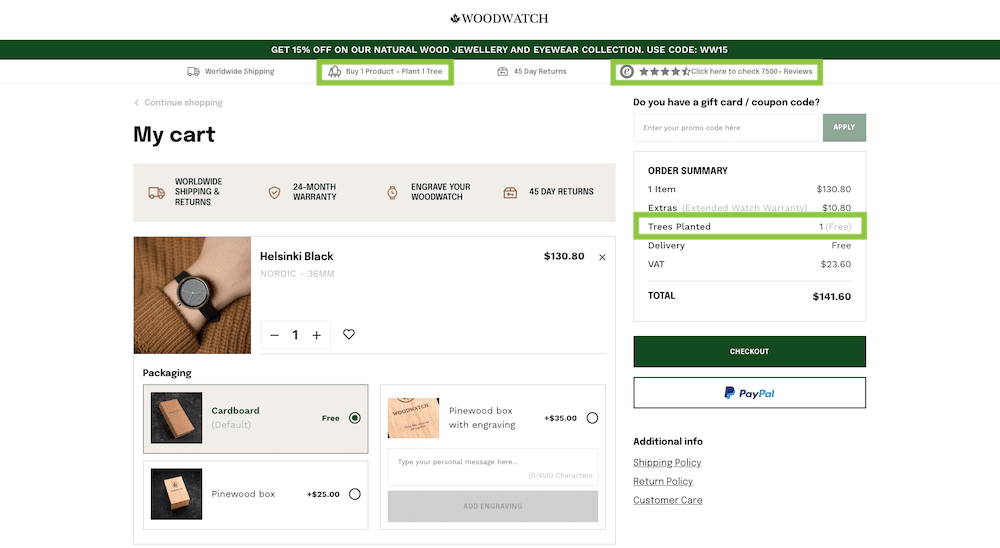
Woodwatch provide both of the above on their basket page. They plant trees for every purchase and display the number of trees your order will plant. They also have their review site rating with a link in their sitewide banner that sits at the top of pages.

woodwatch basket page

Additional Tips For A User Friendly Basket Page

Here are a few other things to consider when creating a basket page that provides a positive user experience:

  • Include imagery of the items in the basket
  • Provide clear product names and descriptions
  • Show pricing – itemised and combined
  • Include customisable options such as size, colour or quantity
  • Display totals with any discounts that have been added
  • If the user qualifies for any free gifts, offers, or discounts, display this

I hope this post has given you some food for thought and got you thinking about how you can improve the UX of your basket page.

If you’re considering a redesign for your ecommerce website that encompasses a UX approach, get in touch with our team today, to see if we could be the right fit for you website redevelopment partner.

Impact team at UK Dev Awards

Is It Time For A Website Redesign?

If you’d like to learn more about our website redesign approach and if it could be a good fit for your business, drop us an email or give us a call.

Share Socially
Vikki Baker
Vikki Baker
Digital Marketing Manager, Cat Lady & Former Female Indiana Jones
Vikki has over 15 years of experience in Digital Marketing for WordPress specialist agencies. She loves WordPress for its simplicity of use, huge flexibility, and how great it is for SEO.
View Team Profile
See More Articles
Vikki Baker
Vikki Baker
Digital Marketing Manager, Cat Lady & Former Female Indiana Jones
Vikki has over 15 years of experience in Digital Marketing for WordPress specialist agencies. She loves WordPress for its simplicity of use, huge flexibility, and how great it is for SEO.
See More Articles
View Team Profile
Let's Get The Ball
Rolling On Your New Website
Give us a call or drop us a message, to see if we could be the right fit for your project.
Let's Chat
studio@impactmedia.co.uk
020 3355 8747
Impact Media's LinkedIn
Impact Media's Twitter
Impact Media's Facebook
Impact Media's Instagram
Impact Media's Youtube
wordpress.org

About Impact

  • About Impact Media®
  • Meet The Impact Team
  • Why WordPress?
  • Our Web Development Process
  • Careers
  • Awards
  • Partners
  • Giving Back
  • 100K Tree Challenge

WordPress Services

  • WordPress Web Design
  • UX Design
  • WordPress Development
  • WordPress Evolve Retainers
  • WooCommerce Development
  • Multisite WordPress
  • Migrate To WordPress
  • Custom Integrations & Plugins
  • WordPress Consultancy

WordPress Support

  • WordPress Support & Maintenance
  • WordPress Managed Hosting
  • Case Studies
  • Insights
  • Contact Us

Addresses

London Address:

50 Liverpool Street,

London, EC2M 7PY, UK

+44 (0) 20 3355 8747


Registered Address:

Woodland Place, Hurricane Way

Wickford, SS11 8YB, UK

  • Privacy Policy
  • Cookie Policy
Impact Media logo
© Impact Media® 2003 - 2026
Impact Media is a trading name of IMDMS LTD. Company Reg. 05970261
Impact® & Impact Media®
are registered trademarks of IMDMS LTD