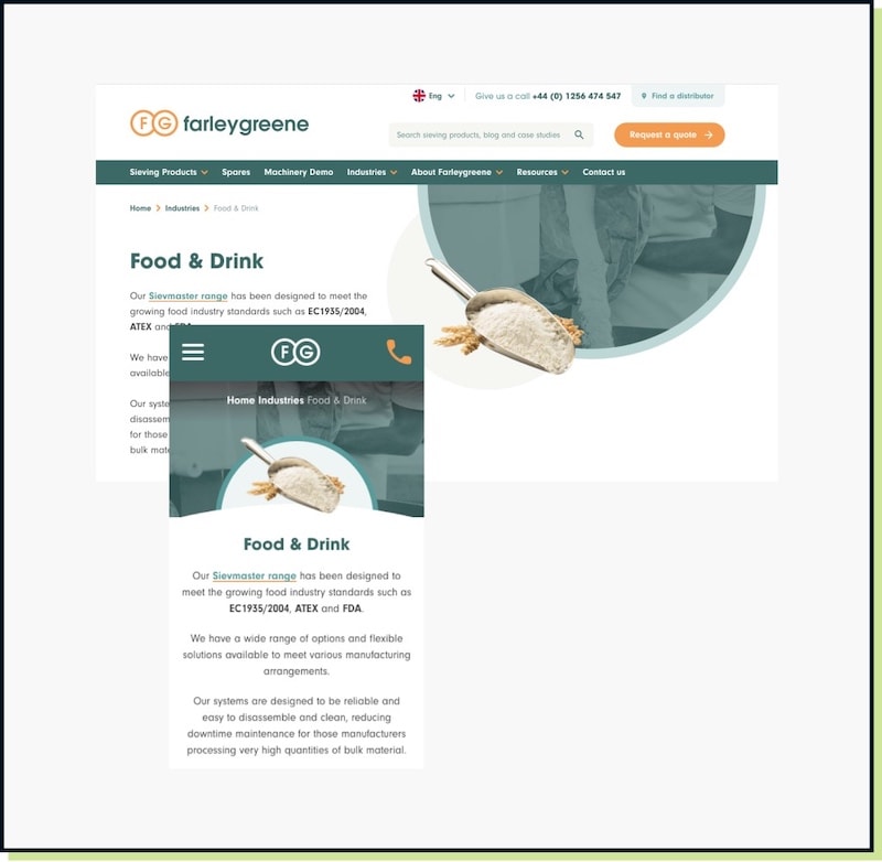
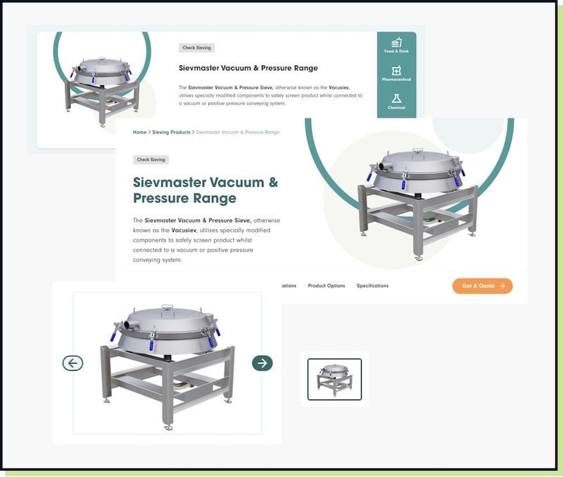
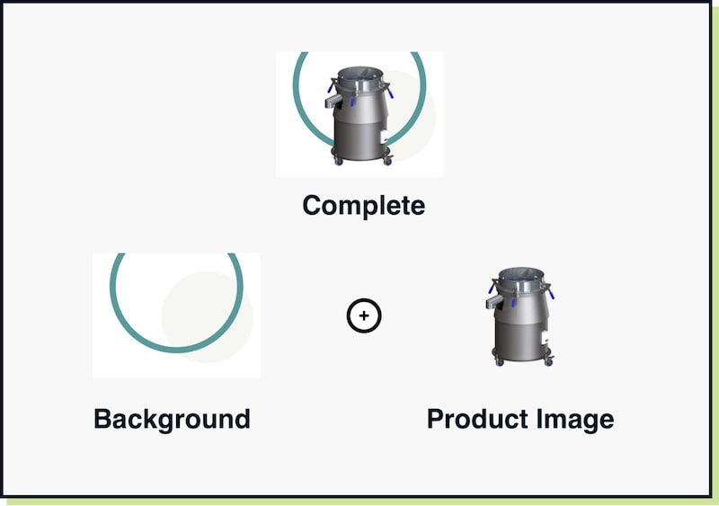
Plan Image Aspect Ratios To Avoid The Need For Multiple Sizes Of Your Images
Planning the image aspect ratios used on your website can remove the need to create your images in multiple sizes.

Oops! We could not locate your form.
Planning the image aspect ratios used on your website can remove the need to create your images in multiple sizes.
If you have been creating content for the web for a number of years then you would have no doubt experienced the many pains of creating multiple sized images for different areas of a website?
Uploading a different featured image, a thumbnail image and maybe a different one for a product page.
You’ve likely had to get to grips with Photoshop and learn how to create these images in different sizes, using a cheat sheet to remember what sizes you actually need to prepare.
Fast forward, and the website may auto crop your images to the size they’re needed. Because they’re displayed at different sizes, you have no control over the cropping and in some instances the image is so weirdly cropped that it’s basically not worth displaying.
Oh, and what about how the images display on mobile? Was there another size you needed to remember? Does this sound all too familiar?
When planning a website, if you consider aspect ratios, then the size of your image shouldn’t be a problem regardless of where it is used.
For example, on the Farleygreene website redesign project we chose to use a 3:2 aspect ratio. So anywhere an image was used in landscape the size would relate to a 3:2 ratio. Making it far easier for the client to create imagery for the site long after launch.
Aspect ratios fix proportions and allow you to scale up and down without skewing an image.
Consider televisions. Every TV is likely to be different but they all follow standardised sizes, i.e. 32 inch, 55 inch and so on.
A video needs to display well on as many TV sets as possible, so creators choose an aspect ratio in which to record and serve the video which will achieve this. In most cases video is 16:9, which displays well on a widescreen TV.
If you watch an older programme you might notice gaps at either side of the video, which are there to avoid stretching the film to meet the screen size.
This is retaining the aspect ratio to avoid stretching or distorting the film. The same works for photos and screens for websites.
You can plan your 3:2 aspect ratio and as long as the image retains the rule, whatever size it is placed at, it will appear consistently.
Shown above is just one page on the Farleygreene website. It shows 2 separate images being used to function on both desktop and mobile devices. The same 2 images deliver this, and both are 3:2 aspect ratio.
By planning the aspect ratio sizes for image usage, you can serve the same image across multiple pages and in multiple positions. Accounting for screen size, placement and positioning changes.
Shown above is a product image that is served on the product landing page, the main product page header, the carousel and as a thumbnail. The client simply needs to upload one image and the website does the rest for them.
When we worked on this website we knew that the client had access to 3D renders, photography and had in-house skills to remove backgrounds from images. So providing a base for delivering imagery with transparent backgrounds would be sustainable and can be maintained without our help.
If image aspect ratio is followed, placing images over coded background elements can inject more creativity into a website, and ensure that it doesn’t feel like everything has to be rectangular and sat on a solid white background.
This is potentially not something you can retrofit into an existing website, so deployment might be slightly more challenging unless embarking on a redesign. However, the key takeaway is learning that consistent use of aspect ratios is important in creating easier to manage website content.
If you redevelop your website at a later stage, request that a fixed aspect ratio is used in as many areas of the website as possible. Like hero areas, product images and blog content. If planned correctly, all can use the same aspect ratio.
Don’t be fearful of introducing different ratios for other areas, as some aspect ratios may not lend themselves well to every area of a website. Or you might want different shaped photos displayed on certain features or pages, like a wide banner or portrait team member image.
Ensuring a consistent set of aspect ratios are used will mean that when viewed on any device, you will avoid the awkward cropping or poor positioning that often occurs.
If you want to know more about using aspect ratios in your website, there’s a post we wrote in 2022.
That’s a wrap for Swipe & Deploy #39. Join me next week when I’ll share another insight or piece of inspiration from around the web.
A look at internet Easter Eggs, and how you could incorporate a fun Easter Egg on your website.
Data data data, we cannot get enough of collecting data. But now we have so much of it, what do we do with it?! How can it be presented to the world to see?
Could adding short autoplaying videos to your product and service pages help capture user attention and boost conversions?