Take Inspiration For UX And Website Features From Amazon
Published 21.04.23
21st April 2023
Last Updated 03.04.24
3rd April 2024

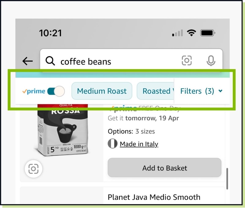
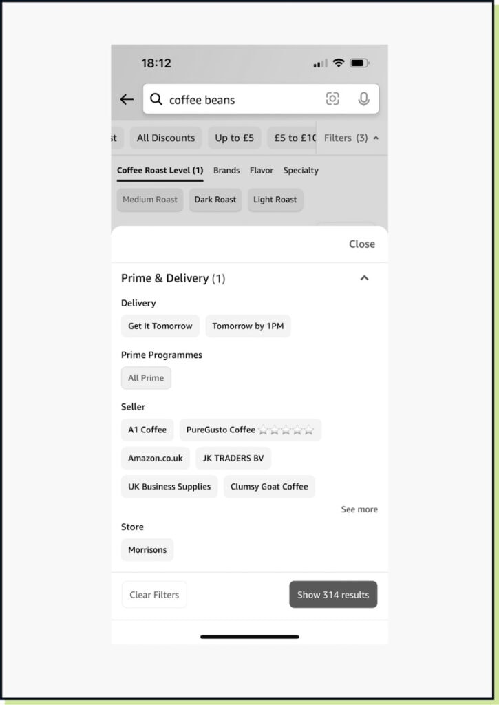
Market leaders with broad user groups are a great source for website inspiration that won’t leave your users feeling confused.