Win Over Shoppers With An Exceptional Online Checkout Experience
Published 10.05.21
10th May 2021
Last Updated 10.04.24
10th April 2024

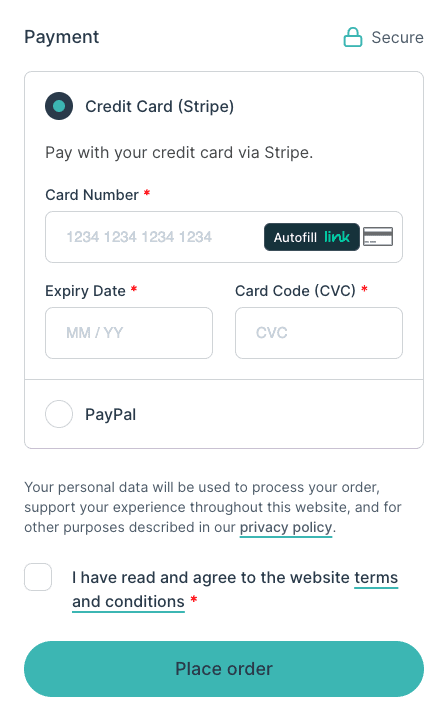
What makes a positive online checkout process experience? Here are 10 things I think all ecommerce websites should try to achieve for an optimal user experience.