Beware The Dark Side: A Look At Dark UX Patterns
Unmasking Dark UX patterns: Discover the manipulative web design techniques that deceive users and harm trust.
Oops! We could not locate your form.
Unmasking Dark UX patterns: Discover the manipulative web design techniques that deceive users and harm trust.
It’s nearly Halloween, a time for spooky fun, costumes, and ghost stories. So it seems like the perfect time to take a look at one horror story that’s all too real and can have long-lasting consequences, and that is Dark UX.
In web design, user experience (UX) should always prioritise the needs and trust of the visitor. However, some design techniques, known as dark UX patterns, intentionally stray from this premise.
Dark UX patterns are manipulative design techniques used to trick or deceive users into taking actions they didn’t intend. This benefits businesses at the expense of user trust.
These practices can harm long-term relationships with customers, cause frustration, and even lead to legal trouble. They also tend to disproportionately target or impact disabled people. Not very accessible of you!
Let’s explore some common examples of dark patterns, why they should be avoided at all costs, and the benefits of focusing on ethical design instead.
Dark UX patterns are deceptive design tactics used to manipulate users into actions they might not choose if they had clearer information.
The term was originally coined in 2010 by UX practitioner, Harry Brignull. He even created a website dedicated to calling them out.
Nowadays, there are subreddits dedicated to dark pattern spotting, and people are becoming more savvy and skilled at recognising these manipulative tactics.
These dark patterns or deceptive patterns, can include sneaky extra charges at checkout, making cancellation processes complex, or forcing users into signing up for services unknowingly. Much like the shadowy creatures of Halloween lore, they can be difficult to spot until it’s too late.
Some businesses may use these tactics to increase engagement, sign-ups, purchases, or data collection. But in the long run, employing dark patterns erodes user trust, damages brand reputation, and can even lead to legal consequences.
Here are a few examples of commonly used dark patterns in web design:
I’ve covered this previously in several posts on eCommerce, banging the drum for transparency when it comes to pricing and fees.
Hidden costs are those that suddenly appear (as an unwelcome surprise) at checkout. Whether they’re shipping fees, taxes, or extra charges, these extra costs aren’t disclosed upfront and the customer has not accounted for them.
I’ve experienced this many times, and it generally leads me to leave without completing my purchase.
It relies on the user either not noticing, or having expended so much effort getting to the checkout (filing out forms etc) that they just accept these stealth costs out of exasperation.
Why Avoid This?
Nothing drives users away faster than feeling like they’ve been financially tricked. This can lead to increased cart abandonment, and the loss of returning customers.
Transparent pricing is essential for maintaining customer loyalty.
Some websites sneak extra products, services or fees into your cart during the checkout process. You didn’t ask for them, and you probably didn’t notice until you’re almost ready to hit “pay.”
This tactic preys on inattentiveness and results in accidental purchases. Sometimes it will be achieved through something as easy to overlook as a pre-ticked checkbox.
Although prohibited in Europe, it still gets used by brands around the world.
Why Avoid This?
Users feel deceived, which can lead to higher returns and lost customers. It’s also likely to increase the workload of customer services, dealing with disgruntled customers.
Transparency is always key to keeping trust alive.
By all means, suggest complimentary products, but never add them, or trick users into adding them with deceptive design. We discussed this in the post below.
Like the Hotel California, once you’re in, you can never leave.
Websites that make it easy to sign up for a subscription but extremely difficult to cancel are following the infamous “roach motel” dark pattern. You may find yourself digging through endless account settings, emailing support, or, worse, having to call to cancel.
Rather than address the route causes of customer churn, some businesses would rather deliberately discourage customers by throwing up numerous barriers to cancellation. Yet subscribing in the first place can be done with a few simple clicks.
This is a practice that is now becoming more known to consumers, and there are various bits of legislation being proposed to prevent this tactic around the globe. Including The Digital Markets, Competition and Consumers Bill in the UK, and The Federal Trade Commission in the US.
To nobody’s surprise at all, certain big businesses who practice this dark pattern, are trying to prevent such measures coming into law. A group of companies in the US have filed a lawsuit against the FTC.
Why Avoid This?
The potential legal repercussions ahead should be warning enough.
But in the long term, it is just bad for business. The frustration caused by these experiences will drive your customers away for good.
A customer may want to end their subscription for a whole raft of reasons, and some of these will be short term. Making it simple to cancel and creating a positive experience, will increase the chances that they may return in future.
If you turn it into a negative experience and put up numerous barriers, you can guarantee that they won’t come back, and they’ll warn others about your brand, and that’s never good for business.
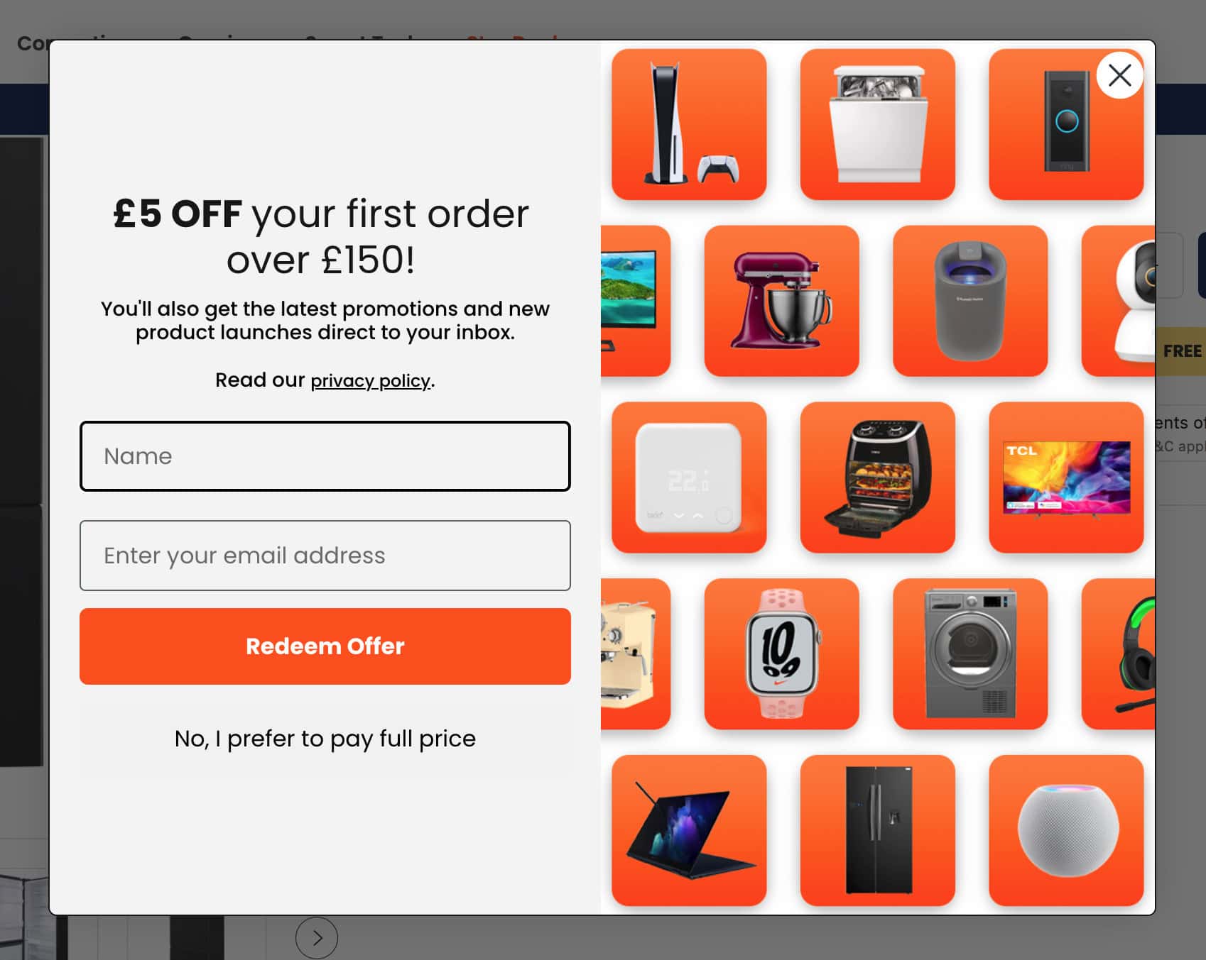
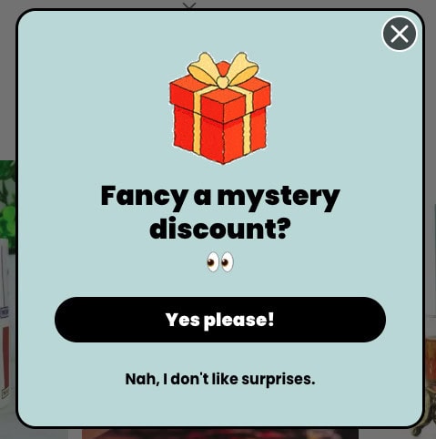
Ever seen those passive aggressive pop-ups that guilt you into saying “yes”? You know the ones. Like when you get a subscribe for a discount pop-up, and the decline text reads something like “No, I don’t want to save money.”
This emotionally manipulative language uses guilt to make you feel bad about not clicking a particular option.
Luckily most brands I interact with have learned that their users do not appreciate this shaming language, and most have chosen to move away from it.
But there are still plenty out there who like to lay it on a bit thick.


Another well known example of this tactic is used by Duolingo. Duo, their cute cartoon owl mascot, has been used as an emotional battering ram for years in order to try and keep users on the app. From push messages with a crying Duo, to the app icon depicting Duo getting sicker looking the longer you go without logging in. No really!


Why Avoid This?
Users see through this form of manipulation quickly. It devalues your brand and turns what should be a respectful interaction into an attempted guilt trip. Big ick!
So many free trials require you to share your credit card details, and users are automatically billed once the trial period ends, often without clear notification or a heads-up about an upcoming charge. By the time the charge hits their account, it’s too late, and cancelling is unnecessarily difficult (which we’ve already covered).
This is a tactic that preys on forgetfulness or people being too busy and distracted to cancel in time, trapping them into subscriptions.
It is especially problematic for those with ADHD, and you may have heard of the ‘ADHD Tax‘. Dark patterns are an accessibility nightmare, that can unfairly and disproportionately impact disabled people.
Why Avoid This?
While it might seem like a way to lock in subscribers, forced continuity only fosters resentment. Be upfront about billing and make cancellations straightforward.
If you are going to take billing details, provide plenty of cancellation reminders ahead of the free trial ending. Even better, don’t automatically bill at the end of the trial, and instead ask users if they’d like to continue as a paid subscriber, so that they are actively opting in.
If your product or service is good, why even take billing details for a free trial? Deliver the free trial, and show users how it benefits or solves their challenges with supporting marketing emails that show them how to get the most out of it.
Dark patterns may seem like a clever way to boost sales or engagement in the short term, but they have long-term consequences that can turn your business’s future grim.
Consumers today are savvier than ever. The moment they catch wind of dark patterns, their trust in your brand crumbles. Earning back trust is incredibly difficult, and they’re likely to spread the word about their negative experience, damaging your reputation.
Many people view these tactics as tacky or spammy at best. Do you want that to be how your brand is perceived?
Dark patterns often result in customers leaving as soon as they realise they’ve been tricked. While your sales might spike temporarily, dark UX tactics lead to poor customer retention and a damaged relationship that no amount of marketing can fix.
Governments and regulators are starting to crack down on dark patterns. For instance, the European Union’s GDPR and California’s CCPA require companies to clearly communicate consent and data usage. Deceptive design practices that skirt around these rules could lead to hefty fines.
At its core, dark UX is frustrating for users. Confusing or manipulative user interfaces lead to poor user experiences, causing them to leave your site, abandon their shopping carts, or worse, never return.
As already stated, UX should prioritise the needs and trust of users. All users. Accessibility therefore, is just a facet of UX. We should be designing websites for everyone.
By their very nature, dark UX patterns aim to confuse, mislead or trick people. This can disproportionately impact disabled people. Particularly those with a cognitive disability, visual impairment, or a neurodevelopmental disorder like ADHD.
We covered some of the reasons why accessible websites are so important in the posts below, But they range from alienating your audience and impacting your organic search performance, through to legal repercussions.
Rather than tricking users, treat them with respect and transparency. Instead of focusing on manipulative tactics, ethical web design prioritises a clear, honest, and user-friendly experience.
Here’s why this matters:
Remember:
Which essentially boils down to: Don’t be a dick.
Keep the tricks for Halloween, not your website.
Rather than relying on deceptive dark UX patterns, businesses should embrace ethical design that respects and empowers users.
Ethical design not only builds trust and fosters loyalty but also creates a smoother user experience that benefits everyone involved. In an age where customer trust is harder to win, focusing on transparency and honesty is the best long-term strategy for sustainable growth.
Happy (ethical) designing!