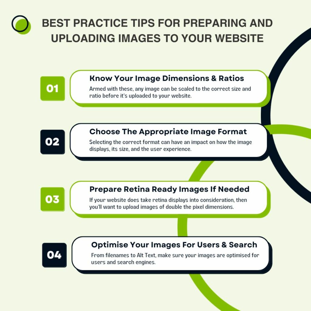
logo

The WordPress Agency

020 3355 8747

Message Us
  • Home
  • About Impact®
    Learn More About Impact Media®
    • Meet The Team
       
    • Our Process
       
    • Why WordPress
       
    • Careers
       
    • Giving Back
       
    • 100K Tree Challenge
       
    James Coates
    Schedule a discovery call with UX Specialist James
    Book A Call
  • WordPress Services
    Learn More About Our Services
    • WordPress Web Design
       
    • UX Design
       
    • WordPress Development
       
    • WordPress Support & Maintenance
       
    • WordPress Multisite Development
       
    • WooCommerce Development
       
    • Replatform To WordPress
       
    • Integrations & Plugins
       
    • WordPress Training
       
    • UX Website Review
       
    • WordPress Health Check
       
    James Coates
    Schedule a discovery call with UX Specialist James
    Book A Call
  • Case Studies
  • Insights
  • Contact Us
The WordPress Agency
020 3355 8747
logo logo
Book A Call
Back
Menu
  • Home
     
  •  
    About Impact Media
    Learn More About The Impacters
    • Meet The Team
       
    • Our Process
       
    • Why WordPress
       
    • Careers
       
    • Giving Back
       
    • 100K Tree Challenge
       
  •  
    Our Services
    Discover How We Can Help
    • WordPress Web Design
       
    • UX Design
       
    • WordPress Development
       
    • WordPress Support & Maintenance
       
    • WordPress Multisite Development
       
    • WooCommerce Development
       
    • Replatform To WordPress
       
    • Integrations & Plugins
       
    • WordPress Training
       
    • UX Website Review
       
    • WordPress Health Check
       
  • Case Studies
     
  • Insights
     
  • Contact Us
     
020 3355 8747
Mon - Fri • 9am - 5pm
Close

Oops! We could not locate your form.

Home / Insights / Best Practice For Preparing & Uploading Images To Your Website
Back

Best Practice For Preparing & Uploading Images To Your Website

Published 20.09.23
20th September 2023
Last Updated 24.11.23
24th November 2023
Newer
11 Min Read
Crystal Coates
Crystal Coates
Web Design
Older
11 Min Read
 
Crystal Coates
Crystal Coates
 
Web Design

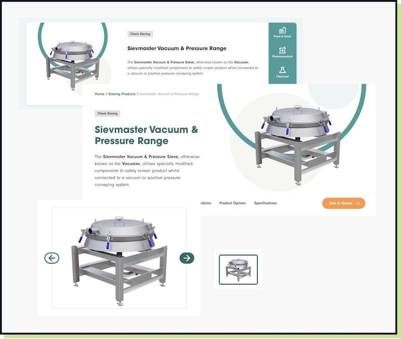
A look at creating a best practice approach to preparing and uploading images to your website.

laptop screen showing multiple images

The demands of modern responsive design, the devices people browse on, page speed expectations, SEO best practices, and creating accessible easy-to-use websites, mean that images play a hugely important role on any website.

If you’ve had a website built by a reputable web developer, the handling and display of imagery will have been carefully thought out and optimised:

  • to display high-quality images
  • to ensure images are served at the correct size for the device they are being viewed on
  • to provide useful data for accessibility and search
  • to compress for faster pages

But once a website is back in the hands of a business, images often become a bit of an afterthought. Whether it’s updating hero images, adding blog or case study images, new product photos, or adding new team member photos.

But bad habits soon build up, and poorly optimised images can lead to slow pages and a poor user experience. They can also just look really bad, and not do your brand any favours.

Introducing a clear and simple process for anyone adding images to a website is the best way to ensure good habits are maintained.

So let’s create that process here and now, so that you can implement it for your business.

Step 1 – Know Your Image Dimensions & Ratios

The first step is to know and record all of the image types used on your website, and their dimensions. Don’t worry, you don’t have to memorise these. They can be included in your brand guidelines or style guide.

If you’ve had your website built by a development agency, ask them to provide you with these.

Armed with these, any image can be scaled to the correct size and ratio before it’s uploaded to your website.

You don’t need to be a design whiz to do this. Yet it’s one of the biggest things you can do to help keep your pages loading quickly.

Nothing slows a page down like a 4000px x 4000px stock image uploaded as a hero that should be 1200px x 960px. Repeat that across a site and that’s a lot of extra weight, and lots of extra waiting by users for images to load!

It’s not just the dimensions that are important, but also the ratio of those image dimensions. As part of creating a responsive website, your web developer will have implemented images with specific ratios, to ensure that they display correctly across a range of screen sizes.

A product image shown at various stages on various pages.
Product Image shown at various stages on various pages

If you then upload an image with a different ratio to what it is designed to display, you’ll end up with skewed, stretched images, or broken layouts.

Step 2 – Choosing The Appropriate Image File Format

There are numerous image file types. It can be a bit confusing as to which you should save and upload an image using.

Image compression header blog hero image.

However, selecting the correct format can have an impact on how the image displays, its size, and the user experience.

The type of image, its purpose and how it’s to be used on your website, will dictate what format you should use. As well as how your website is built. The most common formats you are likely to use are:

JPEG

When using more traditional image file types, use JPEGs for photographs. Saving them as PNGs adds a lot of extra file size, with no noticeable difference in image appearance.

PNG

PNGs, as mentioned above, are generally much weightier files. As such, it is best to only use them where absolutely necessary. For example, where a transparent background is required, or for logos, diagrams and similar graphics. Basically, where image quality would be negatively impacted by using another format.

SVG

SVGs are a special image format that are vector based, rather than pixel based. This means that they can scale up and down without a loss of quality.

You are only likely to use them on your website for logos, and icons.

WebP

WebP is a next generation image file format, created to be significantly smaller without a noticeable loss in quality.

It is gradually becoming supported by more and more browsers and platforms, but that is not yet universal.

So whilst using WebP can be a great way to improve the performance of your website, for now, you’ll need to provide a backup image in a more traditional format. For those users visiting from browsers that don’t support WebP.

Your web developer should make you aware of whether your website uses WebP images, and what fallback image formats you may need.

Step 3 – Preparing Retina Ready Images Where Necessary

Once you know the dimensions required for the image you want to upload, you can choose an image that will fit or scale to those dimensions, or edit one to do so. Then you can save it in the appropriate file format.

The next consideration is based on whether your responsive site serves different image dimensions to devices with retina displays.

If you’re not sure, this is another question for your web developer.

Retina Ready Image Dimensions

To provide the best quality images for retina displays, your site needs to be able to serve them with pixel dimensions of double the size.

This is usually achieved using the newer <picture> and <srcset> HTML 5 attributes, which can be used to offer a web browser a selection of image sizes so that it can pick the one most suitable for display on the device it is connecting from. A fallback is also added to the standard <img> attribute for browsers that don’t support HTML 5.

So in this case you would offer the browser the original 1x image size, and the retina-ready 2x image size to choose from. Then a browser on a device with a retina display would choose to display the image optimised for high-definition retina displays with double the pixels. Whereas for a device with a standard display, a browser would select the original version of the image.

If your website does take retina displays into consideration, then you’ll want to upload images of double the pixel dimensions.

For a hero image of 1200px x 960, you’d want to export the image at 2x the pixel dimensions – 2400px x 1920px.

To help a browser differentiate you can ensure your image filenames include a 1x or 2x. It’s also easier for you when looking for a particular image file.

Different developers may have different methods of serving retina ready images, so ensure this is communicated to you. This will help you build a solid image preparation and upload process.

Step 4 – Optimising Your Imagery For Users & Search

Prior to uploading your image, make sure that it has a meaningful file name. This is useful for search engines and for anyone working on your website.

Once you upload an image, don’t forget to optimise it further for both search and user experience.

If your image isn’t just a decorative element, add useful and descriptive Alt Text. This is hugely important for a number of reasons, with number one being user experience and accessibility.

example of alt text and image title

If someone is accessing your website with assistive technology like a screen reader, the Alt Text will give them the information that the image would otherwise impart.

If someone has a poor internet connection, images may not load, but they will still have the Alt Text for context.

Alt Text is also another important aspect of optimising your image for search engines and image search.

Your Checklist

So to summarise what we have covered above:

  1. Ask your website agency for image specifications for the various image types used on your website. This should include sizes, ratios for optimal display across devices, file formats, and whether multiple versions of any images will be required.
  2. Once you know what image sizes and ratios are required, use them and resize images to fit. Don’t upload images that are larger than they need to be or are the wrong ratio for where they will sit.
  3. Choose the appropriate image file format. Don’t use PNGs where they are not needed.
  4. If you need to create additional versions of images in different sizes, be sure to name them to reflect this.
  5. Always give your images meaningful file names, and add descriptive Alt Text to images. Unless they are just decorative elements, in which case leave the Alt Text blank.

Further Reading On Website Imagery

We write a lot about imagery for the web. Whether it’s from the more technical and performance focused angle, to the more creative or conversion focused.

Here are a few of the articles we’ve written, if you’d like to explore more on this topic:

Performance

If you’d like to learn more about optimising your images and how to reduce their impact on your website’s performance, you can read our post on image compression.

Read this post to learn more about WebP and next generation images formats.

Image Ratios

To understand more about image ratios you can learn the basics here, and if you’d like to know how to make your website easier to manage by better planning image ratios during a website redesign, check out this post.

Making An Impact With Your Website Images

If you have an e-commerce website and would like some tips on product imagery, this post is a great starting point.

If you would like to do more with your Meet The Team images, this is the post for you.

Animations & More Than Static Imagery

If you would like to know more about animations and transitions for the web or providing more than just static imagery, we have a range of posts that might be of interest.

James has written about using animations effectively as storytelling elements, and how you can use shimmer or skeleton animations to keep user interest during loading.

We also have a post on Lottie animations, explaining what they are and how to implement them.

Finally, take a look at this post if you want to step up your image game with the introduction of 3D Virtual Tours on your website.

Download our Support Brochure
Share Socially
Crystal Coates
Crystal Coates
Account Manager, Converse Enthusiast & Copacabana Dance Winner 1995
Crystal is an Account Manager and cares for our clients. She is usually the first point of contact for website support.
View Team Profile
See More Articles
Crystal Coates
Crystal Coates
Account Manager, Converse Enthusiast & Copacabana Dance Winner 1995
Crystal is an Account Manager and cares for our clients. She is usually the first point of contact for website support.
See More Articles
View Team Profile
Want more control over
how you manage content in WordPress?
Edit content that was previously restricted and get creative with building pages in WordPress.
Let's Chat
studio@impactmedia.co.uk
020 3355 8747
Impact Media's LinkedIn
Impact Media's Twitter
Impact Media's Facebook
Impact Media's Instagram
Impact Media's Youtube
wordpress.org

About Impact

  • About Impact Media®
  • Meet The Impact Team
  • Why WordPress?
  • Our Web Development Process
  • Careers
  • Awards
  • Partners
  • Giving Back
  • 100K Tree Challenge

WordPress Services

  • WordPress Web Design
  • UX Web Design
  • WordPress Development
  • WooCommerce Development
  • Multisite WordPress Solutions
  • Migrate To WordPress
  • Custom Integrations & Plugins
  • WordPress Consultancy
  • WordPress Training

WordPress Support

  • WordPress Support & Maintenance
  • WordPress Managed Hosting
  • Support & Maintenance Plan Brochure
  • Case Studies
  • Insights
  • Contact Us

Address

50 Liverpool Street,

London, EC2M 7PY

+44 (0) 20 3355 8747

  • Privacy Policy
  • Cookie Policy
Impact Media logo
© Impact Media® 2003 - 2023
Impact Media is a trading name of IMDMS LTD. Company Reg. 05970261
Impact® & Impact Media®
are registered trademarks of IMDMS LTD