Give Your Users A Show With Scroll-Driven Animations
Animate On Scroll can be an engaging and memorable way of explaining a product or solution, by providing a visual narrative. Find out more about using it effectively.
Oops! We could not locate your form.
Animate On Scroll can be an engaging and memorable way of explaining a product or solution, by providing a visual narrative. Find out more about using it effectively.
If you’ve spent any time on Apple’s product pages, or browsed a well-produced modern site recently, you’ve almost certainly encountered scroll-driven animation. Elements fade in as you scroll down. Images build themselves. A product rotates in sync with your finger. Text reveals itself line by line as you move through a section.
Done well, it’s genuinely engaging. Done poorly, or on the wrong type of site, it slows your pages down, frustrates your users, and quietly damages your search rankings.
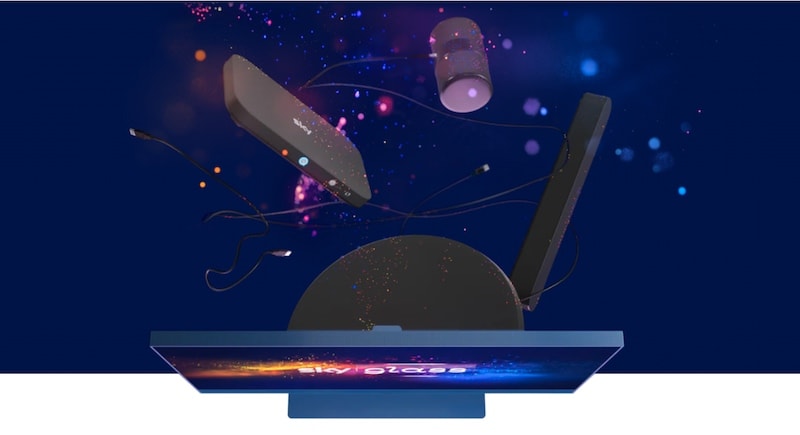
If you’ve not yet seen, Sky is replacing their dishes with their services being built into their own brand of TVs. Me being curious, I wanted to check it out.
As you scroll the page, the scroll bar controls the frames for an animation. So basically, you scroll down the page and the items that the new TV set consolidates are merged inside to present the TV offering.
It’s a great way to engage your users and provide a narrative that is visual and not just a video (which it could quite easily have been).

Scroll-driven animation is a broad term for any visual effect on a website that is triggered or controlled by the user scrolling. This covers a range of techniques:
Animate-on-scroll is not necessarily an easy addition to any website. It requires creativity and planning for this to be executed well.
Brands like Apple use this ‘scroll jacking’ technique to provide a wow factor on their websites, and the user controls the speed of animation and can navigate up and down, watching things move forwards and backwards.
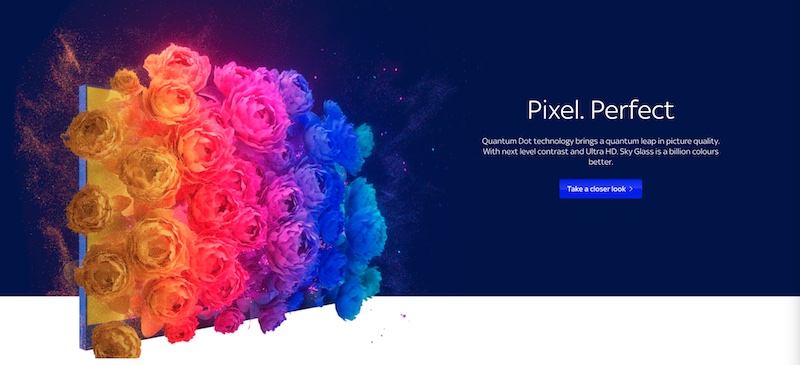
Sky uses another feature lower down the page to promote the quality of their pixels, where you can watch flowers blossom.

Would you apply this on every page of your website? Hell no! It’s nice to have and provides an experience that is engaging. But it works best as a way of explaining products or telling stories. As Sky and Apple are using it.
Returning users might come to loathe it, because of unnecessary waiting. After you’ve seen it once, you’ve seen it, so it makes sense for sales pages.
Apple appears to have benched the scroll effect from the iPhone page but could reintroduce it when they launch the iPhone 15.
Scroll animation is not a general-purpose tool. It earns its place in specific contexts.
When a product has multiple components, or a service involves a multi-stage process, scroll-scrubbed animation can guide users through the explanation visually in a way that’s more engaging and digestible than static diagrams or text alone. Sky Glass uses it to show how their TV consolidates multiple devices. Apple uses it to demonstrate the layers inside a new chip. The animation has a job to do, it’s not just decoration.
About pages, campaign landing pages, or hero sections where you want to create a mood or narrative benefit from controlled, purposeful animation. The key word is purposeful. Each animated element should be doing something specific, like drawing attention, pacing the reveal of information, or reinforcing the brand character.
Subtle entrance animations on a CTA or a key statistic can draw the eye at the right moment. This is where even simpler, lightweight animation can have a measurable impact on engagement.
Where scroll animation tends to fail is on content-heavy pages where the user’s goal is to consume information quickly. So pages like blog posts, service pages, product catalogue pages, checkout flows. Animation that gets in the way of a task or that the user has to sit through repeatedly on return visits, quickly becomes an irritant rather than an asset.
A good rule of thumb is that if the animation helps explain something or creates a genuinely memorable experience, it has a purpose. If it’s there because it looks good, question it.
Here’s where a lot of websites get into trouble. Scroll animations look impressive in a design mockup or a Loom recording, but their real-world impact on performance can be significant, and that performance has direct SEO consequences.
With all that page weight and size, performance can suffer. If you’re aiming to pass Core Web Vitals, then you’ll need to carefully plan the structure and where the animations will kick in.
As of March 2026, Chrome User Experience Report data shows that only 55% of websites have ‘good’ Core Web Vitals across Largest Contentful Paint (LCP), Interaction to Next Paint (INP), and Cumulative Layout Shift (CLS). Scroll animations, particularly JavaScript-heavy ones, are among the most common contributors to failing these thresholds.
The specific risks:
INP measures how quickly your page responds to user input. Scroll animations that run JavaScript on the main thread compete directly with input responsiveness. Google’s ‘good’ threshold is under 200ms, so heavy animation libraries firing on scroll can push this well over the limit.
CLS measures unexpected visual movement. Animations that cause elements to shift position during load, or that aren’t properly reserved in the layout before they appear, will trigger CLS issues. This is especially common with entrance animations that aren’t implemented carefully.
LCP measures how quickly the main content of a page loads. Animation libraries loaded as blocking scripts delay LCP, if the hero image is behind an animation trigger that waits for a script to load, you’re directly hurting this metric.
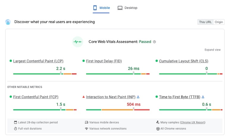
None of this means scroll animation and good Core Web Vitals are totally incompatible. The Sky Glass page (at the time of writing this post) does pass Core Web Vitals as do many sites using animation thoughtfully (so if you’re presenting an idea to your SEO team you can say it’s potentially possible!).

But it does mean that implementation approach matters enormously, and that adding animation to a site that’s already operating close to the Core Web Vitals limits is a risk that needs to be assessed before committing.
Before adding scroll animation to any website (WordPress or others) a few principles are worth building in from the start.
If your site is already in the ‘needs improvement’ range for INP or CLS, adding animation without fixing the underlying issues will make things worse. Run your pages through PageSpeed Insights and understand your current scores before adding anything new.
prefers-reduced-motionSome users, particularly those with vestibular disorders, experience genuine physical discomfort from animation. The prefers-reduced-motion CSS media query lets you detect when a user has requested reduced motion in their operating system settings and disable or simplify animations accordingly. This is no longer optional good practice, it’s a baseline accessibility requirement.
Scroll animations that feel smooth on a M-series MacBook can feel genuinely sluggish on a mid-range device. Always test on real devices, or at minimum. Use Chrome DevTools to throttle to a mid-tier mobile before signing off on an animation implementation.
The sites that use scroll animation most effectively tend to apply it selectively. One or two well-considered moments per page rather than continuous motion throughout. The novelty of scroll animation wears off quickly. What stays is the impression created by the moments that genuinely served a purpose.
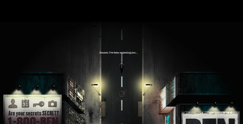
So I can’t end this post about animate on scroll, without sharing my favourite example of storytelling using animate on scroll, Ben The Bodyguard.

This website is over 10 years old and is still live. They have adapted it over time to change with their product, but ultimately it’s a superb example of creativity and imagination using scroll animations.
First things first, animate on scroll is not going to work for every industry or be admired by every user. You have to know it will be accepted by your audience groups.
It can add some additional dynamics to your website and make it more memorable and engaging. I remembered Ben the Bodyguard as it created a memorable experience back in 2011. I’ve since shared the link several times when I have conversations around animate on scroll.
That is a testimonial in itself. If you want to create a memorable experience, perhaps explore if something similar could be introduced to your website.
Scroll animation is a tool, not a style directive. Whether it belongs on your website depends on a few honest questions:
For the right use case, on the right page, scroll animation remains one of the most powerful tools available for making a website genuinely memorable. For the wrong use case, it’s a performance cost with no return.
That’s a wrap for Swipe & Deploy #36. Join me next week when I’ll share another insight or piece of inspiration from around the web.

If you’d like to learn more about our WordPress & WooCommerce Support & Maintenance plans, drop us an email or give James a call.
Our plans provide a holistic solution to your website’s performance, reliability and security, and are inclusive of premium tools and services.
Could adding verification by industry experts help build trust with your users, in a world where so much content is AI slop?
James Coates
A recent addition to the Oh Polly website went viral, and prompted this week's Swipe & Deploy. Could your brand take inspiration from Oh Polly for your own website?
James Coates
A look at how adding functionality for users to save their basket can remove friction and improve your chances of a sale.
James Coates