Hypnotise Your Users Whilst They Wait for Content To Load
Sometimes website load times are unavoidable. Providing users with visual interest whilst they wait can reduce the likelihood of them leaving your website.
Oops! We could not locate your form.
Sometimes website load times are unavoidable. Providing users with visual interest whilst they wait can reduce the likelihood of them leaving your website.

In some cases, loading time is inevitable.
As much as you optimise your content and your website the truth is, if a user is accessing it with a slow connection, there will still be some degree of waiting time. Faster loading websites utilising effective caching and CDNs may load quicker, but even they can’t always win out against a poor 3G connection on a mobile phone in the middle of the Shetland Islands (just ask our Marketing Manager Vikki).
Some websites have complex product customisation tools that take longer to pull data from their databases, so in some cases, loading time again becomes inevitable.
The longer a user has to wait for something to load on your website, the less chance there is that they’ll reach out or buy from you. Amazon state that they would lose $1.6 billion dollars per year if their website loads just 1 second slower.
So if loading is inevitable in some cases and users are not likely to hang around, what’s the answer?

Hypnotising them might be a little extreme, but a way of entertaining or at least providing visual interest to capture their attention is surely the answer.
You have no doubt come across shimmer animations before, and may not have even noticed because they are so subtle. But it’s the fact they are subtle, twinned with the fact that something visual is actually happening, which is why they work so well.
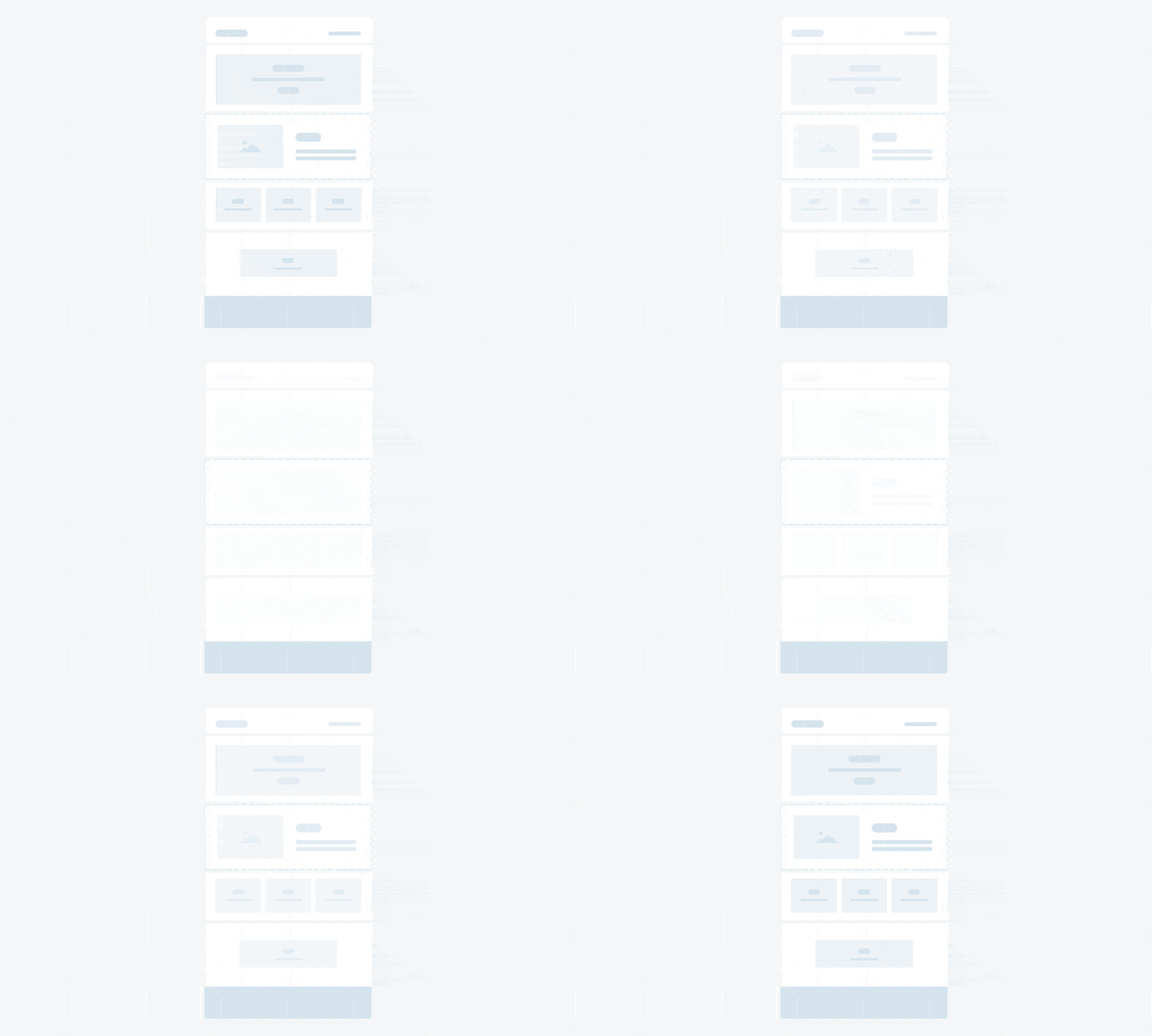
A shimmer animation is essentially a fancy loading or progress indicator. Rather than displaying a spinning wheel, the website displays the core skeleton aspects of the page that is loading. Similar to a low-definition wireframe.
By displaying the ‘traced’ content elements, the user is presented with something more visual whilst they are waiting for the content to load. The slight animated shine effect is what makes it more engaging and indicates that the website is in fact ‘doing something’.
Once the content has loaded the outline of skeleton content is replaced with the real content and imagery.

So where can you see this in action? Facebook use this when loading content (I actually think they were the first to roll this out and may have even coined the term Shimmer). YouTube and many other heavy content brands also make use of this.
I actually first came across it whilst browsing the Volvo website. Below is a screenshot of their skeleton layout.

First things first, if your website is slow, then you may want to check that there is nothing that can be achieved to speed things up without introducing loading indicators.
Loading indicators are not the go-to solution for slow websites. There are many things that can be done to improve loading speeds and performance. Instead, they should be used to counteract loading times for users with slower connections, to indicate that there is something happening.
If your website already uses progress indicators, you may want to explore replacing the standard progress or spinning indicators with a shimmer effect.
The main thing to take away here is that you want to eradicate blank pages during loading. Even when displayed for short periods of time, a blank screen can suggest that something is broken or that nothing is happening.
Any type of progress indicator can work well, but a shimmer can capture the user’s attention better than the classic spinning loader.
Want to implement shimmer progress indicators on your WordPress or WooCommerce website? Chat with us today. Our team can help to evolve your website with new features and functionality.
That’s a wrap for Swipe & Deploy #31. Join me next week when I’ll share another insight or piece of inspiration from around the web.

Whether you are visiting a theme park, zoo or any other type of visitor attraction, there's usually some form of map that customers can download from the attraction's website, that details how they can get around on the day.
 James Coates
Whether you're in the 'it's ok to put up your decorations in November' camp or strongly feel that 'December is the date for Christmas decorations', your website is another place that can be decorated with festive touches. If you want to start in November, we won't judge!
 James Coates
For publishers and websites that rely on advertisement money to support their commercial income, browser AdBlockers, privacy specialist browsers and rejecting Cookie Consent issues can cause an absolute nightmare.
 James Coates