Understanding The Basics Of Image Aspect Ratio In Web Design
Published 05.07.22
5th July 2022
Last Updated 27.09.23
27th September 2023

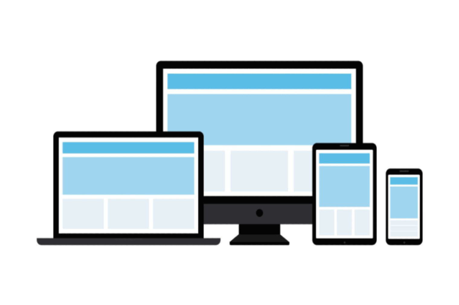
Learn about the importance of aspect ratios in web design for increasing consistency, improving user experience, and saving time.