Ditch The Burger From The Mobile Menu
The burger-style menu is commonplace on mobile websites. But are there other options available that provide a better user experience?

Oops! We could not locate your form.
The burger-style menu is commonplace on mobile websites. But are there other options available that provide a better user experience?

I’m not ranting and this is not some vegan warrior routine. I’m talking about the 3-lined menu icon seen on upwards of 90% of mobile websites.
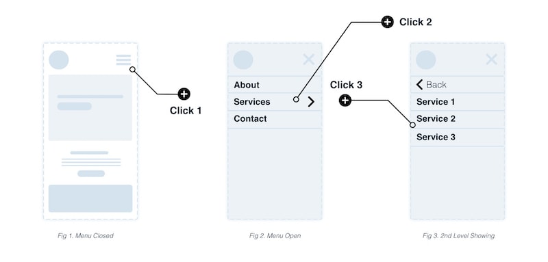
Since the inception of responsive websites, web practitioners have looked for solutions to present navigation menus on smaller screens. The go-to solution for many years has been the humble expandable burger menu.
Through its wide adoption, it has become an expectation for users. However, from a user experience perspective, it can be less than perfect. When needing to navigate a few sections deep, it can become a long process to get to and from menu items.

Compared to its desktop counterpart, there’s an additional click involved.
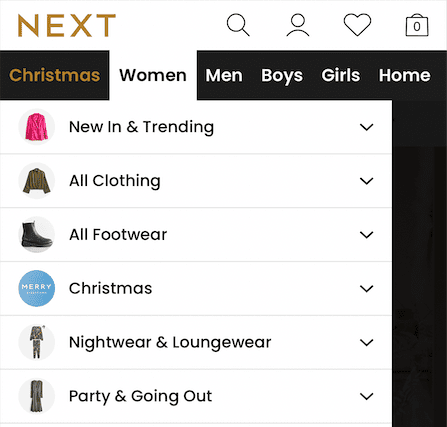
Whilst browsing the Next website from my phone, I hunted around for a menu icon. To my surprise, it wasn’t there. I was greeted with a traditional horizontal navigation like I’d expect to see on a desktop website.


The navigation worked in the same way, but with some elements hidden in an overflow, revealed by the user horizontally scrolling.
Selecting a navigation menu item opens a dropdown with categories, and the website continues to load as normal.

The key point here is that a burger menu isn’t used or required on the website. Should this be the approach that all mobile sites take?
So, with every positive comes negatives, and one of the key ones here is the reason people choose burger menus in the first place. Space.
Limited space means:

At Impact we implement priority navigation, displaying key navigation items within view to make them available in a single click. We also implement overflow menus. However, we’ve always continued to utilise the burger menu too, as it has become a user expectation.
But maybe the times are changing. As with any high-traffic consumer website, as more users become familiar with a certain practice or feature, it can be more widely adopted and accepted on other websites.
Take the common overflow menu items on Google Search on your mobile. Images, videos and other options can be horizontally scrolled. This is used by massive audiences.
The key takeaway here is to adapt and deploy a mobile navigation style that requires fewer clicks, to improve the user experience on your website.
A word of warning though. Drastic changes can mean failing your existing users, so test in stages or adopt the approach of running both and allowing users to show you their preferences via the data.
That’s a wrap for Swipe & Deploy #21. Join me next week when I’ll share another insight or piece of inspiration from around the web.


Whether you are visiting a theme park, zoo or any other type of visitor attraction, there's usually some form of map that customers can download from the attraction's website, that details how they can get around on the day.
 James Coates

Whether you're in the 'it's ok to put up your decorations in November' camp or strongly feel that 'December is the date for Christmas decorations', your website is another place that can be decorated with festive touches. If you want to start in November, we won't judge!
 James Coates

For publishers and websites that rely on advertisement money to support their commercial income, browser AdBlockers, privacy specialist browsers and rejecting Cookie Consent issues can cause an absolute nightmare.
 James Coates