Exploring Mobile Navigation Design Trends On 10 UK Websites
A look at mobile navigation trends on 10 top UK websites, to better understand UX & UI design for broad audiences.
Oops! We could not locate your form.
A look at mobile navigation trends on 10 top UK websites, to better understand UX & UI design for broad audiences.

Not every business can afford to spend the sort of money on UX research & UI design that the UK’s biggest organisations and businesses can. They also tend to have far broader and far reaching audiences than most.
This means they can be a great weather vane for assessing the level of familiarity the general public has with web UI design features and functionality. These sites generally have to be user friendly for a broad spectrum of people, with differing needs, technical abilities, and devices.
Ideally, all website builds will involve a degree of UX research and UI design tailored to that business’s specific audience, but where budgets restrain this, the big businesses can provide us with UX and UI benchmarks for the ‘average user’.
To look at this approach a little further and to give you an idea of what can be learned, I’ve taken a look at 10 websites from big UK businesses, each with a fairly broad user base. For each one I’ve taken a look at their header and navigation design on mobile devices, along with anything that interferes with access to the navigation.
The number of us browsing, shopping, and managing accounts online via our smartphones is growing constantly. Creating a good mobile user experience is more and more important to businesses of all kinds.
To make this fair and objective, I visited all 10 websites on a One Plus Nord device on Android 11, with all cookies and caches data cleared. Websites were accessed using the Chrome mobile browser – version 97.0.4692.87. The phone has a 6.44″ display.
I’ve tried to include a range of website types, from informational, governmental, e-commerce, entertainment, utilities, and so on. This gives us insight into any differences across industries and function, despite all serving very broad audiences.
I’m starting with ASOS as they’ve always been known to invest lots in UX.
There is the argument that their audience isn’t quite as broad as some of the others on this list. They’re definitely targeted more towards a younger core demographic, who are arguably more familiar with certain newer design trends.
These design choices might be less familiar to an audience who spend less time online. So in designing for a much broader audience this would be a consideration.
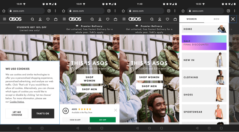
Arriving on the ASOS site as a new visitor, you’re met with a large cookie preference notice at the bottom of the screen. The use of the black button for ‘that’s ok’ is clearly to drive more people to press it. Rather than the more subtle option of the white button ‘let me choose’ where users can select which cookies they will allow.
Once dismissed you are faced with another pop-up at the bottom of the screen, advertising their app. 2 pop-ups to dismiss from a mobile screen for easy uninterrupted browsing always feels a bit gratuitous to me. The cookie one is necessary obviously, but having multiple pop-ups can be annoying. Even more so on the smaller display of a mobile device.
Admittedly, their app is very well designed and well reviewed. I can understand them wanting to drive people to use it. A well reviewed app is certainly more tempting than one with average to poor reviews. It gives them the additional option of push notifications and such, so makes sense for their business model.
Now on to the actual header and navigation area.
ASOS have opted for a hamburger menu (the 3 horizontal lines, signifying a hidden menu) to the left of their logo. It opens the menu over most of the page, to reveal categories and a selector for women’s or men’s clothing. This is also done in the hero section of the homepage, where you can select ‘shop women’ or ‘shop men’ buttons to tailor your experience. The menu is easily dismissed with a clearly defined and easy to tap X.
On the right side of the logo, there’s a magnifying glass icon to indicate site search. This opens up a full screen overlay with a search box. This is also simple to dismiss without accidentally tapping something else.
Next is the account login icon, and next to that is the ‘saved items’ heart icon. The latter is only functional if logged in, otherwise it just asks you to sign in. Finally there is the bag icon to represent the shopping basket.
Below the navigation is a banner area where they advertise offers.
The rest of the page content uses a mix of images, buttons and swipeable carousels to allow users to move around the site with relative ease on a mobile device.
Interestingly, they do not have a return to top of page option active when scrolling. They do thankfully return you to your place on a product listing page, when you navigate back from an individual product page. Sites which drop you back at the start of a product listing page when you navigate back from a product are a pet peeve of mine.
I’m a sucker for including Etsy in these types of post. Mainly because despite being a platform to host the creations of millions of individual makers from across the world, they really nail their UX.
Arriving on their site as a fresh user, you get a privacy/cookie settings modal which sits mid page. It overlays the content and obscuring the page with a grey filter to ensure you take action. They also use a high contrast black button for accepting, and a much more subtle white button to allow users to choose their own settings. The emphasis heavily on accept, they clearly don’t want to lose out on their analytics data! It does feel a little railroaded, but on the other hand, it requires limited effort on behalf of the user. I think it depends on where you land on privacy vs usability.
To sidetrack a little (I can’t help it!). Now that these cookie acceptance pop-ups are so common place, users tend to accept them without a second thought. I’ve seen many sites take advantage of this. I recently helped the mother-in-law with her phone, which was being bombarded with spammy web push notifications. Many of an unsavoury nature. The culprit was pop-ups made to look exactly like cookie acceptance pop-ups, which instead are for providing permission for push notifications from websites. She’d just accepted out of habit.
Anyway, back to Etsy. I think the language choice for this is interesting, using ‘privacy’ whereas most other examples in this post use ‘cookies’. This feels like a more inclusive language choice for an audience that has a broader mix of demographics, with varying degrees of familiarity with internet terminology.
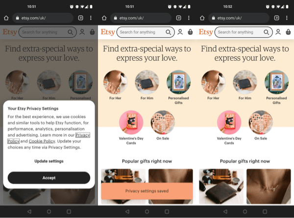
Once the cookie modal is dismissed, a small orange bar appears to say your setting have been saved, but this disappears as soon as you begin to scroll.
Now on to the navigation. Here we have no menu, hamburger or otherwise. In the centre is a large search bar, and to the right of that are the icons for account login, and basket.
Due to the nature of Etsy, trying to fit everything into categories which would sit in a mobile menu would be a difficult task. Search being the major navigation feature on a site that sells anything from stickers, to Star Wars wedding dresses makes sense.
For those there to browse, they do offer a number of general categories in the hero area, along with popular item collections.
There is no return to top option when scrolling, but they do return you to your position on a product listing page when you navigate backwards from a product page, so they get my appreciation for that.
On to Currys, one of the larger electrical appliance retailers in the UK, and a business which also has brick and mortar stores.
On arrival there is quite a lot to deal with in terms of pop-ups and overlays.
Obviously the cookie policy is required, and it’s of a similar kind to the one used by Etsy, with a centre modal and grey filter overlaying the rest of the page.
At the same time you have an advert for their 3.5/5 star app, and a live chat pop-up.
Even on larger modern smartphones, that’s a lot going on at once. Personally I find it disruptive, and driving me to an app with a sub 4 star rating isn’t particularly enticing. Worse is that if you do click to be taken to the app store, the true rating is 2.6/5.
Once you’ve made it through the distraction assault course, you can finally get to grips with their mobile navigation.
Curry’s have opted for a hamburger menu in the top right corner, opening up to cover the full page, listing their product categories and sale section.
They have separate icons in the top navigation for their store locations, account login, and basket.
Just below the main navigation, they have a nice big search bar. Tapping into the search bar brings up a white overlay across the page, and the search query entry field loses its outline which is a bit peculiar. All that’s visible is a small grey back button, the pre-fill text, a sea of white, and then the chat pop-up still hanging out there at the bottom of the screen.
As for the rest of the homepage content, it is primarily swipeable carousels with large buttons, or large images for easy mobile touchscreen use.
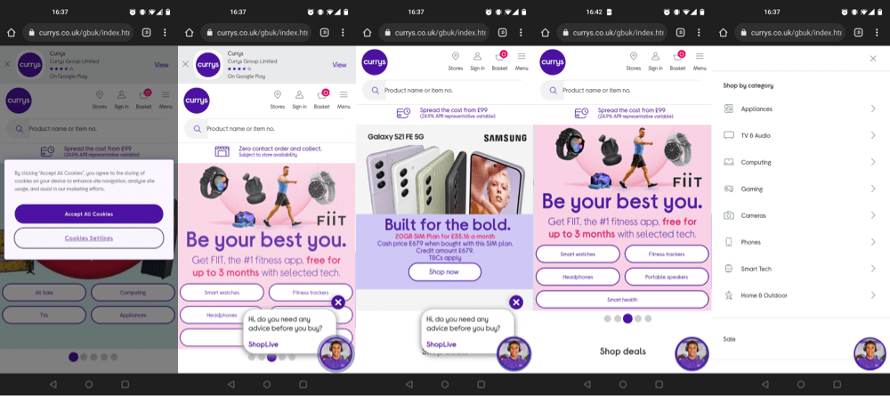
Currys DO provide a return to the top of the page button once you begin to scroll, so they get a thumbs up for that. It can be a very useful feature on mobile devices, especially on longer pages. They also drop you back to your place in product listings when you navigate backwards from looking at a specific item. Hurrah!
I did find the site quite slow and clunky though. Waiting for product listing pages to load was a tad painful, and there was a fair amount of layout shift as images loaded in.
Argos have long been well known for their brick and mortar stores (many of which closed recently). They’ve also always made it very simple for users to order online, and collect in-store immediately if stock permits.
Arriving on the Argos site is less of an assault to the senses. Just the cookie policy pop-up here. One again it is of the kind used by Etsy and Currys, with a central modal and grey overlay.
Despite also having a poorly rated app, they thankfully choose not to push it here.
In the primary navigation we have another hamburger menu, but as the inner most icon from the right side this time. It opens to sit over the full page and provide access to categories, trending items, sales items, store locations, and help.
Beside the menu icon, there are icons for account login, wishlist (for logged in users), and the trolley.
Just below the primary navigation there is a nice big search bar. Tapping into this search bar doesn’t take you off anywhere else, or overlay the page content. You can enter a search query with no additional steps.
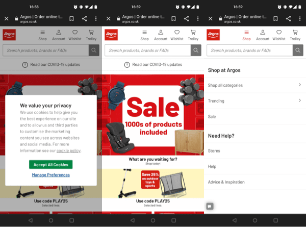
Where Currys opted for swipeable carousels, Argos have nothing off-screen. Just large images of items, collections and offers to tap.
They provide a return to top of the page button once you start scrolling, and return you to your position on a listing page when you navigate back from viewing an item. High five to Argos!
Moving away from E-commerce, let’s look at the Gov.UK site. Its primary role is to be an information portal.
As one would expect, and hope for a government site, you are greeted by a cookie notice. This one requires a second click to fully remove from view, to confirm that you understand you can change your settings at any time.
It is positioned at the top of the screen and takes up about half of the display area, pushing the page content down, rather than overlaying it.
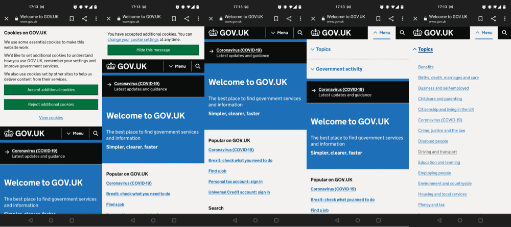
The navigation is very simple in this case, presumably to accommodate for the particularly broad potential user base. The menu is a labeled drop-down, indicating how it will behave with a downwards arrow. The menu initially opens with two options ‘topic’ and ‘government activity’. Selecting either of these unfurls a large list of options which covers the full page. This menu does require some scrolling to access all options.
Next to the menu is the classic magnifying glass icon for site search. This also drops down, opening between the nav and the page content below, rather than sitting over it.
No return to top of page option becomes available on scrolling, even on very long pages.
Another public sector website, this time the main NHS website. Again, its main function is providing information, and signposting to other services. There is some slightly more advanced functionality on this site, to allow users to book covid tests, vaccinations, and to order repeat prescriptions.
On arrival as expected, a cookie notice is the main focus. This one is similar to the Gov.uk one, but is larger, explains what cookies are in more accessible language, and specifies analytics cookies and the analytic platforms they use.
Once dismissed you are left with a message that you can change your mind at anytime, which remains present until you refresh the page, or navigate to another page. It doesn’t follow you down on scrolling thankfully.
There is not a burger menu to be seen here. Although burger menus can be made more accessible with the use of Aria for those users with screen readers and the like, it may be that this was a choice driven by a need for greater accessibility for their incredibly broad audience.
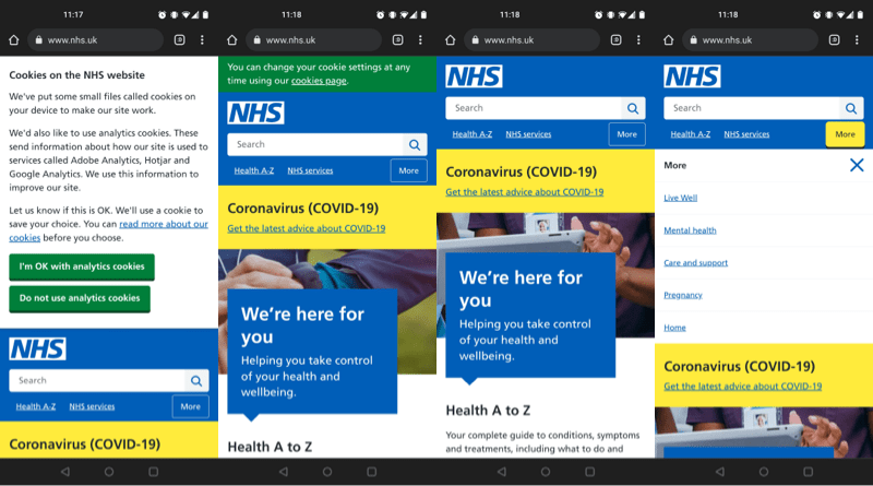
The biggest feature in the top nav is the search bar. This stays where it is, without adding an overlay or taking you off to a separate search page.
Below this there is a ‘Health A-Z’ for people looking for information on specific conditions. It takes you to what is essentially a glossary page, where you can navigate through the alphabet for conditions beginning with each letter.
Next to this in the nav is ‘NHS Services’. This takes you to a page where you can book covid related services, or be signposted to health services near you.
Finally the more button behaves like a burger menu, unfurling to reveal additional services.
There is no return to top of page option when scrolling, even on longer pages.
Love or hate them (with soaring energy bills most of us will probably opt for the latter), E.on are one of the biggest energy suppliers in the UK. E.on Next are part of their group, created when npower closed, and E.on took on their customers.
On arrival we have a cookie notice similar to many we’ve seen already. A mid screen modal and a grey overlay. Cookies is the chosen wording.
Once dismissed there is a ‘skip to content’ button at the top. I’m not quite sure what the purpose of this is, as it just removes itself and you stay at the top of the page.
In the header area, there is a selector to filter business customers to the B2B part of the site.
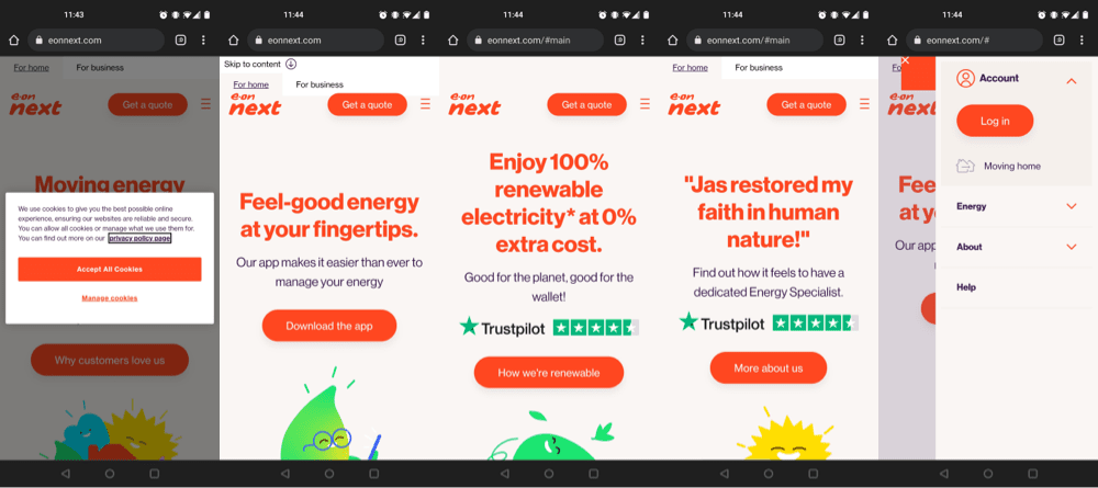
The navigation consists of a right hand burger menu, sitting next to a CTA button for quote requests.
Within the menu users can then access the account log-in area, the moving home service, information on energy tariffs and meters, company information, and a help section.
There is no site search, and no return to top of page option when scrolling.
Whether for their TV, broadband, or mobile services, Sky are a big player in the UK market.
On arrival there is a very text heavy cookie preference modal, sitting in the centre of the screen, with the greyed overlayed screen.
Once dismissed they currently have an offer banner at the top of the page for one of their products. Just personally I find the emojis and layout of that banner a little odd looking on the mobile device.
Now on to the header and navigation area. Sky have opted for a central logo on mobile, with a sing-in button to the right, and a burger menu to the left.
The menu pops out to cover the full screen, with products, and links to their B2B services, deals, help etc. This is also where their site search bar lives, which remains as is when you are entering your query, rather than redirecting to a specific search page or overlaying the rest of the menu.
In the secondary navigation below, they provide links to their 3 main products, and their deals section.
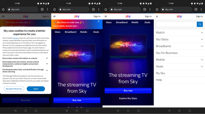
The rest of the page makes use of bright colourful visuals and big blue CTA buttons. The site also makes use of animations for more visual interest. These are eye catching but also made for slow scrolling places.
There is no return to top of page option when scrolling long pages of content.
The BBC website is primarily a news outlet, which also signposts to their other services, such as iPlayer, Radio and educational resources.
They have a relatively small cookie preference bar, which pushes the navigation and page content down. Once dismissed everything moves back up.
Navigation wise, from left to right we have a user login icon, an icon for notifications which only works for logged in users. If not logged in, it directs you to the sign-in page.
Then instead of a burger menu, the largest area in the navigation is the menu tab with a downwards arrow to denote that it will unfurl to reveal menu options, which are news/interest categories and services. This menu sits below the navigation, and pushes the page content down, rather than overlaying it as some ‘mega menus’ do.
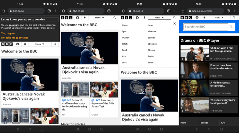
Finally they provide a magnifying glass icon to denote a search option. This takes the user to a separate search page, with a bar for entering queries, and below this is content advertising iPlayer shows.
There is no return to top of page option when scrolling what can be fairly lengthy pages.
The Netflix site has a fairly simple job to perform for visitors first arriving. Either get them to sign up, or to log in for existing users.
On hitting the site there is a small top of the screen cookie pop-up which overlays their logo and what exists of their navigation.
Once dismissed there is a very limited minimal navigation area. A sign in button, and below that in the hero area, a form field and submit button to kick off the sign-up process. It doesn’t get much simpler than that.
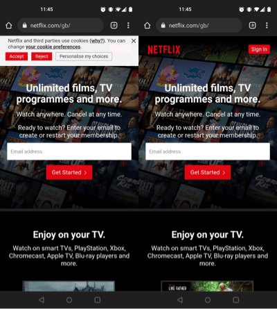
The rest of the page is also pretty simple and short, so no need for a return to top option on scrolling. The page just explains key features and benefits and has FAQs at the bottom.
So there are 10 top UK websites and their mobile navigation choices. With this very small sample size we can begin to make some observations.
Full desktop style navigation bars aren’t desirable for mobile as they can take up a lot of space, so only the most important things are kept on display, usually marked by icons in place of names. Every single one of the sites we looked at, aside from Netflix, uses a hidden or drop down menu of some kind for further navigation options.
The hamburger menu is now a very well established part of mobile design, but for those sites with the very broadest audiences (the public sector websites in particular) we still see the us of labeled drop down menus, over icons. Although aria labels can be used to make hamburger menus more accessible for users with screen readers, a named menu with an arrow to demonstrate its behaviour when clicked/tapped (which is also properly tagged) provides a more straightforward experience for the broadest audience when using hidden menus.
The magnifying glass icon is almost universally used to denote site search now, sometimes within a traditional search box, and sometimes with a search field that opens on selection.
It was interesting to see the range of ways site search was handled across these sites, if at all, as some didn’t include search at all. For some it was the largest area in the primary nav, for others it was hidden away in the drop down menu, and in the case of the BBC users are redirected to a separate search page.
Across the E-commerce examples we had ‘basket’, ‘trolley’, and ‘bag’ used. None opted for the more Americanised ‘cart’. Two were icons with labels, whilst tow were just icons.
Although not strictly a navigation feature, cookie notices are frequently placed over the navigation, or use overlays to obscure them, to force action on the users part. Far more direct than the smaller, passive cookie notices of the past. Now that explicit consent is required, design is used to increase the likelihood of full acceptance.
Now this is just things we can begin to infer from 10 sites, but if you’d like to see a full report on a far larger sample size, looking at trends, sectors, and much more, we have one in the works.
*screenshots used under fair dealing/fair usage for review purposes.
