What You See Should Be What You Get – Why It Boosts Sales
Tips on how product imagery can influence and improve the online shopping experience and customer perception.
Oops! We could not locate your form.
Tips on how product imagery can influence and improve the online shopping experience and customer perception.
10 years ago social media was abuzz, with people debating whether the viral image of “The Dress” was blue and black, or white and gold.
It turns out that people saw different colours, depending on how they interpreted the lighting in the photo.
If you were to buy the dress in a physical store, you would try it on, move it around, and you wouldn’t need to make assumptions about the lighting, as you’d know – but you can’t really do that with a photo online.
If you were to order a white and gold dress online, you’d be disappointed to discover it was actually black and blue when it arrived.
There are many variables that can impact how the subject of a photo is perceived, and on top of that. many photos are edited or doctored.
There are also many photographic tricks and methods to make something look more aesthetically pleasing. This is very common in food photography for example. That’s why that burger looks delicious in the picture, rather than the reality, which is a sloppy mess. Check out this post on photo tricks if you’re working with food.
Landscape gardeners also know a photography trick or two for taking their portfolio shots. They spray everything with water, which gives it all a slick finish, and richer darker colours. So when us mere mortals see one of these pictures on Pinterest or Insta, we think, wow, I want my garden to look like that!
So we go and place an order for the black gravel we really liked the look of in one of these pictures, but when it turns up it looks like it’s been swimming in bleach!
I really love the look of black ice gravel in a garden, so this week’s Swipe & Deploy is actually from my own experience of the process of buying some.
I’ve ordered some before, and experienced that moment of “well that doesn’t look like the photo”. So when I came across this simple but effective trick a seller was using, I knew I had to share it.

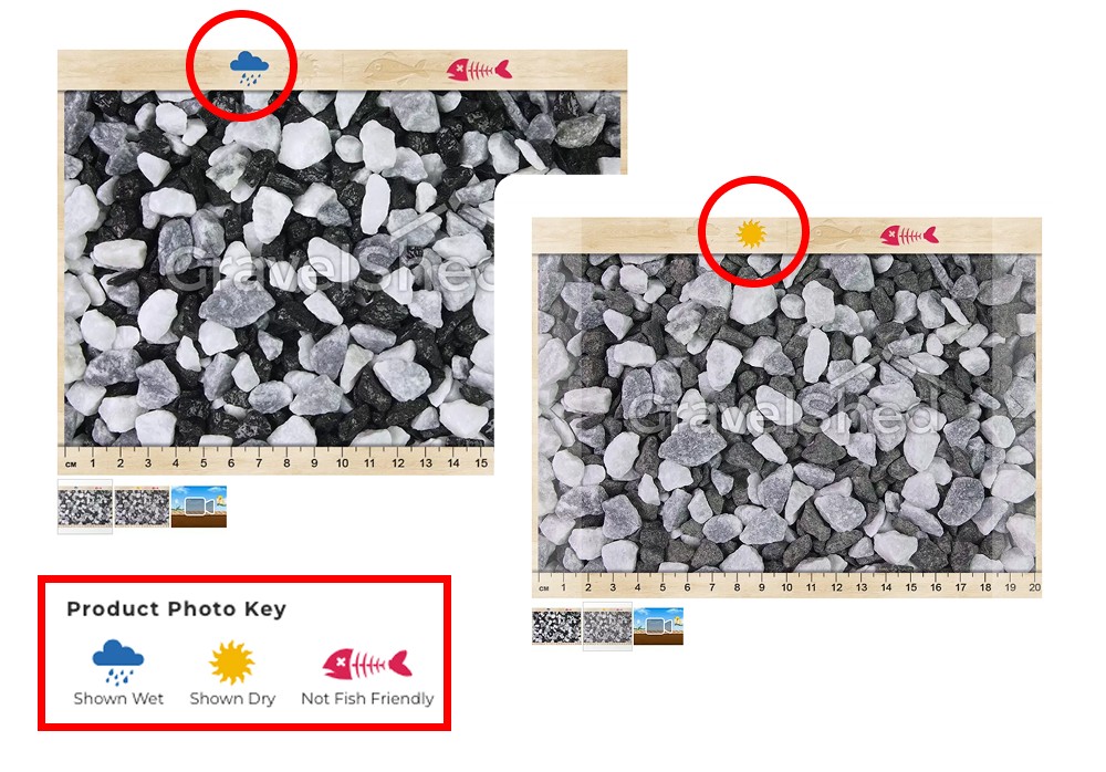
The photo is from The Gravel Shed, and although their buying experience could certainly do with some simplifying, the practical and useful product image carousel deserves credit.
The win here is the fact that they’ve taken a rigid carousel, and created really useful branded images to fit into those spaces, so that potential customers are better aware of how the product can look in different conditions.
They’ve also created a simple key with icons, to help customers identify:
You can switch between the photos in the slider to see the appearance in these different conditions, saving you from disappointment when it turns up dry, and not matching a single staged (and wet) photo on the website, like many other sellers provide.
Another Brucey bonus, is the ruler shown at the bottom of the photo for scale.
It is difficult to judge size from a picture without much contextual information. You might end up with something smaller or larger than intended. So showing the gravel next to a ruler, helps shoppers understand the size, and avoids them having to return the product when it isn’t as expected.
It’s just a shame that they haven’t given the same amount of thought to the product page layout, as it is all very confusing.
The big takeaway this week, inspired by The Gravel Shed, is to think about how you can use simple tools that you may already have in your possession, like an image slider. But also to consider how your product may look in different lighting or different environments, and how you can provide your customers with the information required to make a well informed purchase, and avoid disappointment.
Do your reviews or your customer service team show that there are regularly buyers that are disappointed when they receive an item? Does the feedback mention colour or sizing confusion? Would a photo next to a ruler, or photos of your product in different lighting help more people understand exactly what it is they can expect to receive?
For further inspiration on using product imagery more strategically, check out the blog post below:
That’s a wrap for Swipe & Deploy 071 this week. Join me next time where I will share another insight or inspiration piece from around the web.

If you’d like to learn more about our WordPress & WooCommerce Support & Maintenance plans, drop us an email or give James a call.
Our plans provide a holistic solution to your website’s performance, reliability and security, and are inclusive of premium tools and services.
Could adding verification by industry experts help build trust with your users, in a world where so much content is AI slop?
James Coates
A recent addition to the Oh Polly website went viral, and prompted this week's Swipe & Deploy. Could your brand take inspiration from Oh Polly for your own website?
James Coates
A look at how adding functionality for users to save their basket can remove friction and improve your chances of a sale.
James Coates