Rip Up The Rule Book On Your Product Detail Pages
Not all products sold online are the same, and sometimes to provide a good user experience, you have to tear up the product page rule book.

Oops! We could not locate your form.
Not all products sold online are the same, and sometimes to provide a good user experience, you have to tear up the product page rule book.
The online buying experience has been pretty much the same since the birth of eCommerce.
The standard eCommerce product page layout has barely changed in twenty years. Image gallery on the left. Price, options, and Add to Basket on the right. Description below. It’s familiar, it’s expected, and for the majority of products (a book, a hoodie, a kitchen gadget) it works perfectly well.
But familiarity has its limits. For businesses selling complex, configurable, or heavily personalised products, trying to fit everything into that well-worn format isn’t just a design compromise. It’s a conversion problem.

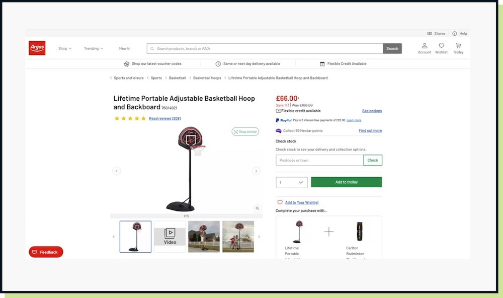
The Argos website shown above shows a very typical product that you can simply add to your basket. This is placed in a very familiar layout that we have come to expect. Image slideshow on left, and the price, content area and CTA on the right.
The global average eCommerce conversion rate is commonly cited as sitting somewhere between 2% and 4%, though it’s worth treating any single number here with a bit of caution. Different tracking firms measure it differently (session-based versus visitor-based, which industries are included, which platforms), so you’ll see figures anywhere from under 2% to closer to 3% depending on the source.but that headline figure masks enormous variation.
What all of them agree on is that the headline figure masks enormous variation. For products with longer decision-making cycles or more complex configuration requirements, conversion rates can fall well below whichever average you’re benchmarking against. One of the most consistent drivers of drop-off is friction at the product page itself, when customers can’t quickly understand what they’re choosing or visualise what they’ll receive.
The default WooCommerce variable product setup handles simple configurations well: pick a size, pick a colour, add to basket. But once you move into territory with multiple components, nested options, dependent choices, or build-your-own functionality, the standard template starts to buckle. Customers find themselves opening and closing accordions, scrolling past blocks of text to find what they need, and ultimately losing confidence in the process. Many will simply leave.
This isn’t a WooCommerce-specific problem. It plays out across Shopify, Magento, and any other eCommerce platform where the default product template is designed for simplicity. The platform isn’t to blame. The mistake is assuming one layout can serve every product type.
Not every product that needs a custom approach is obviously complicated. Here are the most common scenarios where a standard product page falls short:
Build-your-own bundles – Gift boxes, subscription hampers, meal kits, skincare sets etc. Products where the customer selects individual components to create a finished package. The choices are interdependent, quantities matter, and the customer needs to see the whole picture as they build.
Configurable products – Furniture made to specification, bicycles built from components, custom computers, made-to-order jewellery. These involve sequential decisions where each choice may influence what comes next.
Products with extensive personalisation – Engraving, embroidery, custom printing, colour and material choices. Any products where the customer needs to see their changes reflected visually in real time to feel confident placing an order.
Service or product combinations – Especially common in B2B, where customers may be configuring a package of services or products tailored to their specific requirements.
In all of these cases, the standard product page template pushes customers to make abstract decisions rather than immersive ones. The more abstract the process feels, the lower the confidence, and the lower the conversion rate.
We experienced this challenge first-hand with our client Don’t Buy Her Flowers, a gifting brand built around the idea of thoughtful, personalised gift boxes. Their model is great, but it depends on the customer being able to navigate and make a number of choices to build their perfect box.
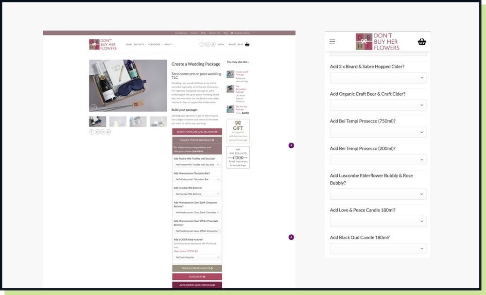
Their original WooCommerce product page used the standard layout, with options presented through accordion drop-downs. It was functional (less so on mobile), but it asked customers to make a series of choices with limited visual feedback. Shown below is the website as it was in 2021.
Opening each accordion revealed more nested options (all text based) and closing it made everything invisible again. The mental model of ‘what am I building?’ was hard to maintain, and with the lack of imagery it required familiarity with the individual products by name, or opening another tab to look them up.

The result was exactly what you’d predict. Committed buyers persevered, but a significant proportion of potential customers dropped off during the configuration process.
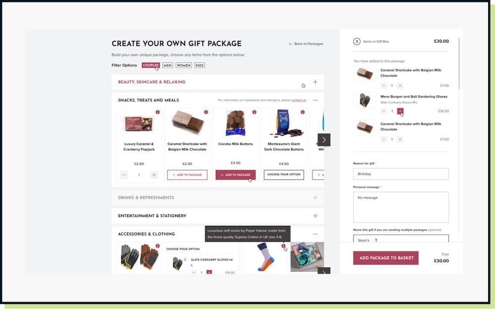
The solution we built was a fully custom WooCommerce package builder, which you can see below. A purpose-designed product configuration experience built around the act of building rather than selecting.
Rather than hiding options inside drop downs, the builder presents choices visually and progressively. As customers add items, their selections appear clearly in a live basket panel that sits alongside the builder at all times, giving a running picture of what the finished box will look like and what it will cost.

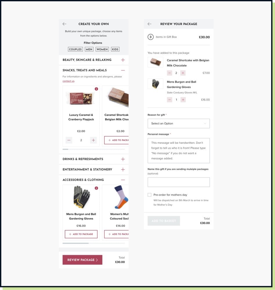
On mobile, critical for a brand with a strong social following, the experience was designed from the ground up rather than adapted from desktop. No standard product header, no image carousel. Just the configuration interface itself, clean, focused, and designed to feel like an app rather than a website.

You can read more in the case study here.
Don’t Buy Her Flowers aren’t alone in rethinking the product page for configurable products. Several well-known brands have built their entire customer experience around custom configuration.
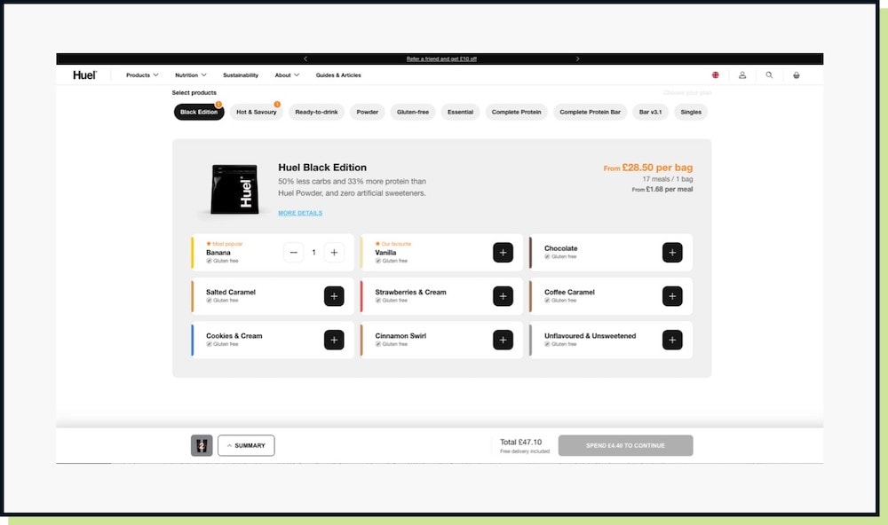
Huel’s Build Your Own Bundle presents a completely different layout to their standard product pages, walking customers through component selection step by step with live pricing that updates as choices are made.

High-end bike and automotive retailers have long used configurators to guide customers through frame, component, and finishing choices, with visual previews that update in real time. Brands like Trek and Specialized offer this for custom and higher-end builds.
Nike By You is arguably one of the most mature consumer-facing product configuration experiences, where the entire page is given over to customisation and the visual preview is the central element of the UI. Nike relaunched the platform in April 2026, upgrading the customiser from a static, flat image you clicked through colour options on, to a fully real-time 3D model that shoppers can rotate and zoom into as they build. It’s a good illustration of the underlying point of this whole post. Even a brand that’s had a market-leading configurator for over a decade keeps investing in making the visual preview more immersive, because that preview is the entire reason the format converts.
What these experiences share is a core design principle. The interface is built around the customer’s actual job to be done – building something – rather than around a template designed for simpler transactions.
The good news for WooCommerce store owners is that the platform is well-suited to custom product experiences, both through third-party plugins and through fully bespoke builds.
When the configuration logic is complex, when the brand experience demands something distinctive, or when the product journey is central to the business model (as it was for Don’t Buy Her Flowers), a fully custom-built configurator will consistently outperform a plugin-based solution.
Custom builds allow you to design the experience around the specific decisions your customers need to make, rather than adapting a general-purpose tool to an atypical use case.
WooCommerce’s real strength in this context is its openness. Unlike closed platforms, WooCommerce gives developers the access needed to build truly bespoke product experiences that sit natively within the store, sharing inventory, pricing, checkout, and order management infrastructure, without the customer ever feeling like they’ve stepped outside a coherent experience.
For businesses that have outgrown the default product page, that flexibility is exactly what’s needed. The standard template got you here. A custom configurator could take you considerably further.
The key takeaway today is if you have a product or even a service that is heavily customised, avoid shoehorning it into a standard format product detail page.
If any of those give you pause, the issue is likely not your product, it’s the presentation.
Think how you can focus on the action of customisation, plan the journey of how you would expect the user to interact, which options they need to select, and then look at how this can be achieved digitally.
Chances are this won’t fit the standard mold so you shouldn’t try to force it into a standard page.
If you have a combination of heavily customisable products and more simple products, those simple product pages can follow a more familiar approach, as these pages can work in combination with a customised product page builder. Or as we did for Don’t Buy her Flowers, you can display the expected product detail page, but then allow the user to customise the product in the next window. Your SEO team will thank you for that content on the product page 🙂
That’s a wrap for Swipe & Deploy #43. Join me next week when I’ll share another insight or piece of inspiration from around the web.

If you’d like to learn more about our WordPress & WooCommerce Support & Maintenance plans, drop us an email or give James a call.
Our plans provide a holistic solution to your website’s performance, reliability and security, and are inclusive of premium tools and services.
Could adding verification by industry experts help build trust with your users, in a world where so much content is AI slop?
James Coates
A recent addition to the Oh Polly website went viral, and prompted this week's Swipe & Deploy. Could your brand take inspiration from Oh Polly for your own website?
James Coates
A look at how adding functionality for users to save their basket can remove friction and improve your chances of a sale.
James Coates