How To Create A Website Hero That Saves The Day
Published 19.05.23
19th May 2023
Last Updated 03.04.24
3rd April 2024

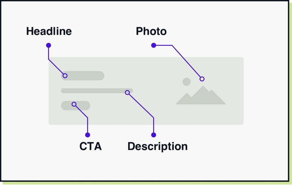
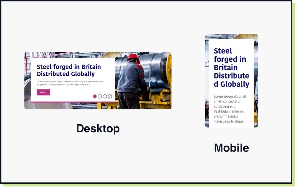
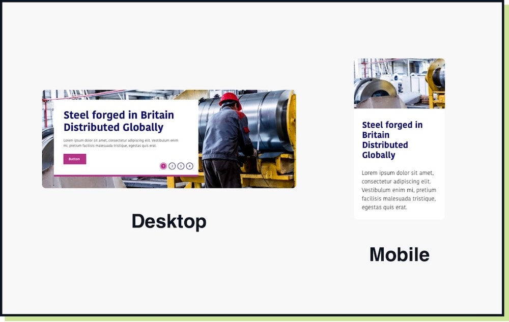
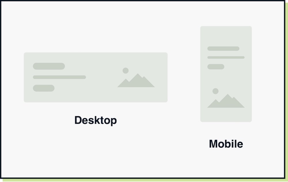
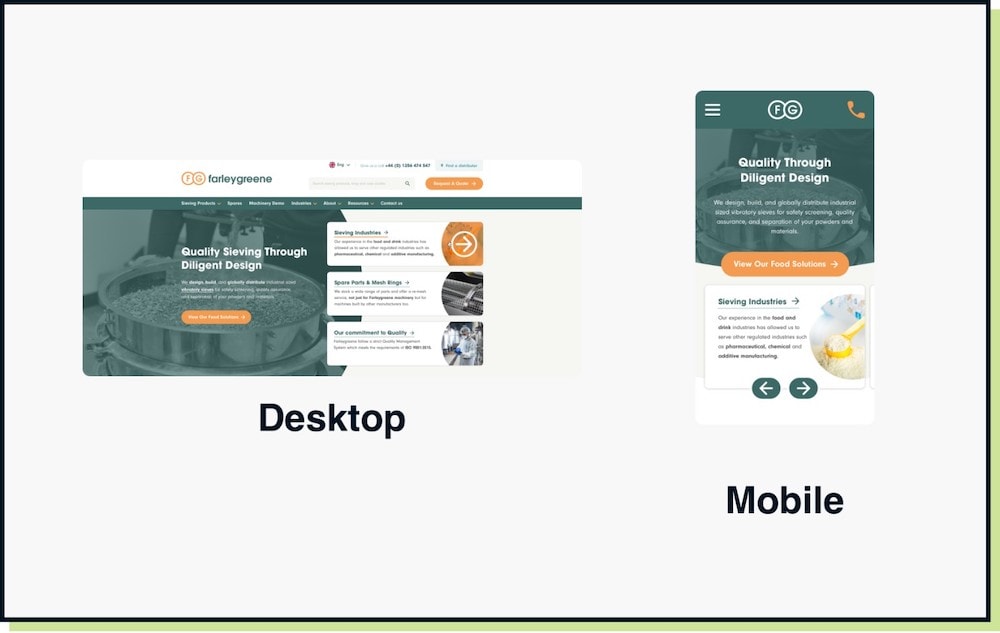
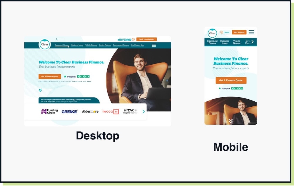
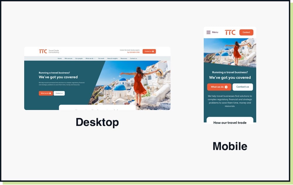
A website hero has an important job to inform and direct users. This should be the case whether viewed on a desktop or mobile device.


