3 Inspiring Service Page Designs & What We Can Learn From Them
A look 3 examples of well designed service pages, B2B and B2C, and the inspiration and learnings we can take from them.

Oops! We could not locate your form.
A look 3 examples of well designed service pages, B2B and B2C, and the inspiration and learnings we can take from them.

Service pages can be tricky to get right and there is no one size fits all approach, as services and their users vary industry to industry, and business to business.
There are however, some commonalties that the majority of service pages share, in what they need to achieve.
So for inspiration, let’s take a look 3 examples of well designed service pages from a mix of industries, B2B and B2C.
We’ll look at how they are structured, what they share in common, key design features, and the onward journey for those who convert.
App based internet banking company, Monzo, have always invested heavily in ensuring that their website and banking app offer excellent usability. This is built around simplicity paired with a clear understanding of what users need and want.
I’m a big fan of their brand, from the banking services they offer, to their hot coral coloured bank cards that are so easy to find in your wallet.
Their website service pages are no exception to this.
As an App based banking provider, Monzo’s service pages are designed to drive downloads of their app. Which is where users can then sign up for their services, such as current accounts, savings accounts, and credit cards.
Here is the service page for their free current account.
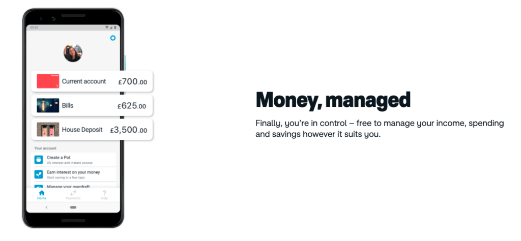
Monzo have opted for a simple layout with plenty of space, good use of graphics, and short blocks of text that are easy to digest. The page works well on both desktop and mobiles devices due to this clean and simple design.
The CTAs are clear, situated throughout the page, and limited in number so as not to confuse users with too many options for their next step.
They build authority and trust well, through the use of social proof and important industry logos.
They also layout their service offering, and USPs clearly, with the key features pulled out accompanied by illustrations or graphics providing visual examples. The copy is kept short and sweet.
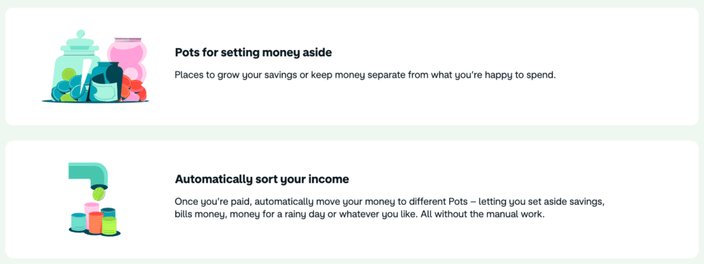
Near the bottom of the page, they offer a service summary table, with their paid account options alongside for easy comparison and selection. Great for users who want to compare the account options available, and great for Monzo to upsell their paid accounts.
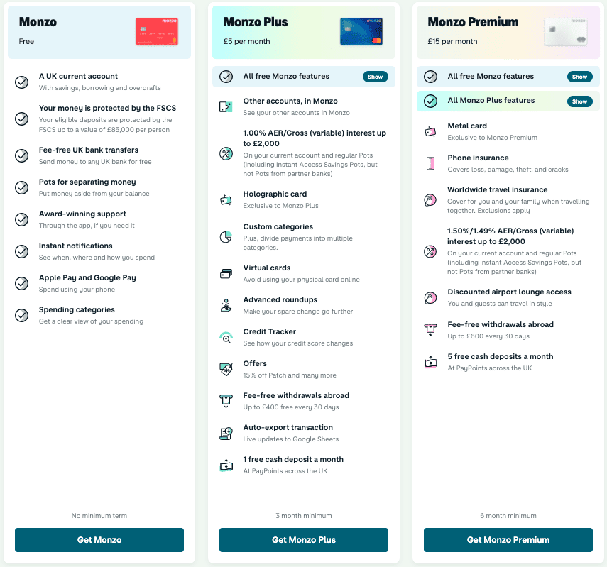
As you can see, their call to action buttons are clear and action oriented. They stand out from the rest of the page as they use a darker, bolder colour. These buttons take you to a page with a QR code and links to take you to the relevant app store, where you can download the Monzo app and sign up for your account.
At the bottom of the page, above their links to articles and blogs, there is one last statement to help persuade users into action. They reiterate the ease of switching to them and how they make it simple for you.
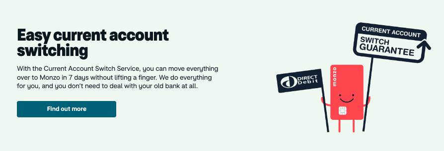
This is very powerful messaging for busy people, and those who despise dealing with banking customer service teams on the phone.

The smooth user experience doesn’t end here, with account sign up and the overall app carrying the baton on into the next stages of the user journey.
Some service offerings are less simple to distill, or of a more custom nature.
Our client AIS Interiors are a global workplace design and delivery business. Whilst they have core specialisms, each project they complete is highly bespoke and incorporates a variety of their more granular service elements.
It is important that these more granular elements are presented on their website for those who are specifically looking for a provider that offers them. But a the same time, it is their core service specialisms that form the backbone of their offering.
Here is their core combined service page from the WordPress website be designed and built for them.
As a design centric business, it is their work that really does the talking. It was important to incorporate quality imagery of this work throughout their website, and particularly on their service page as proof of concept.
As such the rest of the page is clean and simple, to allow that imagery to make its impact.
The page is divided into sections covering their 4 core service specialisms. There are quick links to each of these sections at the top of the page for those who want to jump to a specific service area.
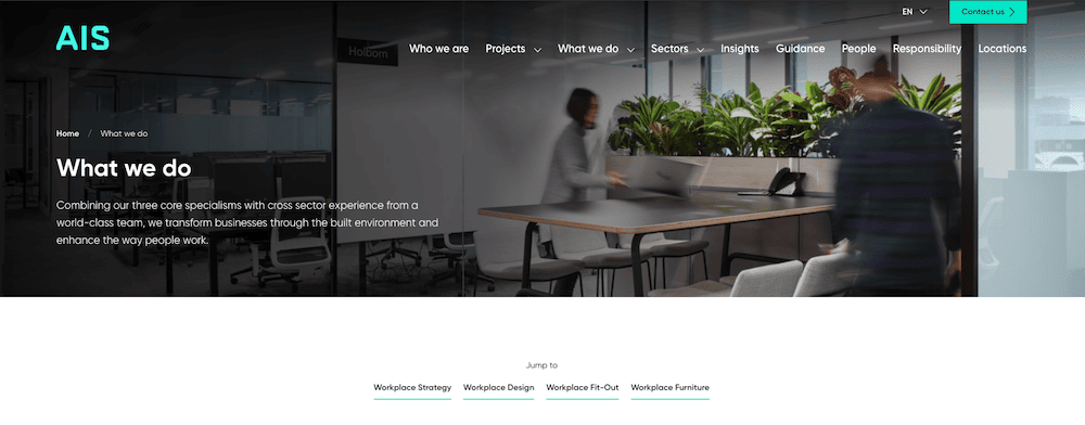
Each core service is succinctly described with its key benefits and messaging that is focused on the customer, their needs, and how they will be met.
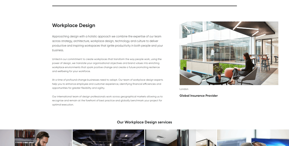
Alongside each of these sections, is a relevant case study, with a large high quality image, and a link to the full case study for those who want to know more.
This is a great use of social proof and visual evidence that affirms their claims.
To keep the page easy to digest and prevent users from feeling overburdened by choice, the more granular service elements are nested under each specialism. This is as image tiles with photography from some of AIS’s projects.

These link through to further more granular service descriptor pages, for those who want that additional information. But for others they provide an attractive way of summarising what each service specialism can include.
Ecologi is an organisation offering climate solutions via carbon avoidance and tree planting initiatives. This is done through a number of channels. Including schemes involving the purchase of trees and the support of carbon reduction initiatives by businesses and individuals.
One such scheme is their Climate Positive Workforce. Offering businesses a way to offset carbon for their employees, whilst growing a company forest, which is a digital representation of all the trees they have planted.
Here is the Climate Positive Workforce service page.
Whilst people require bank accounts, and workplaces need to be fitted out, persuading businesses that they need to part with money in aid of the environment is another kettle of fish altogether. As such, this page makes heavy use of social proof to build trust throughout, along with a little FOMO thrown in for good measure.
The page uses a fairly simple clean design, making use of stylised illustrations. They use earthy colours, aside from for the CTA buttons, which are a vibrant red. These really stand out and the colour choice creates a sense of urgency.
The top of the page leads with a succinct service description, and immediately makes use of social proof for trust and authority building. Along with creating the desire to not miss out on the action.
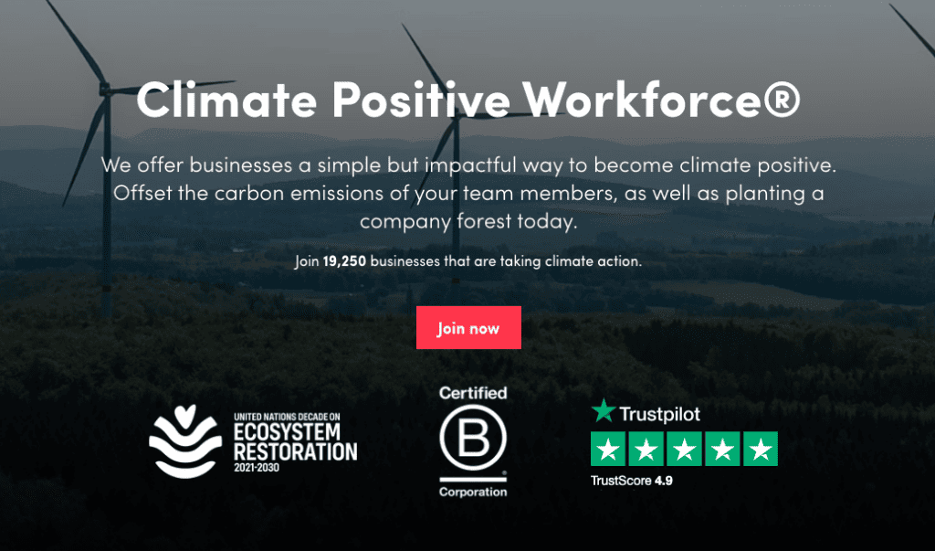
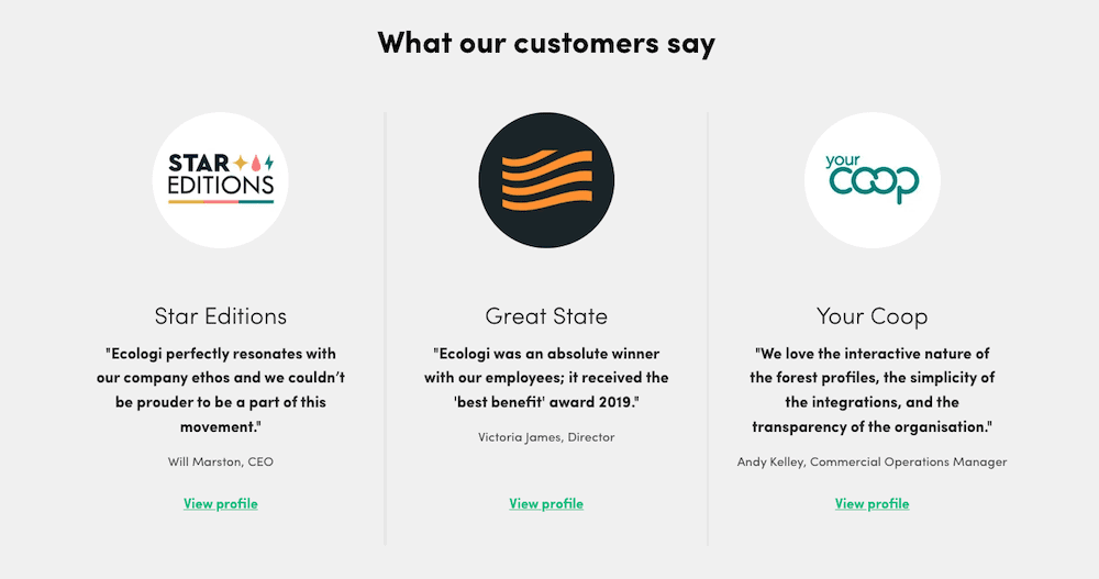
This is used throughout the page, with:
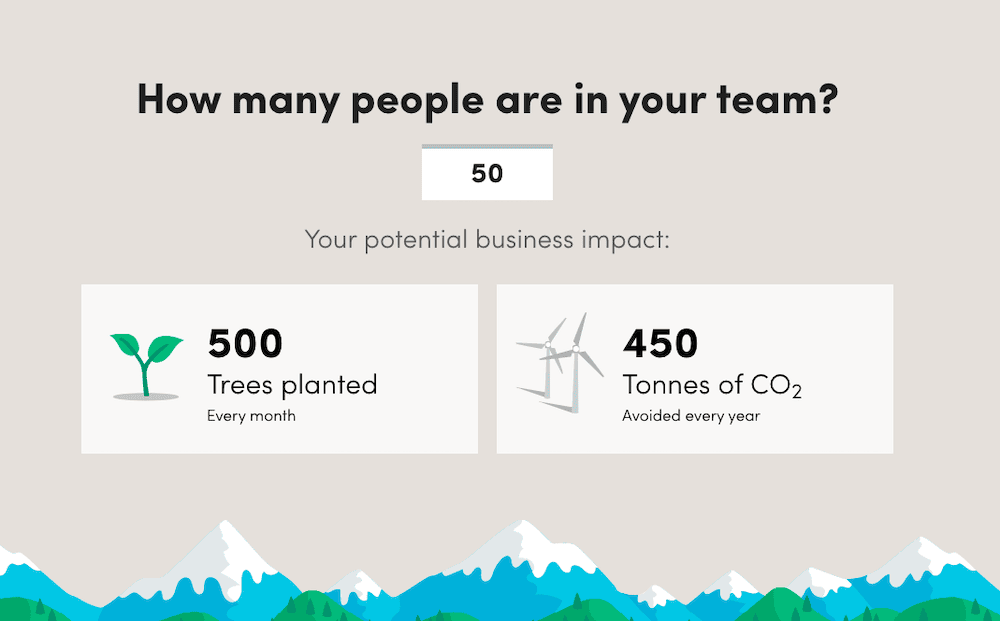
They provide a simple tool to allow visitors to estimate the environmental impact that signing their business up to this service could have. It is based on the number of team members a business has, and provides a figure of the number of trees they’d plant each month, and how much CO2 they’d avoid every year.
This adds some interaction to the page and seeing the actual numbers your team can achieve is very satisfying. It almost adds some subtle gamification too. As a user might consider including different teams from within their business, when they see the impact more members has on the tree and CO2 figures.
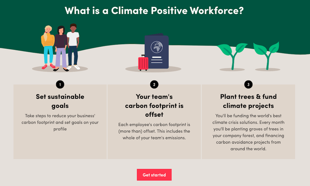
The actual service description is kept short and sweet, divided into the 3 core service features, with relevant illustrations.
This is followed by a summary of the benefits. Both for environmental good, but also importantly, how the service benefits the business. Once again, illustration is used to help convey this succinctly.
Near the bottom of the page, we have another of the vibrant red CTA button. Sitting in a full width green band across the page which really stands out. It uses a cute sloth illustration to catch the eye.
The ‘Get Started’ buttons lead through to a plan builder page where users can create the subscription for their team.

Below this is a form for those who’d rather speak to the Ecologi team directly. Offering options for different communication styles, and an onward journey for those with more custom needs, or further questions.
Whilst each of these pages offer very different services, they share many things in common. We can consider these the core building blocks of a service page:
