Don’t Let Them Leave Without Making Your Move With Exit Intent Popups
Making the first move. How you can use exit intent pop ups to build your prospect list.

Oops! We could not locate your form.
Making the first move. How you can use exit intent pop ups to build your prospect list.

In a romantic film the main character will meet someone at a party and they always make the move and get their number.
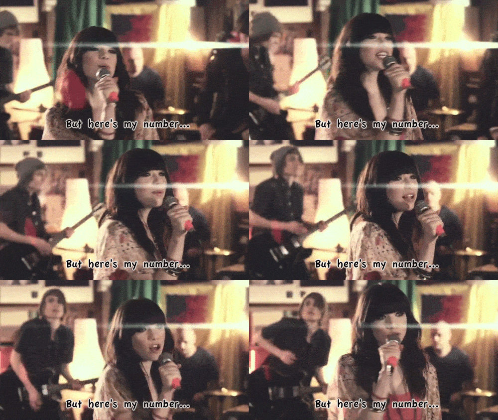
Because who would write a film about the person that didn’t ask?!
So when website visitors are browsing on your website and they go to leave, this is your opportunity to make your move.
Probably one of the most uncomfortable questions you can ever ask someone. In a face to face environment the fear of rejection can scare people into not asking at all.
But in the world of digital, we have our screens to hide behind, so if they say no, we don’t personally feel the rejection.
So let’s ask as if we have the confidence of a drunk Uncle on the dance floor at a wedding.
An exit-intent banner is one of those annoying banners that appear as you go to leave a website. Yes, can be annoying and add to the never ending list of annoying web intrusions we have to deal with each day.
But they play their role in being an awesome wingman, like Goose helping Maverick get the girl.

You can set them up to appear on certain pages when the user attempts to leave the page, when they scroll down a certain depth, or for the time they’ve been viewing a page.
Pop! They appear with a promo message or offer, but it’s almost always something to capture the user’s attention and grab their number or email address.
Here are a couple of examples Impact has helped clients implement.
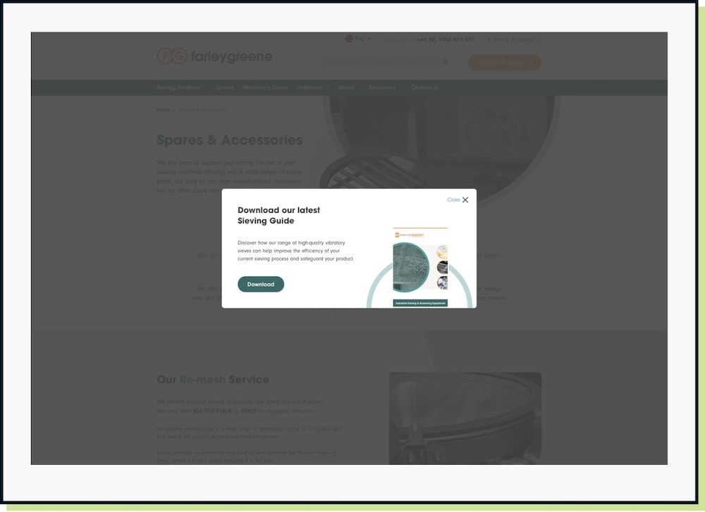
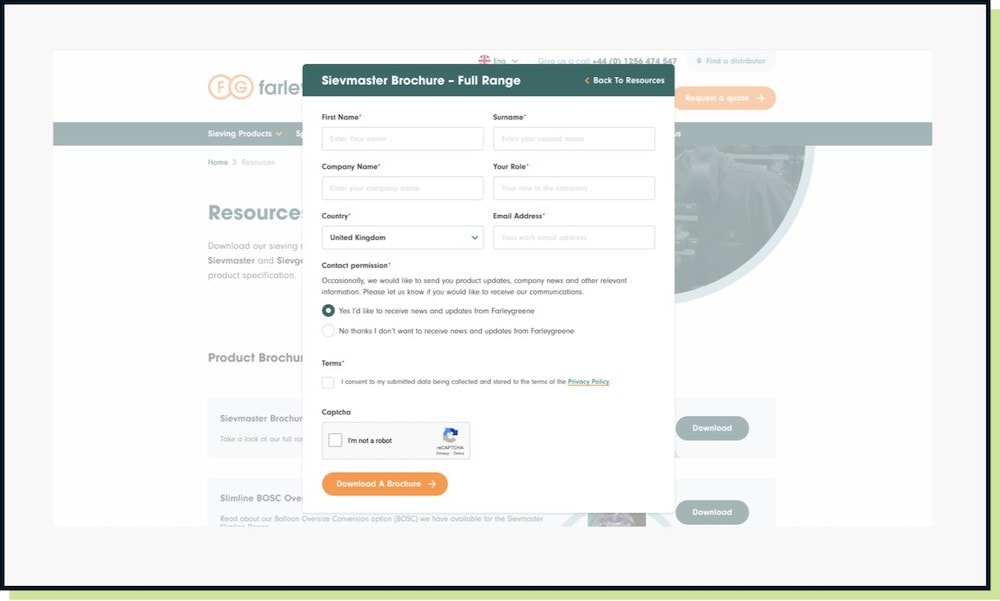
Farleygreene is a project we launched in 2022, and we provided the option for the team to add either a email newsletter signup or a brochure/guide download.
The initial prompt (screen 1) provides a brief intro and shows the thumbnail of the brochure, where as the second screen shows the form that appears once the user clicks to download.
Ultimately, in a B2B environment, we want to be grabbing their details and finding out a little more about them, before we go on our first date 🙂
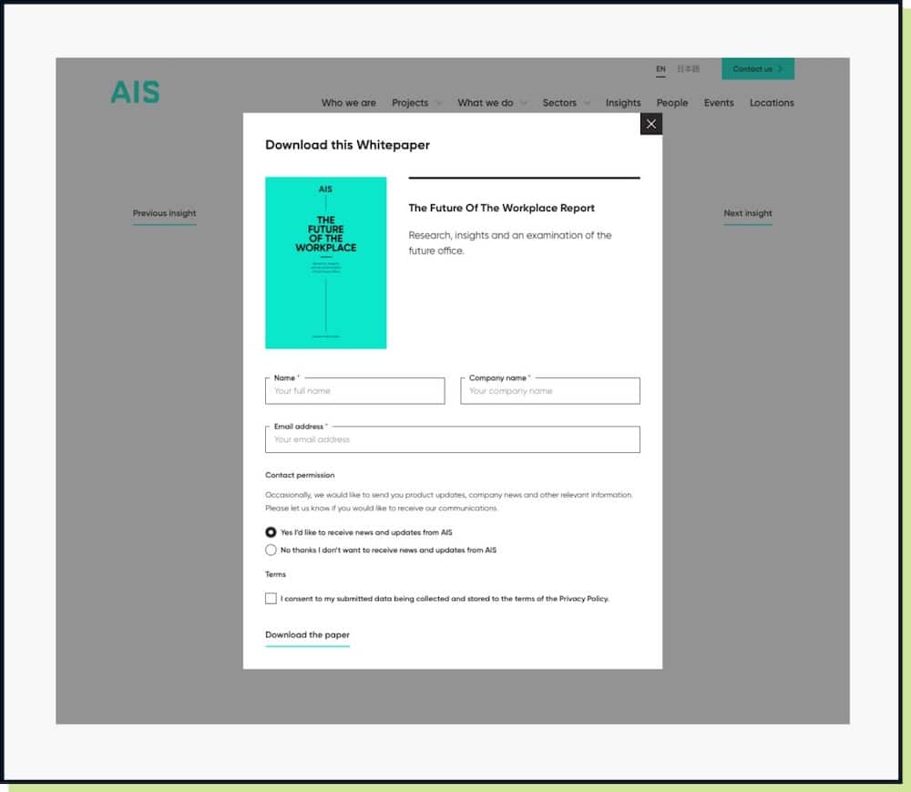
Above is another Impact project, for AIS Interiors. Once again presenting a guide as a carrot in exchange for the prospect’s details.
Like buying someone a drink at the bar, and them sharing their phone number.
At least on your website, they can browse around first, deciding if you’re worth their time. They can still reject your advances if you’re not their cup of tea.
Are you using exit intent banners on your website? Are you afraid to ask?
Chances are, you will land some fish. Perhaps not all of them, but more than you’d get without asking, that’s for sure.
All you need is a little bait, something that provides value. Perhaps a guide or something that your audience are looking for. 10 ways to do X, or maybe it’s your pricing if that’s not something that’s available to read directly.
Whatever it is, if you want to increase your email prospect list, then test using exit-intent banners.
*Avoid putting too many in place and don’t use them on every page. You don’t want to become that person who asks too much and becomes ‘creepy’ like Woody from There’s Something about Mary.
That’s a wrap for Swipe & Deploy #46. Join me next week when I’ll share another insight or piece of inspiration from around the web.

Whether you are visiting a theme park, zoo or any other type of visitor attraction, there's usually some form of map that customers can download from the attraction's website, that details how they can get around on the day.
 James Coates
Whether you're in the 'it's ok to put up your decorations in November' camp or strongly feel that 'December is the date for Christmas decorations', your website is another place that can be decorated with festive touches. If you want to start in November, we won't judge!
 James Coates
For publishers and websites that rely on advertisement money to support their commercial income, browser AdBlockers, privacy specialist browsers and rejecting Cookie Consent issues can cause an absolute nightmare.
 James Coates