Why Getting Detail Into Product Tiles On Mobile Is A Big Win
Why designing mobile first, ensures that all of your users see the information they need, and have an equal browsing experience.

Oops! We could not locate your form.
Why designing mobile first, ensures that all of your users see the information they need, and have an equal browsing experience.
When shopping using your phone, the screen real estate space is small. Designers need to get so much detail into a card view without making the user scroll too much to see the info they need.
Put your tiny violins away, don’t feel sorry for us, we love the challenge!
Many websites, unfortunately, still focus on a desktop first approach. Content that is designed with desktop in mind is easy to consume in that larger space, but is then forced into a smaller mobile view. This means that whilst the experience ‘works’, it doesn’t work as well as it could, and should.
There will be far more scrolling for the user, text can sometimes be too large, or important information or images are missed off in the card view.
This week, my dishwasher gave out. It’s not surprising, as I have 3 young kids and the poor thing is on a lot! It has given up, after years of faithful service, and unfortunately it’s too old or not cost efficient to repair. RIP washy!
So I’m in the market for a new one.
Whilst browsing on my phone, I visited both AO.com and Currys.co.uk, and the key things I was looking for were:
Finally one of the most important aspects for me is Energy Rating.
I appreciate the fact that this thing is on twice a day sometimes, so the running costs are important. I’d expect or hope that a larger initial outlay will mean lower long term running costs.

Both websites do a good job of getting some of this important information in, but the execution is very different.
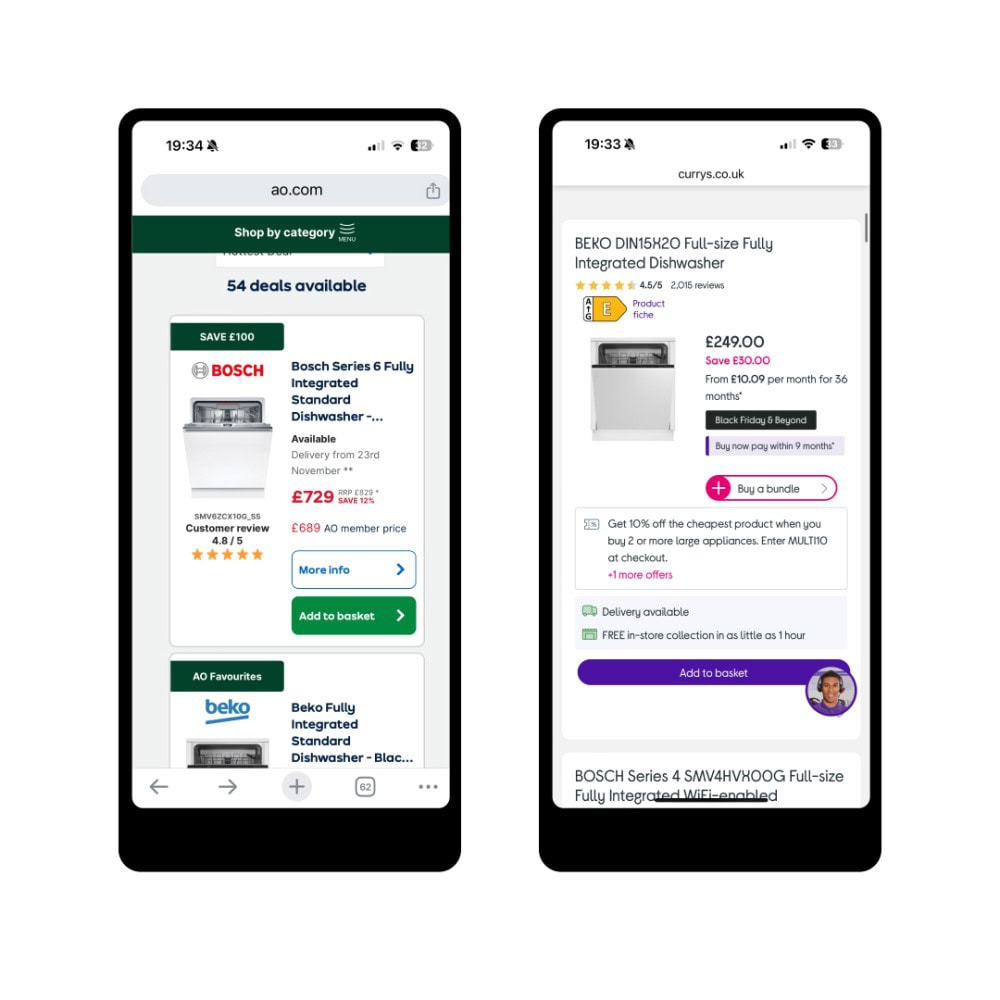
AO have prioritised making everything smaller, to allow another product card to be in view in the product listing. They’ve minimised much of what is shown on desktop, so I applaud them for focusing on a mobile first approach. However, in doing so, they have missed off the energy rating, which is only seen once you click through.
This adds friction to the buying journey, as you need to click through to see the rating, and if it’s a D for example and you want something higher rated, you have to return to the product results page and try your luck with the next one.
Their product filter bar didn’t provide an option to filter by energy rating either, something it does provide on desktop.
Currys on the other hand, remove the brand logo on the mobile card (as the brand name is in the product title anyway). They also included the words Full Size in the title, and include a visual to show the product’s energy rating – saving me from having to click through to unsuitable products.
This meant that as the frugal person I am, I can easily scan through the list and see price, brand, size and energy rating before clicking.
Currys also includes a product filter for energy rating on mobile. So for speed and simplicity, I can filter all the products with A ratings, see the price and quickly change the filter to include B and C ratings, which are more inline with my kind of budget!

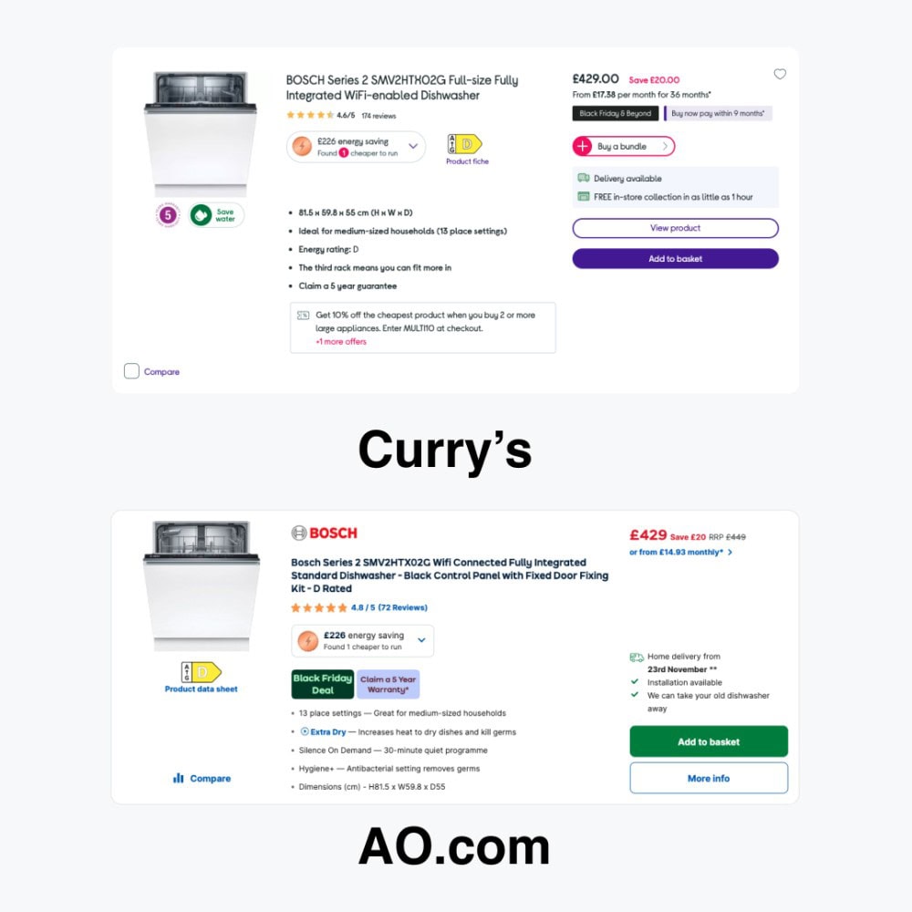
Shown above are the desktop versions of the product tiles. You can see that AO has the energy rating, which is not shown on their mobile view. You can also see what other information is excluded when compared to the mobile experience.
There is so much important information to share with users, and my buying requirements are no doubt different from others, so what do you prioritise?
Ideally, the content experience should be the same across mobile and desktop. I assume that both Currys and AO are user testing, to understand their audiences better, so how they display this information is likely to change constantly.
However, compared to so many retailer, both are doing a great job of squeezing all that important product information into such a small space, so they are great examples to take inspiration from.
Regardless of whether you sell online or not, or are a product based or service based company, you might still use a similar card or tile format on your website.
If you do, take a step back and see what information is actually present on mobile and desktop.
Commonly they will contain a text box and a price where available, but how many are displaying the main USPs and product attributes, or displaying as well on mobile as they do on desktop?
We’ve recently been auditing a website that sells hot tubs, and buyers of hot tubs have completely different informational requirements to someone who wants a dishwasher. There is no silver bullet or template to deploy unfortunately.
But you can focus on what your customer expects to see, ask your sales team what are the core reservations or questions, and place the answers on the product tile.
For example, for hot tubs, power (i.e. 13amp or a 32amp) is something that is critical for those purchasing to know. As it will dictate whether they need to carry out further electrical works to have a hot tub installed or to replace the one they currently have.
Could the category be easier to see, would a sub category benefit the user, or things like product dimensions, the brand logo or even the energy consumption?
Ultimately, there can be so many features and pieces of information to get across, and it is the job of your designer to make this happen. By starting with a mobile first approach, you can create the best experience for users, so it is parallel to the one they get on desktop.
Now I’m off to scrub dishes, as the dishwasher has not been delivered yet.
That’s a wrap for Swipe & Deploy 068 this week. Join me next time where I will share another insight or inspiration piece from around the web.

If you’d like to learn more about our WordPress & WooCommerce Support & Maintenance plans, drop us an email or give James a call.
Our plans provide a holistic solution to your website’s performance, reliability and security, and are inclusive of premium tools and services.
Could adding verification by industry experts help build trust with your users, in a world where so much content is AI slop?
James Coates
A recent addition to the Oh Polly website went viral, and prompted this week's Swipe & Deploy. Could your brand take inspiration from Oh Polly for your own website?
James Coates
A look at how adding functionality for users to save their basket can remove friction and improve your chances of a sale.
James Coates