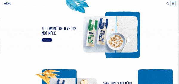
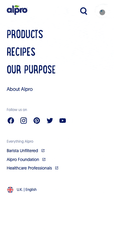
Full Page Takeover Navigation Menus
A look at making navigation menus more engaging and content-rich to improve user experience, using Alpro as a great example.

Oops! We could not locate your form.
A look at making navigation menus more engaging and content-rich to improve user experience, using Alpro as a great example.
Short and sweet this week like a Barista Almond milk flat white.
Whilst browsing the Alpro website (which is really slick by the way. Subtle interactions, transitions and awesome branding – worth a look just for some creative inspiration), I was wowed by its full-page navigation menu.
I’m not usually an advocate for using burger menus on desktop, as they can add unnecessary clicks for users and cause frustration in having to wait as they move between pages.
However, I love how Alpro have executed a ‘mega menu’ style full-page navigation.
They have used the available space to provide key options for their users as they choose between products, recipes, or company information.
The products menu also provides options for ingredients used, as their customers won’t tend to buy across all of their product ranges. They’ll usually prefer a specific dairy alternative like almond milk or soya, so would want to shop that particular range or matching recipes. This takes an extra step out of the user journey, by removing the need to go via a landing page.
As with all responsive websites and mobile-first design, you add all of the bells and whistles to the desktop view, where you have more real estate to play with. You can allow additional branding and creative elements to play their part, whereas on mobile the focus is on getting the important information across clearly.
However, on the Alpro website the ingredients area that is seen on the desktop version of the menu, is also on the mobile menu, and appears once the product tab is clicked. A horizontal slide menu comes into play. I call these thumb slides, and these are very familiar to users nowadays. Some content is hidden, and the user slides their thumb across to reveal it. It is very popular in mobile apps, and is now becoming widely adopted on websites too.
More consideration of navigation menus. Are you just using a bog standard menu or could you be exploring further options to improve user experience?
As mobile navigations tend to be off the canvas, more is being developed to allow the implementation of imagery and additional functionality. We are seeing this applied far more, especially on mobile.
Whilst desktop mega menus have been around for an age, the ability to edit and control the content within them isn’t always straightforward.
Explore what improvements can be made to navigation menus to make them more engaging and content-rich, but also focus on how you can manage the content inside of them as the menu items change throughout the life of the website.
I’d love to explore other navigation menus whether mobile or desktop that made you go WOW. Drop me a message with any that have caught your attention.
That’s a wrap for Swipe & Deploy #7. Join me next week when I’ll share another insight or piece of inspiration from around the web.
A look at internet Easter Eggs, and how you could incorporate a fun Easter Egg on your website.
Data data data, we cannot get enough of collecting data. But now we have so much of it, what do we do with it?! How can it be presented to the world to see?
Could adding short autoplaying videos to your product and service pages help capture user attention and boost conversions?