Filtering Content On A B2B Lead Generation Website
Filtering for more relevant results isn’t just for eCommerce websites. It can also improve the user journey on B2B websites.

Oops! We could not locate your form.
Filtering for more relevant results isn’t just for eCommerce websites. It can also improve the user journey on B2B websites.

Here’s a question worth sitting with for a moment. If a prospect landed on your website right now, could they find what’s relevant to them within the first 30 seconds?
For most B2B websites, the honest answer is probably a no, and that’s an increasingly costly problem.
Modern B2B buyers are self-directed researchers. According to 6Sense’s 2025 Buyer Experience Report, buyers now complete around 60% of their journey independently before they engage with a vendor, forming shortlists, developing preferences, and often making preliminary decisions before a sales conversation even begins. Your website isn’t just a brochure. For a lot of your prospects, it’s the first part of their relationship with you.
If the content on your site doesn’t speak clearly to who they are and what they need, they’ll leave, and without telling you why.
On websites with large service offerings or product catalogues, or for those who work across an array of industries, it can be a challenge for users to self-define what products or services are relevant to them.
Go to almost any eCommerce website, and you’ll find filtering as standard. Choose your category, your size, your price range. Within seconds, the catalogue has reorganised itself around your needs. The irrelevant has been stripped away, and what remains feels curated for you.
Now visit a typical B2B website serving multiple industries. You’re often greeted with a wall of services, a navigation structure built around the business’s internal logic rather than the visitor’s goals, and content that isn’t differentiated by who you are or what challenge you’re facing.
It’s a strange inconsistency. The filtering behaviour that eCommerce has mastered, helping users self-select into relevance, is almost entirely absent from B2B website design, despite the fact that B2B buyers have a far greater need for it. They’re making larger, more complex decisions, often on behalf of multiple stakeholders, and they’re doing most of that evaluation before they speak to anyone.
The fix isn’t complicated. It’s applying the same logic to the B2B context, giving users control over what they see based on who they are.
There are a few different ways to implement this, ranging from lightweight to more sophisticated.
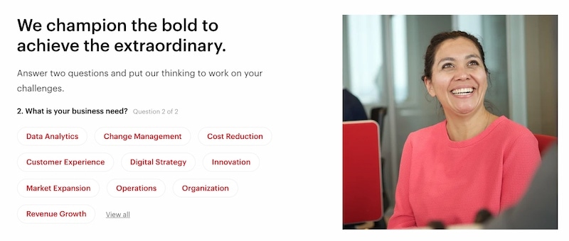
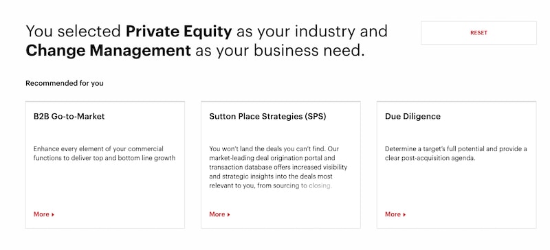
Consultancy giant Bain & Company have a broad service offering and deep navigation. But they also have what you could call a content personalisation wizard on their homepage. Before showing you their services or resources, the wizard asks two simple questions:
Based on your answers, it surfaces content that’s directly relevant to your situation, such as case studies, solutions, and thought leadership pieces, filtered to match your interests.


It’s a smart approach for a business with a genuinely broad service offering. Rather than asking visitors to navigate a deep, complex structure and hope they find what’s relevant.
If you have a lead generation website, you might be wondering if this is a high-tech piece of wizardry. Well actually, as long as your pages are set up in categories or have tags associated with them, they can be filtered in a similar way to how you would filter blog posts or case studies.
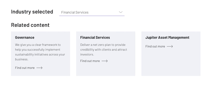
For businesses with a slightly narrower or more defined offering, a simpler industry selector can achieve much of the same effect. The user picks their sector, say, manufacturing, and the page reorganises to show the content, case studies, and solutions most relevant to that category.
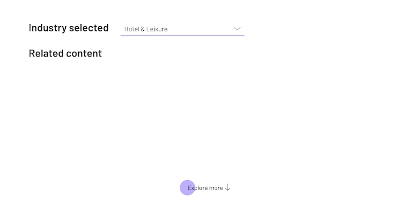
Carbon Intelligence use this approach, that you can see below. With a simple selection from the industry tab, you can display the related content.


This is easier to implement and lower friction for the visitor. No multi-step wizard required, just a single selection that makes the experience feel immediately more relevant. This is the same filtering method, done on a smaller scale.
Both approaches work on the same underlying principle. That content already exists on your site in relevant categories and with relevant tags. The filtering interface is simply a front end that lets users navigate to it more intuitively, rather than hunting through a standard navigation or pagination.
The case for content filtering on B2B websites has strengthened considerably in recent years, for a few interconnected reasons.
B2B Buyers Expect Personalisation – According to a Forrester study for Adobe, nearly 60% of B2B customers expect fully or mostly personalised content when researching a product or service, and 66% expect it at the point of making a purchase decision. A website that treats every visitor identically is falling short of what buyers now consider standard.
The Buying Group Is Getting Larger And More Complex – 6Sense’s 2025 research shows the average buying group for complex B2B solutions now involves around 8 stakeholders, and those stakeholders often come from different departments with different priorities. A CFO visiting your site needs something different to a Technical Director or an Operations Manager. A filtered content experience lets each of them find what’s relevant to their role and concerns (if that content exists, or is it a gap you need to fill?).
The Cost Of A Poor Experience Is Invisible But Real – Between 10% and 60% of website visitors will leave a site if they can’t find the information they’re looking for within 15 seconds. For B2B sites with complex offerings, that number will skew towards the higher end. The prospect doesn’t call to complain. They simply move on to the next option on their list.
The Research Phase Is Where Decisions Are Shaped – Buyers spend the majority of their independent research phase creating a shortlist and forming a preferred vendor. This is well before anyone picks up the phone. If your website fails to communicate relevance to a particular industry or challenge during that phase, you may never get the chance to correct the impression in a sales conversation.
Not at all. The principle scales.
At its most sophisticated, a content personalisation system like Bain’s requires investment in UX design, category architecture, and development. But the underlying mechanism, which is content tagged by industry or challenge type, that is surfaced via a filtering interface, can be implemented at a much smaller scale.
If you run a WordPress website and your case studies, services pages, or blog posts are already organised using categories or tags, you’re closer to this than you might think. Building a simple industry selector that filters existing content is well within the scope of a straightforward WordPress development project. You don’t need to build Bain’s wizard to deliver a meaningfully better experience than most of your competitors.
Even a modest version, like a clearly signposted ‘I work in [industry]’ prompt that reorganises your resources and case studies accordingly, can have a significant impact on how quickly relevant visitors find their footing on your website.
Before you build any filtering interface, the content architecture underneath it needs to be solid. A few things to consider are:
Tag and categorise with the visitor in mind, not your internal structure – The most common mistake is organising content around how your business thinks about its services rather than how your visitors describe their challenges. Wherever possible, use the language your buyers use.
Make sure there’s enough content in each category to make filtering worthwhile – A filtering system that surfaces two pieces of content for a given sector will feel underwhelming. If your content library is thin in certain areas, that’s an argument for creating content before building the filter.
Keep the friction low – The goal is to help visitors self-select, not to interrogate them. A simple industry or challenge selector should take a single click. Multi-step wizards can work (as Bain demonstrate), but only when the depth of the service offering genuinely warrants the complexity.
For WordPress-based B2B websites, this type of functionality is very achievable without super heavy custom development.
WordPress’s native categories and tags, combined with a custom post type structure (for services, case studies, or resources), provide the underlying data layer. Then your developers can build a filtering interface that can surface content dynamically based on user selection, without page reloads that interrupt the experience.
For more sophisticated implementations like multi-step wizards, role-based personalisation, or content that adapts based on returning visitor behaviour, custom development will gives you exactly what the experience requires. This is particularly worth considering for businesses with genuinely complex offerings where the default navigation is struggling.
You may be thinking “whoop dee doo Basil, but what does it all mean?” (10 points if you can tell me what film this quote is from).
The reason this works isn’t magic. It’s the same reason Amazon’s recommendations feel useful and most B2B content libraries feel exhausting to navigate. When content is presented in a way that acknowledges who you are and what you need, the cognitive load drops. The site feels like it’s working with you rather than asking you to work for it.
If you operate across multiple industries, serve multiple buyer personas, and have products or services that aren’t all relevant to all of your visitors, then this can help your users discover content relevant to them faster. Funnelling them down into the journey you want them to take.
Content filtering is one of the most underused tools available for improving the website’s performance as a lead generation asset. The technology is straightforward. The impact on first impressions, time-on-site, and enquiry quality can be significant.
We work predominantly on B2B websites, and complex navigation structures are always a challenge. Filtering in this way can provide a solution to our quest to make websites easier to use.
If this intrigues you and you might be wondering how it could work on your website, drop me a message. I’ll happily take a look and provide some ideas and suggestions.
That’s a wrap for Swipe & Deploy #18. Join me next week when I’ll share another insight or piece of inspiration from around the web.

If you’d like to learn more about our WordPress & WooCommerce Support & Maintenance plans, drop us an email or give James a call.
Our plans provide a holistic solution to your website’s performance, reliability and security, and are inclusive of premium tools and services.
Could adding verification by industry experts help build trust with your users, in a world where so much content is AI slop?
James Coates
A recent addition to the Oh Polly website went viral, and prompted this week's Swipe & Deploy. Could your brand take inspiration from Oh Polly for your own website?
James Coates
A look at how adding functionality for users to save their basket can remove friction and improve your chances of a sale.
James Coates