Create Such A Great Experience, Your Users Will Eat Humble Pie
Creating a great user experience can be one of your greatest USPs, ensuring that even if tempted away, customers will always return.

Oops! We could not locate your form.
Creating a great user experience can be one of your greatest USPs, ensuring that even if tempted away, customers will always return.

I order a weekly food shop from Asda via their app or website, but mostly via their app. I have been a customer for over 3 years. My orders are always delivered, as Asda is a little too far for me to drive to for click-and-collect.
Recently Asda’s picking quality has become, well, awful. Food often arrives with an expiry date the same as the delivery date or the day after.
The process is that you should check it at the front door and if it’s wrong, hand it back. This makes for a frustrating experience because you feel like you need to go out and pick and buy your shop yourself.
When a driver arrived recently it was pouring down with rain, so we bundled everything in the house to avoid the driver getting too wet, but this meant failing to check the dates of the items.
So once the driver was gone and we were loading things into the fridge, we spotted some very short dates and raised them immediately with Asda via the app. Usually, they are very good with this, but on this occasion, they refused.
Long story short, I felt that I’d had enough of having to raise items weekly, and was going to try Sainsbury’s.
I usually order on a Saturday for Sunday delivery with Asda, so expected to be able to do the same with Sainsbury’s. However, I couldn’t get a delivery slot, only click and collect.
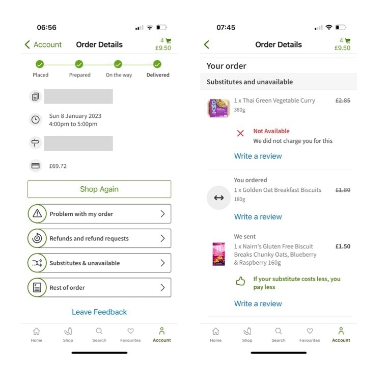
Asda usually informs you upfront and itemises what substitutions are included in your shop and anything that is missing. Sainsbury’s did this on a PDF receipt, but not in a digital way for you to tap and explore.
I handed back the subbed items to the driver at the store and I thought that was it.
Sadly I was still charged for these substituted items, or the receipt failed to update to show them as not being accepted. Within the app itself, there wasn’t a way to view the actual order like there is on the Asda app. I had to complete a long form or call a number.
I opted to call the number and was told that they had to raise this and confirm that it was the case with the store. As a customer, I don’t want to have to be doing this every week, if this is their refund process every time.
I swallowed the loss and have now gone back to Asda with my tail between my legs, and that I need to be slightly hotter on dates when I take in a delivery.
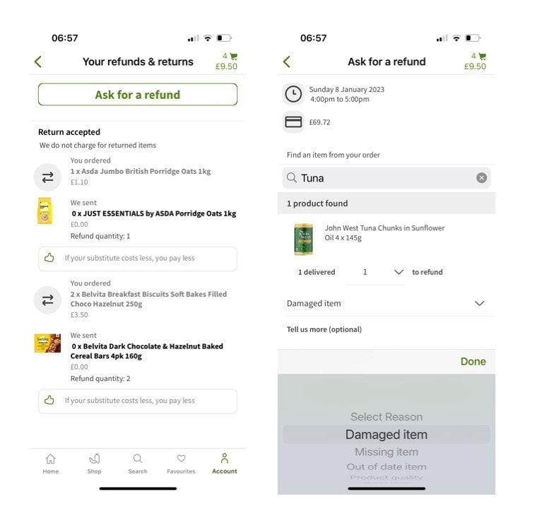
Asda’s app allows you to easily see your entire order, and they allow you to quickly see any substitutions or unavailable items. These are clearly itemised and not just in a PDF.

By clicking on the refunds and requests button, you can quickly search for the item, list what the issue was, and add multiple items to a request. You can do this after the driver has left, and you don’t need to call them. It takes under 60 seconds to complete.

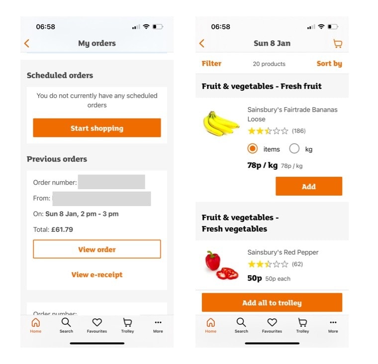
Sainsbury’s digital experience is far less streamlined and user-friendly. When clicking on orders, my expectation is to get a similar experience to that of Asda, but that is not the case.
To see the order so I could scroll through all the items and see what wasn’t actually available, I needed to download a PDF. Further to that, when I clicked view order, my expectation was to be able to see the substitutions and returns, but instead the items appeared like I was creating a new order from the previous shopping list.

My experience with Asda with short dates created a pain point for me. However, that is likely an issue for all supermarkets and one they will all have to work on improving.
How Asda choose to handle issues is second to none. I now wouldn’t trade the time and hassle I save, leaving to use a competitor. My pain point is now a process where I will ensure to check dates upon delivery and accept that on occasion there are some items I will have to go and out and buy.
If you make your website and buying journey easy and seamless, it makes it hard to replicate. Our mission at Impact is to Make Websites Easier For Everyone, and this is a great example of how providing an easy-to-use experience can become one of your greatest USPs.
Food for thought – sometimes you need to let customers leave to experience what it’s like on the dark side. If you have created an easy-to-use experience, they’ll come back and eat that humble pie. In that process, you will have no doubt gained a customer for life.
If you have a WordPress or WooCommerce website or are looking to move to WordPress, we can help. UX underpins every single website we design and build. Get in touch to see how we can help make your website redesign deliver on user experience.
That’s a wrap for Swipe & Deploy #26. Join me next week when I’ll share another insight or piece of inspiration from around the web.


Whether you are visiting a theme park, zoo or any other type of visitor attraction, there's usually some form of map that customers can download from the attraction's website, that details how they can get around on the day.
 James Coates

Whether you're in the 'it's ok to put up your decorations in November' camp or strongly feel that 'December is the date for Christmas decorations', your website is another place that can be decorated with festive touches. If you want to start in November, we won't judge!
 James Coates

For publishers and websites that rely on advertisement money to support their commercial income, browser AdBlockers, privacy specialist browsers and rejecting Cookie Consent issues can cause an absolute nightmare.
 James Coates