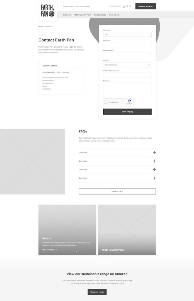
Simple UX Tips To Improve Your Contact Page And Increase Conversions
Conversion optimisation can be as simple as improving your UX. These 5 tips improve experiences while building a better funnel.

Oops! We could not locate your form.
Conversion optimisation can be as simple as improving your UX. These 5 tips improve experiences while building a better funnel.
We live in an age of lead generation. The more you’re able to connect initial marketing touch points to actual conversations with your audience, the more likely you’ll be able to eventually turn them into long-term customers.
That’s especially true in the B2B space, where personal attention is especially valuable in the buying journey. Yet, too often, your audience goes through the familiar process:
Chances are you don’t want that to happen. The sticking point, then, is obvious. If you already have an existing marketing strategy, look to your contact page to close the deal. It’s not like any other page on your website. It needs to be easy to use, convincing, and ready to help your audience convert.
That sounds complex. It doesn’t have to be. Consider these 5 ways to increase conversions on your contact page, all in the name of user experience.
The right UX starts with the right layout. When your audience first visits your page, what do they expect to see at first glance, and what can wait?
Heads up. The form itself probably shouldn’t be the attention-getter.
It’s the final step you want them to take, which means that other content has to come first. Yet, you also don’t want to lose the form altogether for those who already know the step they want to take.
Most times, that means placing the form at the top right of your page. Doing so leaves you enough space for a compelling headline, a great visual, and some extra content (more on that later) for your audience sees first. That takes into account the Z-shaped pattern in which people consume web content.
Let’s hone in on the form itself. Especially if you’re asking for more than just three or four fields, it’s tempting to go to multiple columns. After all, it can help you ensure that your forms don’t get nearly as long and don’t take up as much space on the page.
Unfortunately, that’s a misconception. Multi-column forms are prone to misinterpretation, causing users to frequently miss fields.
Instead of going back to correct their mistake, many of them leave out of frustration. Those who don’t take longer to fill out the form, which tends to lead to fewer conversions.
The fix is simple. Keep your contact forms to one column, and don’t stray from that rule. That alone can improve UX and drive conversions.
You want to know as much as possible about your audience. That’s natural. But you don’t have to let them know that. Yes, it might be helpful to know your visitor’s business size, job title, and three types of contact information. But asking for too much can feel invasive, and create concerns around trust.
Wouldn’t a name, email address, and company name be enough? You can learn everything else through your initial conversation, their website, or LinkedIn.
Research supports cutting the clutter. Contact forms perform best when you keep them shorter. Any more, and you’ll drive users who just have some introductory questions about your company away. Lead quality desired will also dictate the length.
Don’t rely on the fact that your website users know you enough to want to learn more by parting with their data. Instead, give them a reason to contact you.
Content is key for effective contact pages, and testimonials can make a big impact. Consider anything from product reviews to expert analysis. You can use simple text, images, or integrate videos that relay the same message.
We’re psychologically predisposed to trust the advice of others, and you can leverage that trust if you know which testimonials to feature. Of course, that doesn’t mean testimonials should overtake your other content. Don’t let them push down your contact form.
Instead, use them as a sprinkling to support your own copy and to make sure that you’re not the only one touting your brand, products, or services.
Finally, never underestimate the importance of optimising your contact pages for mobile users. A report last year showed that 57% of internet traffic now comes from mobile devices. In the U.K, 48% of devices now used to access the internet are smartphones, with another 15% accounting for tablets.
Is your website and more importantly your contact form ready for that fact? It better be.
That means responsive design and a form that’s just as easy to find and fill out on a 4-inch phone touchscreen as it is on a 21-inch desktop monitor. Responsive design is no longer optional. It’s necessary for usability and to get conversions.
Part of that conversion optimisation means accounting for scenarios in which your audience wants to talk, but is not ready to hand out their contact info.
That means not just listing your phone number on the page, but also making it so that a user can call you right from their device with the push of a button. Every aspect of the process should be as easy on a mobile device as it is on a desktop computer.
None of these tips is exceptionally difficult to accomplish. Some, however, require a bit more work and expertise than others.
Sure, you can easily reduce the number of form fields. But do you know how to build a responsive contact form, or condense your form into one column?
Fortunately, you don’t have to. Improving your contact page to get more conversions can be as simple as a few minor tweaks, or as complex as redesigning the layout of the entire page. No matter your needs, we can help.
Our expertise in building WordPress websites is a perfect match for B2B marketers looking for better ways to guide their audience through the funnel.
Let’s chat about how we can work together on improving the ways you engage with your audience through your website.
If your business operates in the US you may have heard of ADA Compliance.
Can you dance? I certainly cannot! Well, standing in a crowd listening to house music with my disco arm going ...
A look at internet Easter Eggs, and how you could incorporate a fun Easter Egg on your website.