
logo

WordPress Design Agency

020 3355 8747

Message Us
  • Home
  • About Impact®
    Learn More About Impact Media®
    • Meet The Team
       
    • Why WordPress
       
    • Careers
       
    • Giving Back
       
    • 100K Tree Challenge
       
    James Coates
    Schedule a discovery call with UX Specialist James
    Book A Call
  • WordPress Services
    Learn More About Our Services
    • WordPress Web Design
       
    • UX Design
       
    • WordPress Development
       
    • WordPress Support & Maintenance
       
    • WordPress Evolve Retainer
       
    • WordPress Multisite Development
       
    • WooCommerce
       
    • Replatform To WordPress
       
    • WordPress Consultancy
       
    • Integrations & Plugins
       
    • WordPress Managed Hosting
       
    • WordPress Health Check
       
    James Coates
    Schedule a discovery call with UX Specialist James
    Book A Call
  • Our Process
  • Case Studies
  • Insights
  • Contact Us
WordPress Design Agency
020 3355 8747
logo logo
Book A Call
Back
Menu
  • Home
     
  •  
    About Impact Media
    Learn More About The Impacters
    • Meet The Team
       
    • Why WordPress
       
    • Careers
       
    • Giving Back
       
    • 100K Tree Challenge
       
  •  
    Our Services
    Discover How We Can Help
    • WordPress Web Design
       
    • UX Design
       
    • WordPress Development
       
    • WordPress Support & Maintenance
       
    • WordPress Evolve Retainer
       
    • WordPress Multisite Development
       
    • WooCommerce
       
    • Replatform To WordPress
       
    • WordPress Consultancy
       
    • Integrations & Plugins
       
    • WordPress Managed Hosting
       
    • WordPress Health Check
       
  • Our Process
     
  • Case Studies
     
  • Insights
     
  • Contact Us
     
020 3355 8747
Mon - Fri • 9am - 5pm
Close

Oops! We could not locate your form.

Home / Insights / Balancing Form And Function – The Foundations Of Good Web Design
Back

Balancing Form And Function – The Foundations Of Good Web Design

Published 17.09.24
17th September 2024
Last Updated 12.06.25
12th June 2025

Newer
10 Min Read
Joe Dawson
Joe Dawson
Web Design
Older
10 Min Read
 
Joe Dawson
Joe Dawson
 
Web Design

Explore the key elements of successful web design. From user experience to accessibility and functionality, discover how good design impacts website success.
Design is all about aesthetics right? So surely it’s all about having an attractive design?

Not exactly. Good design balances form and function. So whilst visual design appeal is an important part of good design, it is just the surface level.

Think of a building exterior that looks finished and attractive, but once you step inside, the layout is confusing, the doors are in the wrong places, the floor is slippy, and the lift doesn’t work.

A well-designed website is much more than a pretty interface. While aesthetics are important, the true foundations of good web design go deeper, focusing on user experience, accessibility, functionality, and responsiveness. Good design can dramatically impact the success of a website.

Five Foundational Elements Of Great Web Design

Whether you’re creating a personal B2B brochure website, a SaaS sales platform, an eCommerce store, or a corporate site, understanding and prioritising these core principles ensures that your website delivers value, engages visitors, and achieves your business goals.

Here are five foundational elements that every website should prioritise to ensure long-term success:

  1. User Experience: Prioritising user experience and ensuring that function drives design, you create a website that not only looks appealing but also serves its purpose effectively.
  2. Accessibility: Design with inclusivity in mind, making your site usable for people with disabilities by adhering to accessibility standards.
  3. Mobile Responsiveness: Ensure your site looks and functions well on all devices, from desktops to smartphones.
  4. Intuitive Navigation: Make it easy for users to find what they’re looking for with clear, straightforward menus and links.
  5. Visual Appeal: Creating a first impression that keeps users interested in learning more about your business.

Now let’s look at each of these in further detail.

1. User Experience (UX): Prioritising Function Before Aesthetics

While visual appeal is important, it should never come at the expense of functionality and the experience of the user. At the heart of good web design is a focus on the user. A beautifully designed site that frustrates or confuses users won’t deliver results.

When designing a website, the user’s journey and the site’s overall functionality and experience should always come first.

User-centered design means creating a website that meets the needs, preferences, and behaviours of your target audience. This involves understanding who your users are, what they’re looking for, and how they interact with your site.

Here are some ways to prioritise function:

  • User-centered design: Focus on who will be using your website and design with their needs in mind. Consider their goals, pain points, and the actions they’re most likely to take. A website that aligns with user expectations will keep them engaged and lead to better conversions.
  • Clear calls to action (CTAs): Every page should guide visitors towards a specific action, whether it’s making a purchase, signing up for a newsletter, or contacting your team. These CTAs need to be prominent and easy to engage with.
  • Fast load times: A slow-loading site can frustrate users and lead to high bounce rates. Optimise your website’s speed by minimising code, compressing images, and leveraging caching techniques.
  • Logical user flow: Each part of your website should be designed to guide users smoothly from one action to the next. Whether they are navigating product pages or reading a blog, the user experience should feel intuitive and intentional.
  • Feedback and interactivity: Interactive elements, such as hover effects, animations, or pop-up messages, can enhance the user experience when used correctly. Providing feedback, such as visual cues when a button is clicked, helps users understand their actions and makes the site feel more responsive.

Design should serve the site’s purpose, not distract from it. Functional websites keep users engaged, help them achieve their goals, and increase the likelihood of conversion.

2. Accessibility – Designing for Everyone

Web accessibility means ensuring that your website can be used by everyone, including people with disabilities. It’s not just a legal or ethical responsibility, but it also opens up your site to a broader audience, ensuring inclusivity.

Accessible websites accommodate users who may rely on assistive technologies like screen readers, keyboard navigation, or voice commands. Some key principles include:

  • Keyboard navigability: Ensuring users can navigate through the site using a keyboard alone, without relying on a mouse.
  • Clear content structure: Using proper heading tags (H1, H2, H3, etc.) helps users, including those with disabilities, navigate content more easily.
  • Readable fonts and colours: Contrast between text and background should be strong enough for all users to read comfortably.
  • Alt text for images: Descriptive text for all images so that users with visual impairments can understand what’s being displayed.
  • Accessible forms: Ensure all form fields are properly labeled, with clear instructions and error messages that are easy to understand.
  • Skip navigation links: These allow screen reader users to bypass repetitive content and go directly to the main content of the page.
  • Responsive design for assistive technology: Make sure that your site works well with different assistive technologies, such as screen readers and voice recognition software.
  • Video and multimedia accessibility: Offer captions or transcripts for video and audio content so that users with hearing impairments can fully engage with the material.
  • Accessible PDFs and documents: Ensure any downloadable files, like PDFs, are accessible with readable text, alt text for images, and proper formatting for screen readers.
  • Focus indicators: Highlight elements (like buttons and links) when they are selected via keyboard navigation, allowing users to understand where they are on the page.

By designing with accessibility in mind, you create a more inclusive experience for all users, and don’t risk alienating a portion of your audience.

Why would you overlook such a large portion of your target audience by building sites that aren’t easily accessible for users with a range of needs and abilities? What could that represent in lost business?

3. Mobile Responsiveness – Optimising for Every Device

With the majority of web traffic now coming from mobile devices, ensuring your site is mobile-friendly is no longer optional, it’s a necessity. Mobile responsiveness means that your website automatically adapts to fit the screen size of any device, whether it’s a smartphone, tablet, or desktop.

Some key aspects of mobile responsiveness include:

  • Flexible layouts: A responsive design ensures that images, text, and buttons adjust seamlessly to different screen sizes.
  • Readable fonts and tappable buttons: On smaller screens, font size must be large enough to read easily, and buttons should be easy to tap without zooming in.
  • Optimised images and load times: Mobile users expect fast loading times. Optimising images and code helps ensure that your site loads quickly on any device, preventing visitors from bouncing.

Mobile responsiveness also impacts your site’s SEO ranking, as Google uses mobile-first indexing, meaning it primarily evaluates the mobile version of your site to determine where it ranks in search results.

4. Intuitive Navigation – Guiding Users Seamlessly

Navigation is one of the most critical aspects of a well-designed website. Visitors should be able to find what they’re looking for quickly and easily, without needing to search through endless menus or click on confusing links.

To create intuitive navigation:

  • Clear, concise menus: Your website’s menu should be straightforward and organised logically. Stick to common terms like “About,” “Services,” or “Contact” to avoid confusion. Limit the number of main menu items to the most important categories.
  • Search functionality: Especially for larger websites, having a search bar is essential. Make sure the search feature is easy to find and provides relevant results.
  • Breadcrumbs: This type of secondary navigation helps users understand their location within the site’s hierarchy and allows them to navigate back to previous pages easily.
  • Consistent placement: Keep navigation elements, such as menus and CTAs, in consistent places throughout the site. Users don’t want to hunt for the menu on each new page.

The easier it is for visitors to navigate your website, the longer they’ll stay, and the more likely they are to take action.

5. Visual Appeal – Creating a Memorable First Impression

First impressions matter, and your website’s visual design plays a significant role in capturing attention and keeping visitors engaged.

While functionality and user experience are crucial, visual appeal plays a significant role in capturing your audience’s attention and creating a memorable first impression. A well-designed website should be aesthetically pleasing, reflecting your brand’s identity and values. The visual elements on your site should enhance the user experience rather than distract from it.

To create a visually appealing design:

  • Consistent Branding: Use your brand’s colours, fonts, and imagery to create a cohesive and recognisable look that reinforces your identity across all touch points. Consistency builds trust and recognition with your audience.
  • Whitespace: Don’t overcrowd your pages; whitespace helps to create a clean, organised layout that is easy on the eyes. A good use of whitespace, or empty space, between design elements helps prevent clutter and gives your content room to breathe. It also creates a sense of balance that makes your website easier to read and navigate.
  • High-Quality Imagery & Media: High-quality images, videos, and graphics can elevate the visual appeal of your site. Be sure to choose media that is relevant to your brand and message, while ensuring it doesn’t negatively impact site performance through slow load times.
  • Typography: The right font choices can have a significant impact on the overall look and feel of your website. Use typography that is easy to read but also aligns with your brand’s tone—whether it’s modern, classic, playful, or serious.

 A visually appealing website draws users in and creates an emotional connection. While function should always take priority, design aesthetics should complement and support your website’s usability, creating an experience that’s both beautiful and effective.

Balancing Form and Function

The foundations of good web design lie in the balance between aesthetics, usability, and accessibility. A website that looks great but doesn’t perform well will miss its mark. On the other hand, a purely functional site that lacks visual appeal might not engage users as effectively.

By prioritising accessibility, mobile responsiveness, functionality, and intuitive navigation, you ensure that your website delivers a seamless, enjoyable experience for all visitors. When these foundational elements are in place, you can then layer in aesthetics that complement and enhance the overall design, creating a website that not only looks beautiful but works beautifully, too.

At the end of the day, good web design is all about creating an experience that helps your audience connect with your brand—and drives results for your business.

Beginning A Website Redesign?

A website redesign is more than an opportunity to refresh your website’s look and improve the user experience. It is your chance to make genuinely impactful changes to your business. Whether that be in terms of leads or sales, or rather in time savings or improvements to key processes.

That is why it is important to find a web designer who is interested in more than just looks.

If you’re planning a website redesign, get in touch with us and we’ll talk you through our process. Let’s build something amazing together!

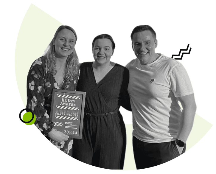
Impact team at UK Dev Awards

Is It Time For A Website Redesign?

If you’d like to learn more about our website redesign approach and if it could be a good fit for your business, drop us an email or give us a call.

Share Socially
Joe Dawson
Joe Dawson
Head of Digital
Joe is Head of Digital at Impact. His expertise are UX and design, but he's also a highly experienced web developer. He's been designing and building websites since he was at school. These days he likes to attend as many WordPress conferences as possible, to continuously expand his skills.
View Team Profile
See More Articles
Joe Dawson
Joe Dawson
Head of Digital
Joe is Head of Digital at Impact. His expertise are UX and design, but he's also a highly experienced web developer. He's been designing and building websites since he was at school. These days he likes to attend as many WordPress conferences as possible, to continuously expand his skills.
See More Articles
View Team Profile
Want more control over
how you manage content in WordPress?
Edit content that was previously restricted and get creative with building pages in WordPress.
Let's Chat
studio@impactmedia.co.uk
020 3355 8747
Impact Media's LinkedIn
Impact Media's Twitter
Impact Media's Facebook
Impact Media's Instagram
Impact Media's Youtube
wordpress.org

About Impact

  • About Impact Media®
  • Meet The Impact Team
  • Why WordPress?
  • Our Web Development Process
  • Careers
  • Awards
  • Partners
  • Giving Back
  • 100K Tree Challenge

WordPress Services

  • WordPress Web Design
  • UX Design
  • WordPress Development
  • WordPress Evolve Retainers
  • WooCommerce Development
  • Multisite WordPress
  • Migrate To WordPress
  • Custom Integrations & Plugins
  • WordPress Consultancy

WordPress Support

  • WordPress Support & Maintenance
  • WordPress Managed Hosting
  • Case Studies
  • Insights
  • Contact Us

Addresses

London Address:

50 Liverpool Street,

London, EC2M 7PY, UK

+44 (0) 20 3355 8747


Registered Address:

Woodland Place, Hurricane Way

Wickford, SS11 8YB, UK

  • Privacy Policy
  • Cookie Policy
Impact Media logo
© Impact Media® 2003 - 2026
Impact Media is a trading name of IMDMS LTD. Company Reg. 05970261
Impact® & Impact Media®
are registered trademarks of IMDMS LTD