How To Get Creative & Trim Development Costs
Published 30.09.22
30th September 2022
Last Updated 03.04.24
3rd April 2024

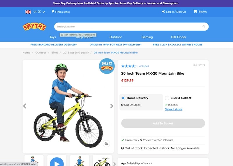
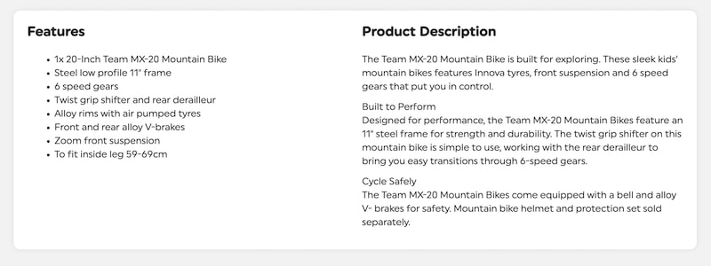
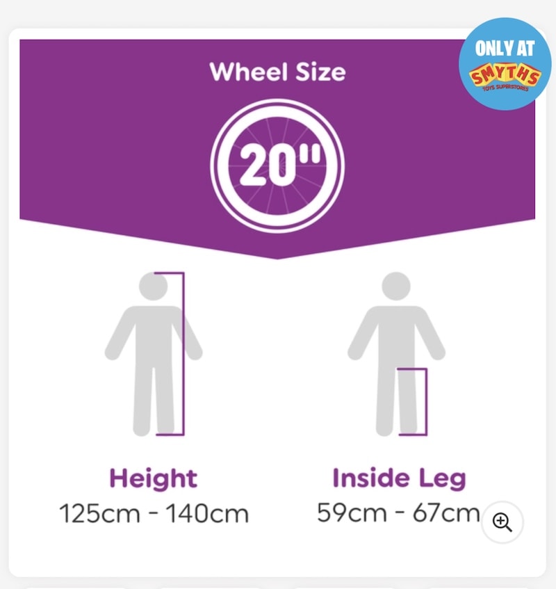
There are creative ways to provide your users with important information that isn’t easily displayed via your current page layouts.