Add Some Fun and Practicality With Custom Cursors
How you can make use of custom cursors to add value and engagement, without it becoming gimmicky and damaging to user experience.

Oops! We could not locate your form.
How you can make use of custom cursors to add value and engagement, without it becoming gimmicky and damaging to user experience.

You’re on a website and the mouse pointer moves and clicks. Yawn! It feels so 1996, but it doesn’t have to.
Cursor controls and changing them is not new in web design. In fact, people have been doing it for years. But striking the balance between being useful when replacing the expected classic ‘pointer’ with some 90’s inspired novelty item is far more difficult.
This week I want to show a few cursor effects that make the browsing experience more engaging, rather than feeling like a silly novelty.
Addressing the elephant in the room, “hello Nellie”. Custom cursors will only display and work when a mouse is used to navigate a website, so on mobile devices where there’s lots of swiping going on, you won’t tend to need cursors.
This is where some of the engaging cursors I have seen play their role. They deliver an experience that uses swiping, but using your cursor, whilst also enabling users to natively click.
Here’s what I mean.
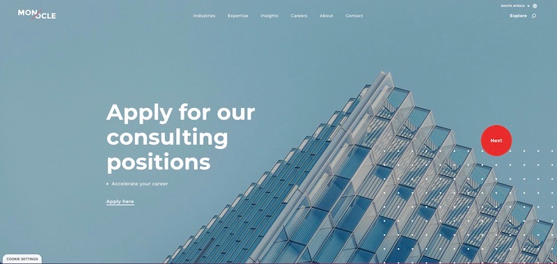
On the Monocle Solutions website when you hover your cursor over the hero area, the cursor changes to a large red circle with either ‘Next’ or ‘Prev’ on it depending on whether you are on the left or the right of the banner.
A left drag whilst clicking will activate the slider to move left, and a click and drag right moves it to the right.
The circle cursor is not used consistently throughout the entire website, just in key areas. This is where typically I feel they can become a novelty and in some cases can be a burden, as some developers add them sitewide. Selecting areas such as links in copy can become challenging when applied in this way.
With the Monocle site, it feels like added engagement, not a novelty.
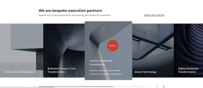
Shown above is yet another example where Monocle has used its cursor further down the page. When you hover over the image tiles they expand in size, the cursor changes, and because it changes colour and size, it captures your attention.
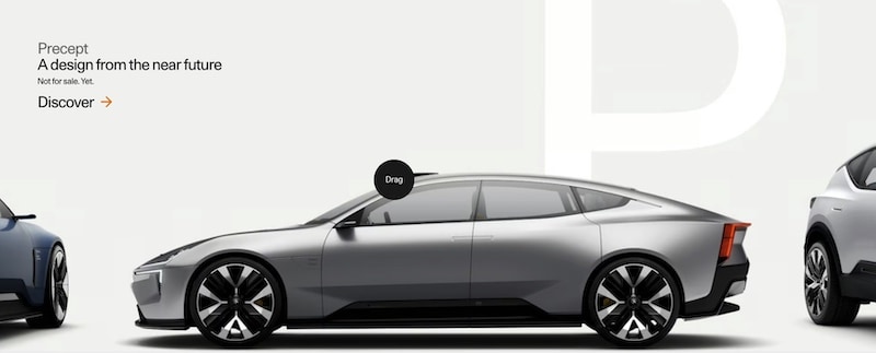
Electric car manufacturer Polestar also uses a custom cursor when users are sliding through their car models. This feature works in tandem with the slick animations of the cars turning as they are being scrolled through.
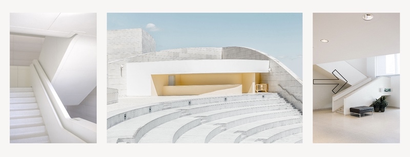

Shown above are demo files from a website inspiration library called CoDrops. There are 5 different demos to share cursor ideas, however, these are the only 2 I feel tick the box for striking that balance I spoke about. They animate or morph, which captures your attention and provides a visual indication of what they do.
From a UX perspective, I disapprove of needing to label something with ‘scroll down’ or ‘drag’ because if you have to explain it, it’s simply not intuitive enough. But using subtle symbols like arrows, or next and previous labels doesn’t annoy me.
Hold your horses and take time to consider the usability of the website and an area where you feel a custom cursor would work, and actually add value. Remember doing this too much on the website can be annoying and frustrating, so select key sections or areas in which to utilise it to good effect.
Monocle only really uses their circular cursor on their homepage, as a gateway page to provide a memorable experience perhaps. If it was everywhere it might lose its impact.
If your website has a high percentage of traffic coming from mobile devices, then the chances are, any changes won’t get noticed anyway. Just you in your office at your desk 🙂
So the key takeaway is to get the balance right and try to avoid using gimmicks or novelty cursors. Unless of course, you’d rather have a 90s-inspired cursor effect, in which case, you should check out Tholman’s Github account where you can view and use that very thing.
That’s a wrap for Swipe & Deploy #34. Join me next week when I’ll share another insight or piece of inspiration from around the web.

Whether you are visiting a theme park, zoo or any other type of visitor attraction, there's usually some form of map that customers can download from the attraction's website, that details how they can get around on the day.
 James Coates
Whether you're in the 'it's ok to put up your decorations in November' camp or strongly feel that 'December is the date for Christmas decorations', your website is another place that can be decorated with festive touches. If you want to start in November, we won't judge!
 James Coates
For publishers and websites that rely on advertisement money to support their commercial income, browser AdBlockers, privacy specialist browsers and rejecting Cookie Consent issues can cause an absolute nightmare.
 James Coates