

There are numerous reasons why a website might need to collect address data.
Though it seems like a straightforward process, address collection forms can be a UX minefield. It can become an easy source of frustration or a point of abandonment for users.
So here are 5 tips to improve the experience for users entering their address details on your website.
1. Address Autocomplete
Typing out an address can be time-consuming and even a little confusing depending on the fields available. It can also be the source of data entry errors, which can cause issues further down the line.
Luckily there are a couple of varieties of address lookup and autocomplete tools out there to simplify this process. For both the user and to ensure the accuracy of the data entered. They can be a huge time saver and frustration remover.
Some tools and APIs offer access to both styles of autocomplete, whilst others specialise in one or the other.
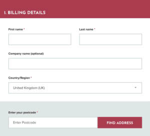
Postcode Lookup
This type of address entry allows a user to just enter their postcode, and then allows them to pick their address from a list genrated that share that postcode.
Although there is a little additional work for the user to find the correct address in the list of returned matches (which can be hefty for large apartment complexes), it does remove the confusion that address variations can create in with other types of address lookup.
Searching by postcode removes this as a potential issue, and I can quickly find my address regardless of the format of the first line.
It is pretty simple to add this functionality to your WordPress website using APIs like GetAddress and Postcoder. This is made even simpler by many of the popular form plugins for WordPress having add-ons to integrate these APIs, removing the need for additional development. Gravity Forms is one such example.
Search As You Type
This type of address entry starts searching a database as soon as a user starts entering their address. Once they see their address in the search results, a user can click on it to autocomplete the address fields.
This however does come with the potential issue created by address variations. Although it isn’t hugely common, different address databases will have different variations of address formats.
For example, if searching by typing the first line of my address I sometimes have to complete multiple searches due to different databases having my address recorded differently.
The variations I have seen include:
- Flat #, # Street Name, Town, County, Postcode
- Apartment #, # Street Name, Town, County, Postcode
- #, # Street Name, Town, County, Postcode
Although it’s not the end of the world, it can be a little frustrating. Also with more commonly occurring address first lines, a user can end up typing out nearly their full address to find theirs anyway. Can you imagine just how many 1 High Street’s there are in the UK?
Once again, it is fairly straightforward to introduce this functionality to your website, with services like the Google Maps API, Loqate and Fetchify. Which have integrations available for WooCommerce, or APIs to create integrations.
In a recent study by Baymard, 55% of the e-commerce websites they looked at didn’t provide automatic address lookups.
2. Option To Override Autocomplete If Required
Although I have just sung the praises of autocomplete functionality for address entry, it is also a good idea to have an option for users to override this and enter their address manually.
Why you ask?
Because of new builds and buildings converted into multiple addresses.
Here’s another personal anecdote for you to illustrate this. When I moved into my current home, the building had been converted from a single business premise to a block of flats for residential use. This meant the creation of new address records with new postcodes.
Unfortunately, it took some time for the various address databases used by many websites to receive this new data. So frequently when I came to enter my address details online for delivery or an admin task of some kind, autocomplete tools would come a cropper. My address didn’t exist despite the reality. In the cases where those websites had no alternative to autocomplete address lookups, I was left in form completion limbo.
You can imagine how frustrating this was, and how it could very easily tar someone’s opinion of your website.
3. Form Fields & Labels
In one of their many ongoing UX studies, Baymard Institute took a look at the usability of a large sample of websites with a checkout process.
One particularly interesting finding was that frequently used “Address Line 2” in address forms was a common point of confusion and friction for users. In many cases, it led to them getting stuck or entering the wrong information.
This is because, for many, a second address line is unnecessary. However, its presence in a form can lead users to feel that it must be completed. This creates a sticking point.
Baymard’s advice for this is to hide this additional address line behind a link, so it can be accessed by those who actually require it, without adding confusion for those who don’t. Yet only 20% of the e-commerce sites they looked at did this.
Obviously, address lookup tools like the ones we mentioned previously can also remove this potential friction point.
4. Don’t Make People Enter Their Address Multiple Times
Where avoidable, don’t ask your users to enter their addresses multiple times. This can really get peoples’ backs up.
Use Same Address For Billing/Shipping
If your user has to enter a shipping and billing address, make sure you offer an option to use the same address for both. Although sometimes people will need to enter separate addresses for each, most often they’ll be the same.
A simple tick box or slider to select that they wish to use the same address for both will save a user time and frustration.

Saved Addresses
For websites with user accounts for login users, make sure that they can select from a list of any saved addresses they may have. A huge time saver, and a reason they may choose to create an account with you for future interactions with your website. The lure of convenience is strong.
5. SSL & HTTPS
One simple way to improve the experience of any user entering personal data on your website is to show them that you take even the most basic steps to protect their data.
This one might seem like a no-brainer, but it surprises me how many websites I still come across with no SSL or an expired SSL. Yet this can be a turn-off for someone just visiting your site, let alone sharing their address details with you.
Lacking one means that users will see a Not Secure warning in their browser, which can definitely cause them to think twice about parting with their address details.

Everything Can Benefit From A UX Approach
These 5 tips can dramatically improve the experience for someone using an address form on your website, and yet that is just one small part of the whole machine.
Make sure that a UX approach is central to any website design project.