Structuring Product Information On Brochure Websites For The Manufacturing Industry
A look at structuring product information for manufacturing industry websites that don’t sell directly online.

Oops! We could not locate your form.
A look at structuring product information for manufacturing industry websites that don’t sell directly online.
We work with a number of manufacturing clients, and the majority of them choose not to sell directly online. They prefer to have brochure sites, designed to present their technical product ranges clearly, so that the right enquiries land with their sales teams, rather than to process transactions.
Brochure websites for manufacturing brands are brochure sites in the most literal sense. In many cases, they were created as digital versions of their print brochures, when having a web presence first became a necessity, and evolved with changing marketing trends and web technologies.
Designing a brochure site calls for a different design approach to the one you would adopt for designing an eCommerce website for a manufacturer. This approach differs across the site as a whole, but in this post, I’m going to focus on the structuring of products and product information.
Some manufacturers sell directly online, whilst many others don’t, preferring not to for numerous reasons, including:
These are just some of the reasons that just duplicating the structure of an eCommerce website doesn’t work in this context, both for the manufacturer, and the prospective buyers. The expectation is different, and the nature of the product and how it is sold is different.
Several of our clients are manufacture, making products with in-depth technical specifications that are hugely important to the decision making of their prospective customers, so we’ve had plenty of experience in this area.
The recurring issues we see on the websites of established manufacturers is a content issue, but not due to a lack of content. It is usually the opposite, with years of product ranges, brochures, spec sheets, photos, videos, diagrams and more, that have built up without a consistent structure behind them. Pages get duplicated for each new model or item, PDFs get uploaded ad hoc, and updating one range means hunting down every page that mentions it.
This is why a well thought out structure, and a content system built around that structure, takes a lot of the pain out of managing a website for a manufacturing brand, and is at the centre of how we approach redesigns for our manufacturing clients.
Rather than one, long, flat list of products, split the content into two levels:
A visitor can land on a range overview, get the general picture, then drill down into the specific model/s relevant to them for full technical detail. That structure holds up whether a range has three models or thirty, because it is driven by post types and relationships.
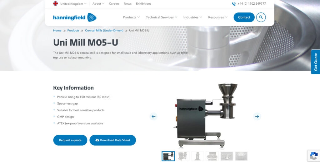
On Hanningfield’s website, this is exactly the pattern we implemented. Users browse the ranges, and then move on to the individual model pages for complete specifications, before being pointed on to a quote request.
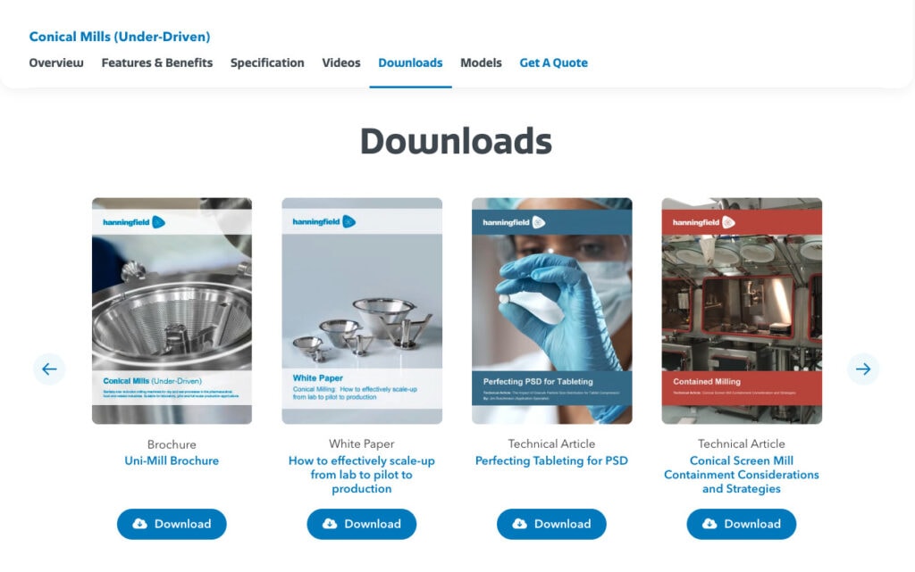
Rather than maintaining a separate downloads page that inevitably falls out of date, attach the relevant brochure, technical specification sheet, and any product videos directly to each model as custom fields. The model page then displays whatever is attached to it automatically. Add a new model, update a spec sheet, and there’s one place to do it, rather than several pages to remember.
This is also the point where professional product photography earns its keep. A technical, engineering led product still benefits from being presented well. It can be the difference between a page that looks current, and one that looks stale or neglected.
Here is an example from on of the product range pages on the Hanningfield site. This one is for conical mills, and as you can see, all of the relevant downloads for this type of product are pulled through in the downloads section. The same goes for videos and other assets on the page.

Since the goal is a qualified enquiry, rather than a checkout, every model page should carry a clear, low friction way to act on it. Whether it’s a form, or a quote request button, they should be placed consistently. Don’t rely on people heading over to your contact page of their own accord.
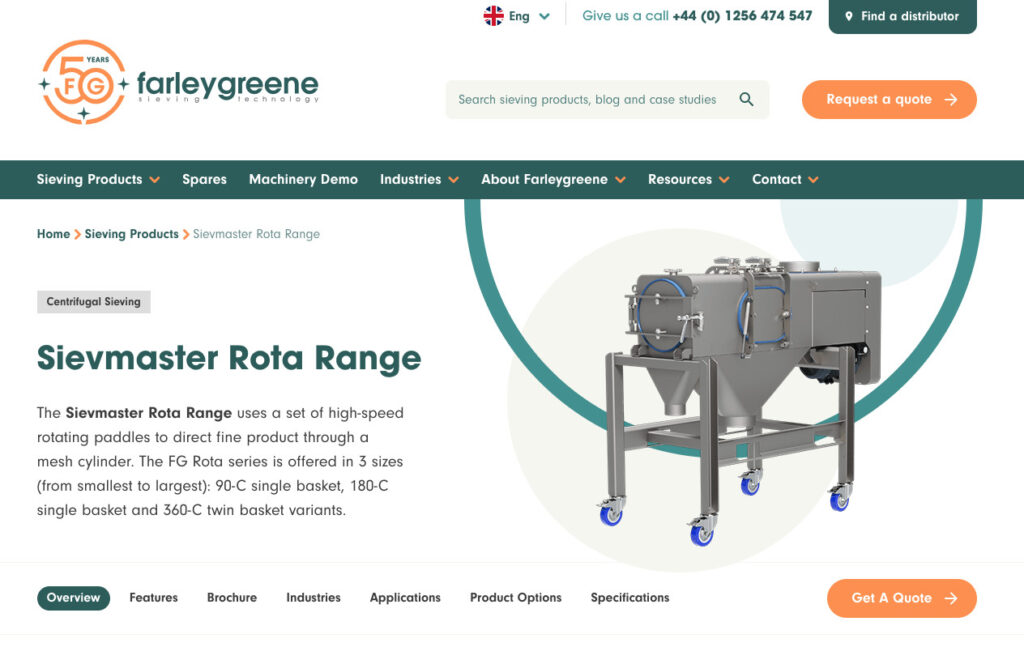
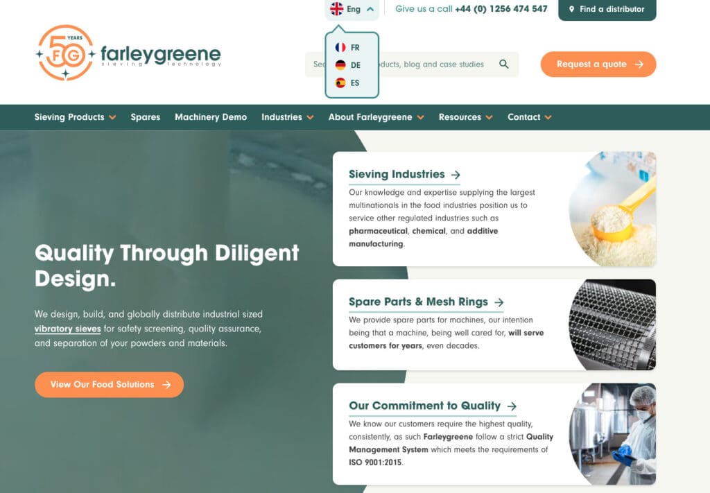
Here are examples from both Hanningfield and Farleygreene, with clear ‘Request A Quote’ CTAs. Both pages have CTAs repeated down the page, and both have a form on the page too. On the Hanningfield site, the request a quote button at the side of the screen follows the user down, and opens the quote request form in a modal.


For a considered B2B purchase, the visitor comparing three models back-to-back should never have to go hunting for how to get in touch about the one they’ve settled on. Even better if the model name is then automatically pulled into the contact form, so the prospective buyer doesn’t have to type it out of copy/paste it across.
Manufacturers often serve several distinct sectors from the same product range. A visitor arriving from the food processing industry for example, wants to see relevance to their industry before they wade through a full technical range.
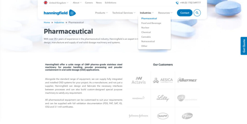
The site we built for Hanningfield handles this with a dedicated industries section, which covers 5 core sectors they serve, each with its own page, that pulls though the information and experience relevant to that industry.

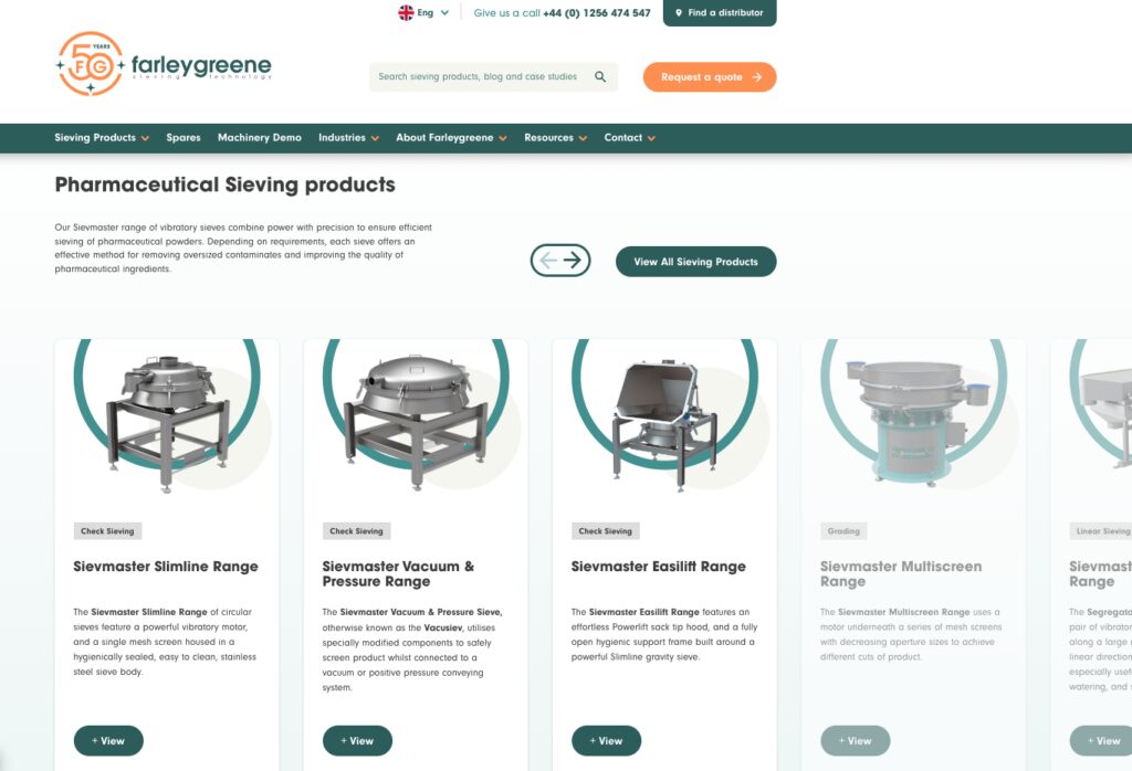
The site we built for Farelygreene handles this is a similar fashion, but goes a step further, and pulls through products that are relevant to the industry as well.

Structurally, this means tagging products with the industries they are suited to, rather than duplicating product content per industry. The same model can then surface naturally under every relevant sector page.
It’s tempting to reach for faceted search and filtering once a range gets large, but for most brochure sites, a well organised range and model hierarchy, combined with decent on site search, does the job admirably, without the overhead of building and maintaining a filtering system designed for shopping, not specifying.
Filtering is worth the investment when a range is genuinely large and visitors arrive knowing a precise technical constraint. Otherwise, clear categorisation gets you most of the benefit for a fraction on the build and maintenance cost.
For manufacturers selling into multiple countries, this structure needs to hold up in more than one language. On the Farleygreene website we built, the brief was a multilingual, easy to navigate site for their global sieving machinery manufacturing business. Keeping ranges, models and their attached technical content needed to remain consistent across languages, and this was as important as the translations themselves.

Deciding on the range/model structure and how content variants like language or region work with it before content is added, makes this much easier to extend at a later date, whether that’s with a new language addition, or as with some of the websites we are currently building in this industry, a new set of ranges entirely.
The case for this structure isn’t purely a technical one. Once every model has it’s own properly built page, rather than a line in a PDF, that page can actually rank on its own for specific model and technical queries, not just the range it belongs to. Then the range pages can rank for more generic range and product type related queries. A flat catalogue buried in downloads doesn’t give you the change to optimise for these different searches and intents.
It also changes who can maintain the site’s content on a day-to-day basis. Adding a new model, updating a spec sheet, or swapping in new photography becomes a simple content task once the fields, mapping, and templates are in place. Avoiding the need to ask for developer help, or having to build out a completely new page.
Industry tagging pays off beyond navigation too. An enquiry that comes from a page already tagged to food processing or mining, gives you a good idea of the prospect’s needs, before a phone call happens. Always useful context for beginning a sales conversation.
Because the underlying content, specs, brochures, imagery, is. structured rather than locked into a single page layout, it is easier to use for building out a PPC landing page, a page for an email campaign, or a distributor portal, without needed to rewrite it from scratch each time. In fact, with a block based builder, like our own (Imblox), you can quickly build out campaign pages using custom blocks, without developer assistance, which pull in all of the relevant content and media.
A solid strategy for handling how ranges, models, industries, and languages relate to each other, before jumping into design and build is the way forward. Then building post types and fields to match. If you get this structure right from day one, new ranges or markets can slot in cleanly, and you won’t end up with a mountain of individual pages to maintain and update.
If you are a manufacturing business looking to redesign your website, and you’d like to work with an agency that knows your industry well, give us call or drop us a message. We can arrange a commitment free discovery call to discuss your project, and see if we could be a good fit.

Impact Media® has been crafting award-winning websites since 2003.
If you’d like to learn more about our website redesign approach and if it could be a good fit for your organisation, drop us an email or give James a call.